Keep Calm and Carry On Poster

Keep Calm and Carry On

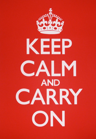
Originally, this poster was intended to increase British morale before the Second World War. Now, this poster has become even more famous. I see this poster almost everywhere, and I believe that it has a powerful message. It tells its’ viewer to not worry about what is going on, but to remain calm, and to keep moving along. Not only is its’ message very strong, but it is designed very well. The Gill Sans typography that is used remains the same throughout the entire poster. It is white, bold, and stands out very clearly in front of the bright, red background. The typography, color, and design are very clear and keep the message short and simple. I don’t believe anything should be changed to this poster to improve its effectiveness.


Sushi/Plastic Pollution Poster

sushi_ad


The major message this poster tries to convey is that polluting the ocean with garbage should be prevented because fish eat that garbage and we eat fish. I believe the designer decided to use this sans-serif typography because it is easy to read on a poster-sized paper, and the message is straight to the point. I also believe the designer used the color blue for the typeface to represent the blue of the ocean. The visual choices made were very clever. The picture is two pieces of sushi with a pair of chopsticks like it is ready to be eaten. The issue with these pieces of sushi is that the outside is wrapped in plastic, and the inside, where the raw fish is usually placed, contains more plastic remnants. The words connect very intimately with the graphic image because the words say that we eat fish and if fish ate plastic pollution we are essentially eating plastic. The picture shows exactly what the words are saying by showing plastic on and in the sushi pieces where food from the ocean usually is in sushi pieces. The poster met marketing goals by grabbing the attention of readers with an interesting visual, while having a bold, easy to read, and straight to the point message. It makes for a clever yet easy to comprehend poster. There is always room for possible improvements. I think that maybe the words could have been written on a path of a wave to drive home the ocean message even further. Additionally, one of the chopsticks could have pointed down toward the text to encourage the reader’s eye to read the message. Lastly, the logos in the bottom right could be smaller because the size they are now is a little distracting from the overall message.

Outback and Disney Wordmark


outback-steakhouse

This wordmark of the famous Australian steakhouse Outback, that is now open worldwide, does a phenomenal job of portraying the brand image in the name. The crumpled and irregular typeface of “Outback” and its bold, red color gives an impression of wildness, amazon, and jungle. This is carried on through all of their branding strategies. For instance, their television commercials are usually composed of having jungle, Australia, kangaroo, and wildness as the main themes. Furthermore, the thickness of the typeface also portrays masculinity, which is well paralleled with the actual interior design of this steakhouse.


disney-logo


Disney’s wordmark is probably one of the most famous of all times. Disney’s target audiences are children, which means the associated values that they want their target to associate with are friendly, fun, exciting, and magical- all at the same time. It’s whimsical and curly typeface gives an impression of magical fantasy, which is exactly what they wanted to portray to the audience. . The roundedness of the typefacess gives an impression of friendliness and warmth. However, the use of the color blue allows Disney to have a balance of both masculine and feminine. If the wordmark of Disney was a feminine or warm color, they could have possibly lost their male audiences.

Metalica and Dewalt wordmarks

metallica_logo

I selected the Metallica wordmark because I think it does a very good job using the highly stylized M and A to evoke thoughts of edgy, metalic, sharp items like concertina wire, spear, fishhook or even lightning bolts, all of which embodies the style of the band’s electrifying heavy metal music.


dewalt-logo

I chose the Dewalt Tools wordmark for their simple, solid construction using all capital letters. I think the yellow and black that make up the wordmark are well chosen because they mirror the traditional color of larger construction machinery as well as safety and caution warnings typical to construction sites.

Dunkin’ Donuts and Ikea Wordmarks

Dunkin Donuts


When imagining a typical donut, the image in one’s head could (and should) be of a fat, perfectly circular (possibly iced) treat. Dunkin’ Donuts utilizes a rounded, bolded, sans-serif to achieve that image in their wordmark. Because the two words in Dunkin’ Donuts are perfect matches, it is effective to stack them. Through applying two different colors, orange and pink, Dunkin’ can also differentiate the two words, just like their two primary products – coffee and donuts.

IKEA

Ikea, on the other hand, brands itself through interchanging the same two colors as its home country, Sweden’s, colors. Sweden and Scandinavia have a reputation for quality modern furniture and by creating a connection to their company, Ikea connotes the same reputation as other finer Scandinavian furniture stores. It is also important to note the thick-bodied letters and the tracking between the letters. There are minuscule serifs on the edges of the letters that can also add more character to the wordmark.


Ferrari and Johnson & Johnson Wordmark

ferrari-wordmark-logo

Wordmark of Ferrari is definitely an eye catcher. The white characters stand out from the red background, which makes the brand name more impressive and easy to remember at first glance. Tracking is natural and comfortable. The best of all is the extension of the letter “F” in the ascender line, marking its end with the letter “i.” Such design resonates with Ferrari’s brand image, as it is well-known for its super cars. The ascender line could have extended to “I”, but it doesn’t, suggesting that while Ferrari cares about the speed performance, it also emphasizes on the concept of “safe driving,” — to stop where necessary. Overall, this wordmark is well-designed and enhances the brand image.

johnson-johnson-logo

This wordmark of Johnson & Johnson has both pros and cons. Tracking is moderately adjusted; letters are attached to each other, creating a fluid sense, which I think is very stylish. HOWEVER, I personally don’t quite get it why a company specializing in pharmaceutical and consumer packaged goods would come up with such a design idea. Shouldn’t such companies be more classic and traditional when it comes to wordmark design? What does this wordmark suggest in relation to its brand image? Any thought is more than welcome!


Tony Turretto – Wordmarks

Wordmark one for week two assignment.

Wordmark one for week two assignment. 

I really like the Ray Ban wordmark because it has always been associated with ‘cool’. The wordmark, as most of you know I’m sure, is always neatly and subtly placed in the corner of all their products. I always thought that was neat because it distinguishes their product from similar ones. I like the bold color that draws you in, but I also like the the way they present themselves elsewhere using only the signature font. It’s unmistakable.

Wordmark two for week two assignment.

Wordmark two for week two assignment.

This wordmark is a classic. The font is unique but familiar and bold. I think the wordmark matches appropriately with the products it represents because of the bold color and sleek appearance. Unlike Ray Ban, Ferrari uses a block/slab serif that I find appealing because it’s bold and uncompromising. When I see Ferrari and Ray Ban wordmarks I think of classic and uncompromising brands that don’t aspire to be trend setters. These wordmarks and the associated products set the standard of what we know to be cool.


Interesting and Bold

hp

The Harry Potter wordmark uses the Harry P typeface, which was specifically designed to use for the series. The designers created the typeface with crooked letters and distinct serifs to illustrate the world of magic that Harry Potter portrays. The bolt image that extends from the P in this wordmark as a descinder brings the motif of Harry’s lightning bolt scar on his forward into the wordmark itself. Certain letters are larger than the others, and the H and the A, along with the P and the O are interlocking to place emphasis on the oddities and the other realm that the books and movies take the reader to.

espn_logo_887

The ESPN wordmark uses the ESP typeface. This is especially effective because of the type of magazine ESPN is, and the portrayal the editors want their audience to have of the magazine. The line going straight through the letters in a consecutive way illustrates a moving forward of sorts, or a type of action, as one’s eye moves directly across the image, from left to right, in a quick and fluid motion. The lack of negative space between the S and P elongates the word, keeping the word connected, as all of the sports and ideas within the magazine are connected as well, which is a great branding technique. The red is a warm color, keeping the wordmark in full view the entire time, making it stand out.

Cool Whip Word Mark

Cool Whip

The typeface Cool Whip uses, which resembles Gans Antigua Gold, is a fun and effective wordmark. The letters look like the the topping when it is scooped out of the container. The color white also represents the contents inside the package, which is excellent brand identity. The characteristics of the word mark such as the typeface, color and arc gives an air of lightness and fun. It creates a memorable visual due to the quirkiness of the serifs and the tight kerning of the letters. The brand identity is also incredibly strong because when you look at the wordmark you are immediately reminded of the contents within the package and how tasty it is to eat.

CNN Word Mark

CNN

The CNN wordmark strikes me as particularly interesting and effective. The warm red color comes forward and catches the eye. The color gives a sense of urgency like a stop sign as if to say “Stop here and listen to the news.” The wide sans-serif typeface is attention-getting yet simple and will easily jump out when flipping through the television channels or while searching stories on the web. The white line running through and connecting all the letters is also very defining. It makes the words flow and reminds me of a path like the way news travels. The connection and flow of the words also remind me of the way we are all connected to the news and general happenings of the world. All these aspects of the wordmark represent the brand identity well for CNN. It is eye catching yet still sends the message that CNN is a news outlet.