Scavenger Hunt: Carli Aluotto, Sarah Richheimer, Kevin Claffey, Eric Gordon
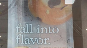
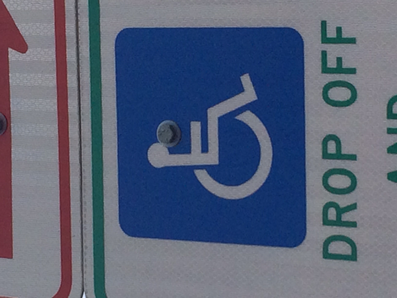
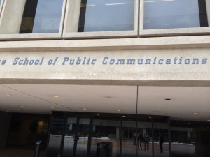
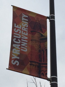
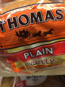
1. Old Style serif type in signage
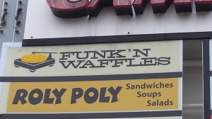
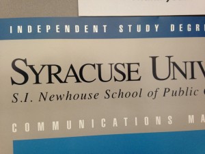
2. Modern Serif type in signage (Funk’n Waffles)
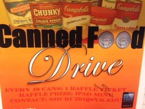
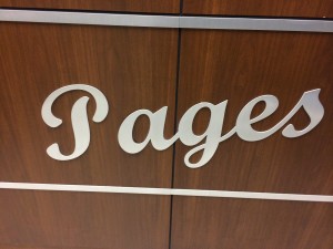
3. Script or cursive type in signage
4. Slab serif type in signage
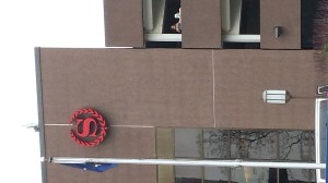
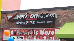
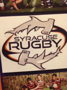
5. Pictographic logo
6. An effective logo
7. Silhouette form in a logo
8. Analogous color use
9. Complementary color use
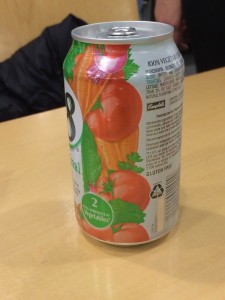
10. Color repetition from visual to type
11. Isomorphic correspondence in visual use
12. path or continuation in visual use
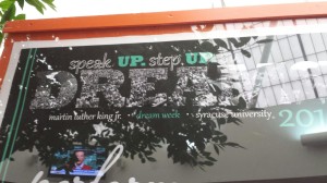
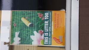
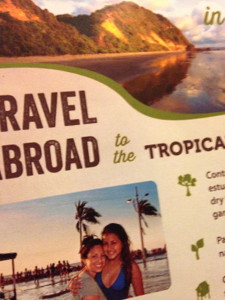
13. Word emphasized in type size in a headline display
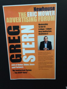
14. Word emphasized in color in a type display
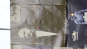
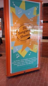
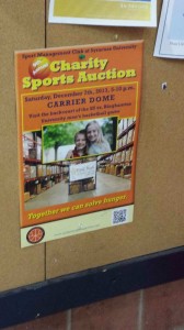
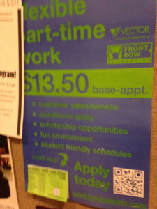
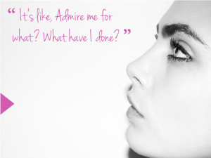
15. A good poster design
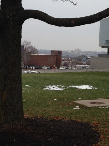
16. Use of a picture showing rule of thirds
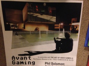
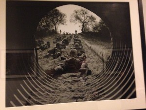
17. Use of a picture showing leading line
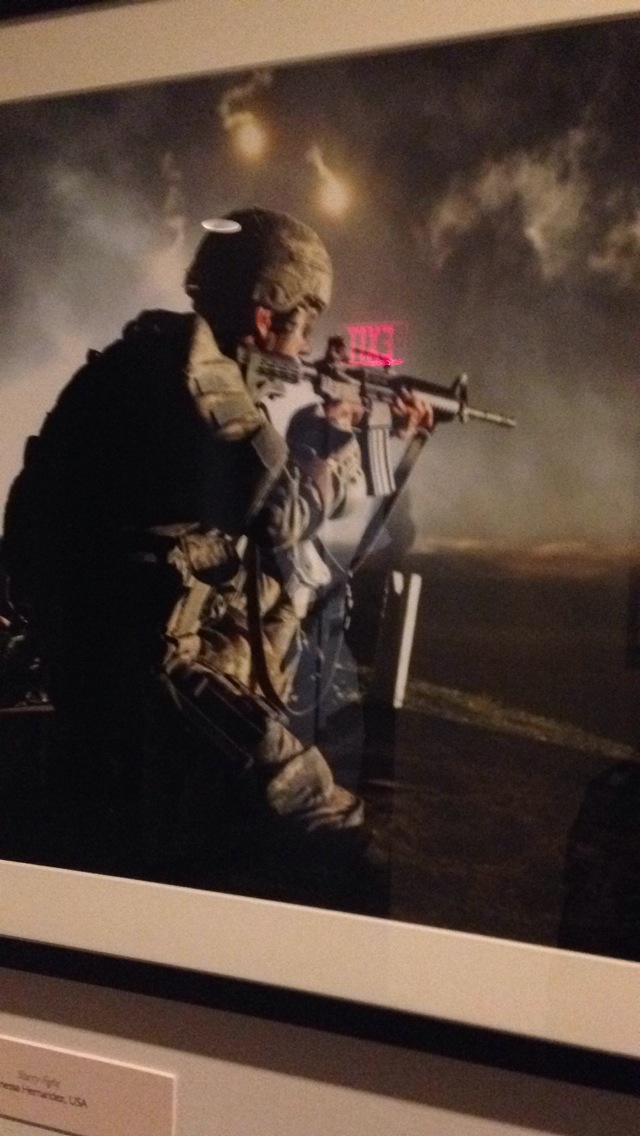
18. Use of a picture showing stopped action
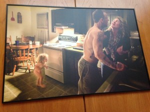
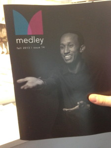
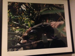
19. An environmental portrait
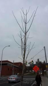
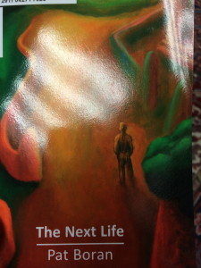
20. Something in nature that looks like a letter (Y)
Courtney Inbody, Holly Johnston, Michael Clavijo, Stephanie Diacovo
 1. Old Style Serif type in signage
 2. Modern serif type in signage
 3. Script or cursive type in signage
 10. Color repetition from visual to type
 11. Isomorphic correspondence in visual use
 12. Path or continuation in visual use
 13. Word emphasized in type size in a headline display
 14. Word emphasized in color in a type display
 16. Picture using rule of thirds (top picture)
 17. Use of a picture showing a leading line
 18. Use of a picture showing stopped action
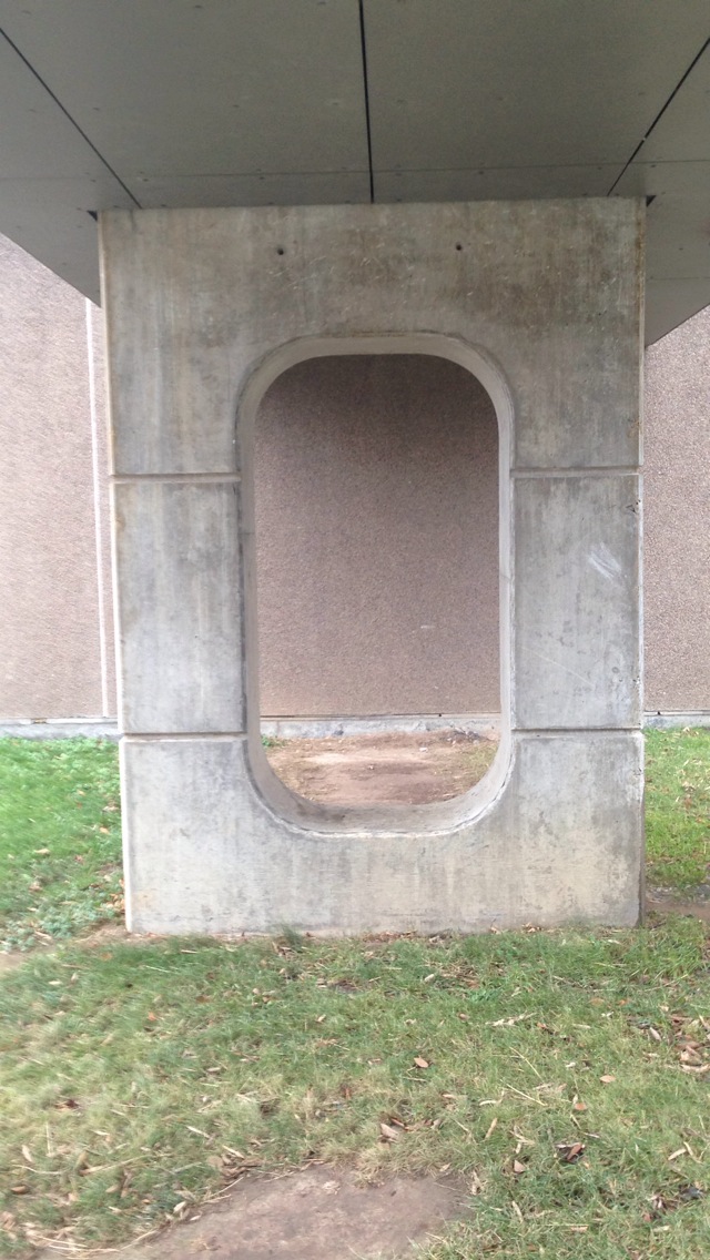 20. Something in nature that looks like a letter
Scavenger Hunt by Julia, Julie, Rosalind & Austin
10. Color repitition from visual to type

2. Modern serif type in signage
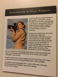
16. Use of a picture showing rule of thirds
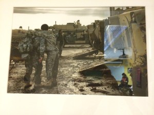
12. Path or continuation in visual use
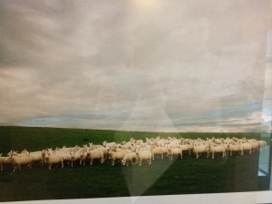
14. Word emphasized in color in a type display
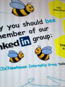
18. Picture showing stopped action
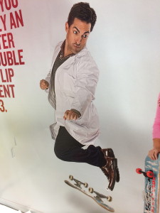
13. Word emphasized in type size in a headline display
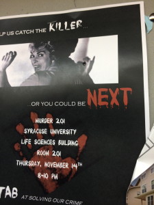
3. Script or cursive type in signage
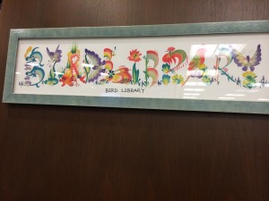
20. Something in nature that looks like a letter
Nora Horvath, Emily Capobianco, Dean Carney scavenger hunt
ipad project
Tablet Design – Draft
Magazine Tablet Design
From this assignment, I learned the difference between magazine design in print and on tablets. Tablet magazine covers often have fewer (if any) cover lines. Cover lines exist to sell the magazine to the reader, but tablet readers have already bought the magazine and therefore don’t need to be convinced to buy it. Tablet covers often only have an image and the magazine’s name. Also, magazines have unlimited space on tablets so the designers can space out the type by adjusting leading and put fewer elements on each page. Interactivity promotes reader engagement, and allows designers to fit more content on the pages.
The main thing I learned with this iPad design was to be patient with learning new Adobe software. I prefer Photoshop to any other program, but this project allowed me to be a lot more hands-on with InDesign than the resume project did. Though InDesign is still not my preferred program, but I am lot more comfortable with it now than I was back in September.
Shaffer Art Gallery Extra Credit
Yesterday I had the opportunity to visit the Shaffer Art Gallery and spend some time looking at the history of printmaking. It was very interesting to see the styles and sophistication evolve throughout the years. The images began with mono-color wood engravings. These images were very detail-oriented and the talent that was involved in creating those pieces was very clear. After the mono-color era of printmaking, there were two-color linocuts and lithograms. These images were more involved and it was clear that the artists began to experiment with the color and where to place the color in the image so it’d be most effective. Eventually, printmaking developed into tri-color and more detailed images. These images were more advanced. It was also clearer from these images to see the progression from the tri-color lithographs to today’s design principles.


