
![]() For my logo, I wanted to make my name look cohesive, because it’s a good way to draw the reader in and get the whole picture. I liked the use of my full first name, because that is more important to me. I then connected the last letter of my first name with my single initial of my last name to have the eye read from first to last name. I like this simple font because it was easy to manipulate, however, I may explore more diverse fonts for the future.
For my logo, I wanted to make my name look cohesive, because it’s a good way to draw the reader in and get the whole picture. I liked the use of my full first name, because that is more important to me. I then connected the last letter of my first name with my single initial of my last name to have the eye read from first to last name. I like this simple font because it was easy to manipulate, however, I may explore more diverse fonts for the future.
Category Archives: Resume
Personal Logo
![]()
My first thought when I was sketching out different ideas was wanting to do something with the “rah” since it was in both my first and last name. I added the color to my first name and made my last name thinner so it might help differentiate between the two. I used the same font and color as my resume because I assumed people I may be giving my resume to, I’ll also be giving a business card to, so it would be beneficial to have every piece of my paper identity coherent.
![]()
For this second idea, I wanted to incorporate something with the S and G in my names being similar curves and shapes. I think this one might be a little difficult to comprehend, and it might be because of the font. I think because the font is slightly unusual, it might get in the way of understanding it. However, on a business card with other information, it might make more sense. At first I had the G in the same maroon color as the first logo, but decided to change it so it would have more a contrast with the black S on top of it.
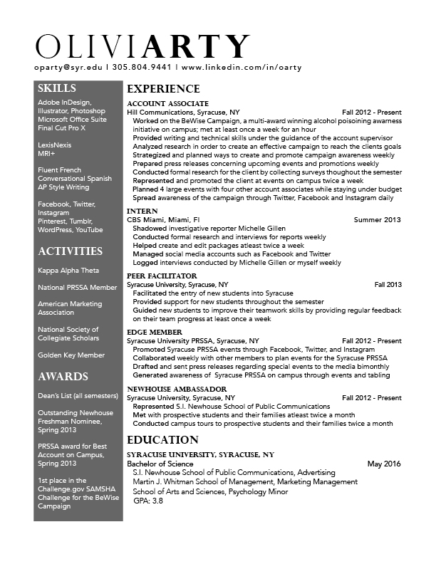
Resume Final

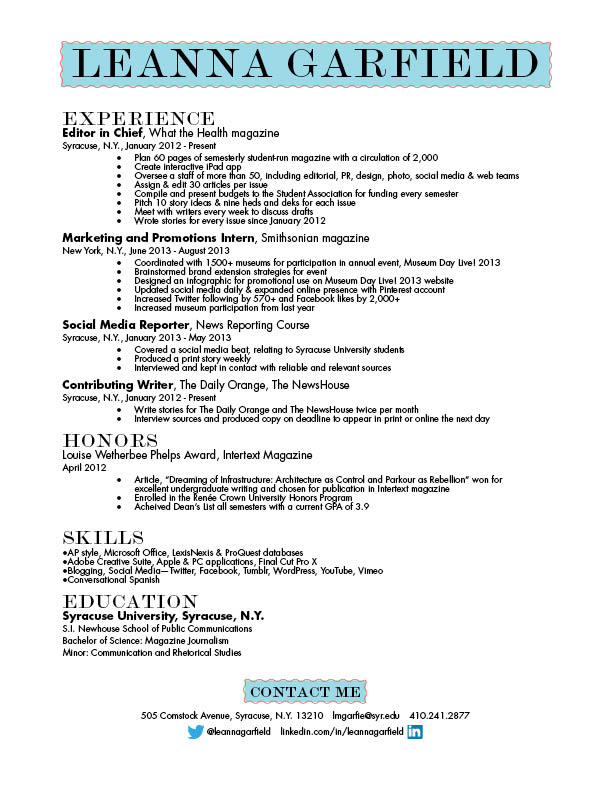
Resume
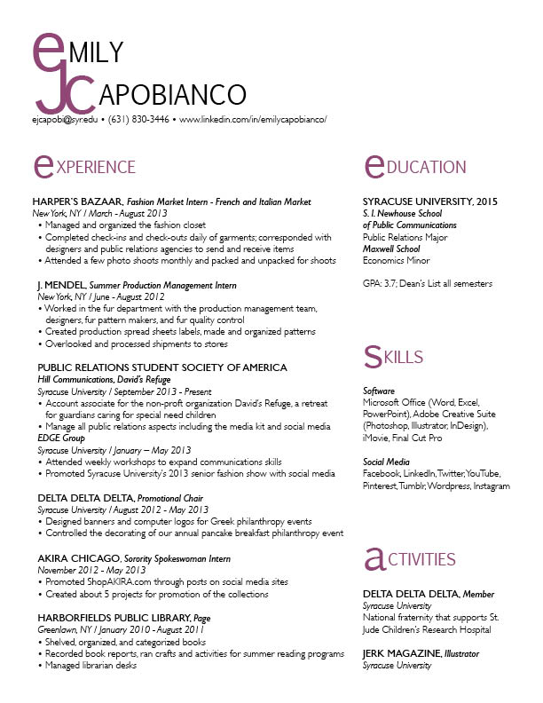
Resume Re-do
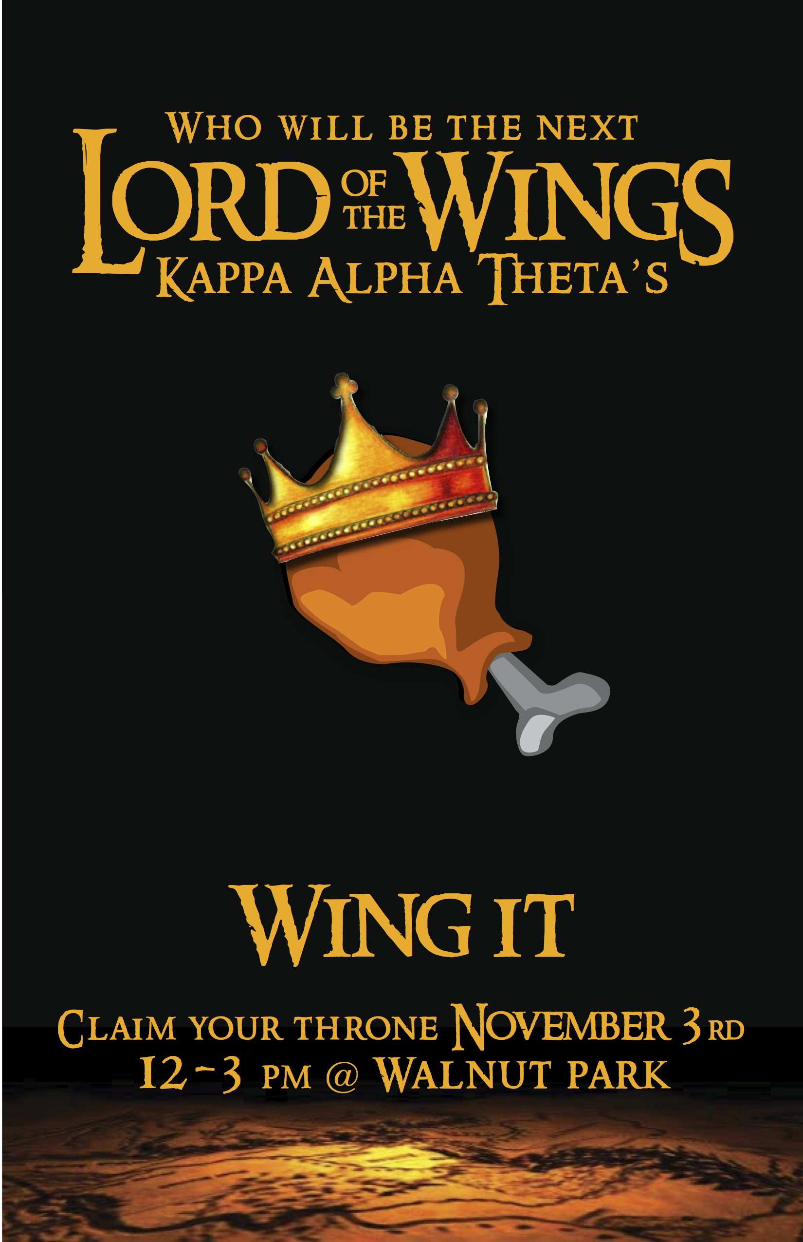
Poster
Resume Re-Do
Poster
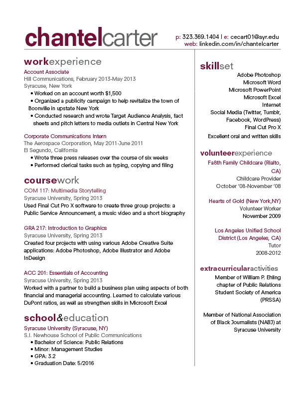
Resume 1B
Week 8 Post
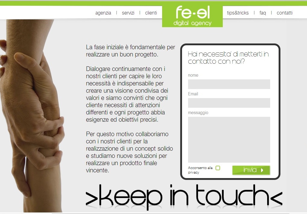 www.fe-el.com
fe-el.com is a web design agency that focuses mostly on highly interactive webpages that focuses strongly on interaction and communication with customers. Their website does not focus much on photography, but it is relying very heavily on elements of graphic design to bring their website together. It’s a very deep website with the user having to continue to scroll which might be a turn off to some viewers. The one photo that they do have on their website is under the “Keep in Touch” option, which shows an image of two people literally “keeping in touch”. I think it works well because it conveys the message fe-el thinks that their partnership with customers is important in order to achieve success.