Deck and Headline

gra 217 blog


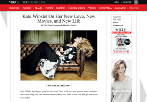
This deck and headline work well together because the headline gives the essential information for someone to understand what the article is about.  The deck goes further into detail by giving background information about the topic as well as the name of who took the photo.

Headline and deck

Screen Shot 2013-11-08 at 8.25.14 PMThis headline and deck work well together because the headline tells of who the article is featuring and what they are focusing on. Then the deck compliments and furthers this, describing more specifics and who will be interviewing the subject, Kate Winslet.

Headline and Deck

屏幕快照 2013-11-08 下午04.35.10

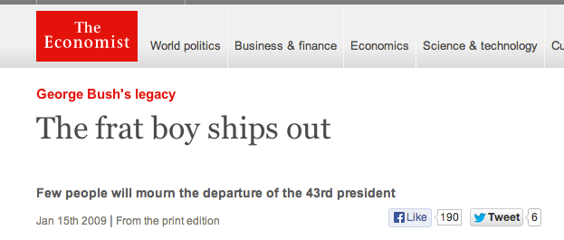
This is a feature story on Economist magazine about Bush leaving the White House. The magazine teased the lack of popularity of Bush’s presidency in the United States. Economist also teased Bush’s poor policy-makings.

Head and Deck

Headline: Miley Goes Bang

Deck: With her devil-may-care attitude and rocking new sound, the pop star proves she still can’t be tamed. By Derek Blasberg.

I think this head and deck are very clever because they refer to two pieces of her music (her new album Bangerz and her old song “Can’t Be Tamed”). The deck also successfully introduces you to the topic they will be discussing in the story.

(From Harper’s Bazaar, October 2013)

Magazine Headline and Deck

Screen shot 2013-11-08 at 12.59.46 PM


I like the headline because it is simple enough to get the point across and will come up in a search when using a variety of words. I was particularly drawn to the deck though because of the way it used questions to make you want to read the article.

Magazine feature

mens health


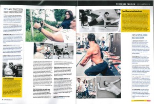
Above is Men’s Health’s article published every month on a specific workout.  The layout of this two page article is what attracts my eye.  Men’s Health not only utilizes the directions of how to properly perform each workout, but has pictures to give readers an accurate description.  This simply layout and placement of text and pictures creates an easily navigable article that will entice readers to read all the way through.

Magazine

car

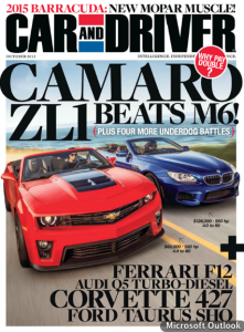
I like the way Car and Driver has had their layout for years because it tells you whats going to be featured in the main articles of the magazine before you read it. The bold headline of the magazine helps to draw in the reader for car enthusiasts with big company names and popular car brands. Every cover the magazine features vibrant cars dueling it out or in an action shot to further attract the reader.

Favorite Magazine Layout

KANYE WEST COMPLEX COVER


For my preferred magazine, I chose Complex Magazine’s 2009 Kanye West cover. Personally I am a huge fan of Kanye West not just as a musician, but as an individual and an icon of my generation. But what I felt Complex did that really helped attract the viewers eye was their use of visual hierarchy. They made KANYE WEST the biggest text after “COMPLEX” to help attract the attention of Kanye fans to the magazine, and used the term “MOST INFLUENTIAL BRAND” to further intrigue the reader. In addition, they did a good job of putting white text in front of Kanye’s polarized face, which is something difficult to do because they are both lightly toned.

Magazine Spread Design

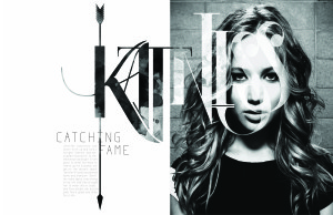
katniss_fook_final


I really love this two page spread, and not just because I love the Hunger Games. Although this design shows no color, it is far from plain and simple. The typeface used for “Katniss” is extremely creative. The designer also incorporated a different picture within the typeface to contrast from the picture of Jennifer Lawrence. The texture seems to be either dirt or blood stained, sticking to the theme of the movie. The arrow going through the K also fits perfectly with the theme of the written piece (which is about Jennifer’s role in the movie) because it is one of the main sources of survival for Katniss. The designer further perfected this design by making the arrow go through the K in Katniss, the I in Catching and the F in Fame. Not to mention that Jennifer Lawrence looks absolutely beautiful.

Magazine Spread

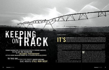
mag


I am really drawn to two page magazine spreads that have a continuation of a picture from page to page. With magazines, people often pick them up and flip through them rather quickly if they are bored, or waiting for something. I like the idea of having two page spreads in magazines because I feel like they break up the monotony of the average magazine article.

I specifically chose this spread because I was really drawn to the way it has the ability to grab the reader’s attention without using color. The photo itself is stunning, and the contrast between the light and dark parts of the image work extremely well together. I also liked the fact that the photo contained a vanishing point. It gives the photo depth and dimensionality rather than just shooting the sprinkler system head on. I was also drawn to the placement of the type and how it did not interfere with the photograph, but aided in getting the message across.