My personal logo includes my initials, BBW, which stand for Bridget Bohannon Williams. I placed them in a triangle simply because that is my favorite shape. I flipped the middle “B” and made it bold just for stylistic purposes. I was really going for simplicity with clean, straight lines. It is black and white to again keep it simple. I created my logo on Photoshop. I have incorporated my logo into my website in the header and favicon. bridgewithat.com
dhs logo sketch
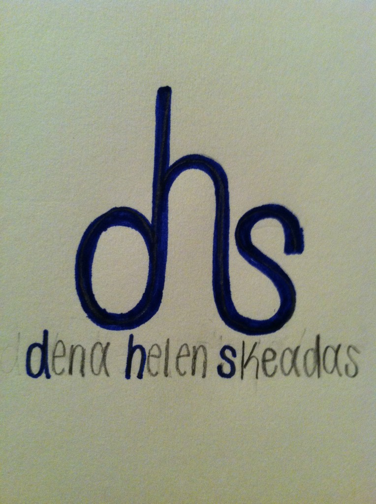 Above is my personal logo sketch. Behind this design, my thinking process is as follows: I wanted to use all three initials in my name because I think my name is unique and stands out. With this in mind, I wanted to incorporate the “d”, “h”, and “s” together, so this sketch is the way I thought it looked the best. I chose to use lowercase letters because it is the only way I could incorporate the letters together next to one another without flipping them around. I like how the “d” and the “s” are the same size, but how the “h” is slightly bigger. I also like the type is curved; it adds a touch of gentleness. If I were to implement this sketch, I would make the “dhs” a little bolder. I would keep the “d”, “h”, and “s” in the full name the same blue color as the initials above it. Then I would make the remainders of my first, middle and last name white. Blue and white are Greek colors, and if you couldn’t tell from my name, my name is Greek.
Blog Assignment: upload your own logo
On Wednesday’s class, professor Taylor asked you to design your own logo. So for this week’s blog, you need upload a photo of your logo sketch. Below the sketch, describe briefly your thinking process behind the design and how you are going to implement this new identity.
You can upload multiple sketches if you have different ideas. If you want to directly design it in Illustrator/PS/Indesign, feel free to do so. Just remember to upload a jpeg/png of your final image.
Sketch Post due on Saturday 11:59 PM (Not Friday)
Comments due on Sunday 11:59 PM.
WWF
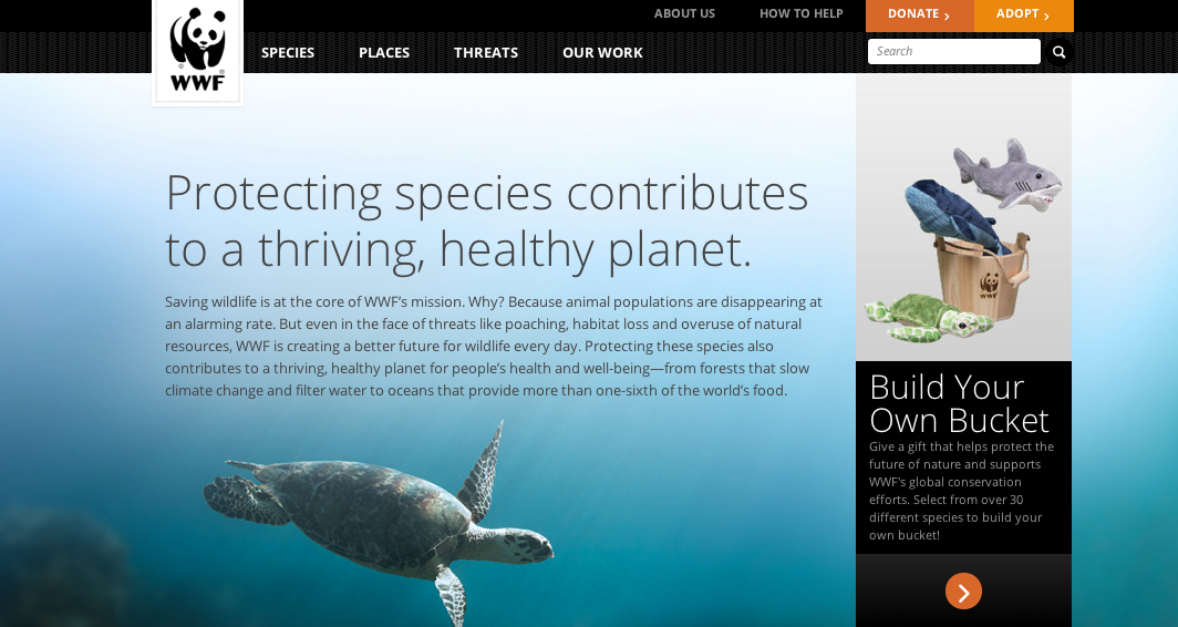 The World Wildlife Foundation employs the use of exquisite photography in an animals most intimate setting. This is essential to the success of the organization as it must appeal to its followers and subsequent donators that the very objects this website advertisers are worth saving. These photos are always of incredibly high quality and attempt to capture the detail and beauty of the environment in which the animal is set. Whether that be by using a wide angled lense to capture the greater area of a habitat (like shown with the turtle above) or zoomed in amazingly close, this website always parades its photos in an incredible way. The above picture really plays with light well as you can see the rays from the sun flooding in on the turtle from above and leading the viewers eye to this tranquil animal, imploring for the viewer to help it in its time of need. The blueness of the water is very calming and easy for the viewer to look at. This is often how the WWF displays its pictures as it evokes the most appropriate response from viewers.
Photo in web design
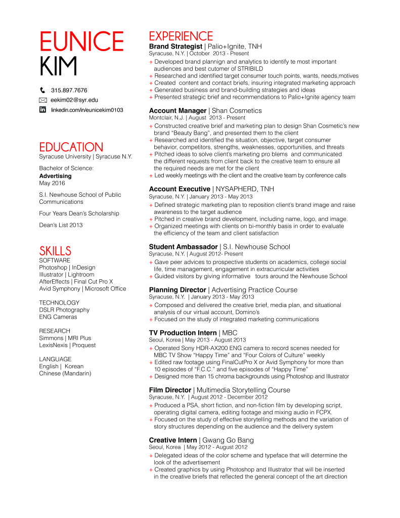
Eunice Kim Resume 1B
Charity : Water – Use of Photography on Web
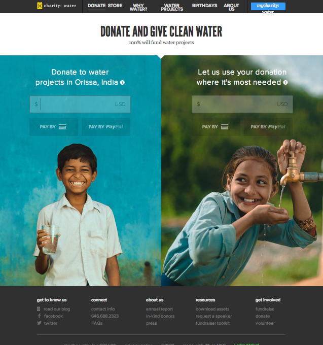
This is the “Donate” page for Charity : Water website. I specifically chose this page instead of the conventional “Home” page because I wanted to to see the organizations use of photography in a page that is the most essential for convincing or persuading audience to take action.
This is the view of the website after I zoomed out three times to get the whole layout of he page. In original setting, the two photos will be bigger than the window itself that I need to scroll down to finish the photo. I love their use of two images of very cute children who serves as the faces of the mission of this organization, and thus very relevant. The use of complementary colors attracts the viewers more to the page and the contents on the photo (donate). Also, the color used for typeface contrasts with the photo that it is very legible. The target audience could be seen as in the wide range of teenagers to seniors. The call-to-action is purposely on the photo so that the message will associate with the beautiful photos, evoking ethos to the audience.
Photo in Web Design
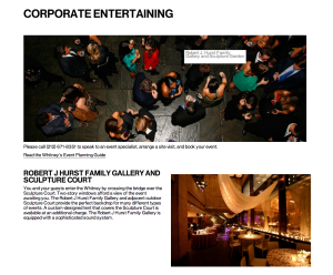
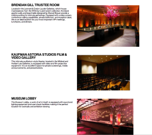
This webpage is about corporate entertaining. The Whitney Museum of American Art encourages corporations rent their places to hold events. Those photos work very well. The target audience are corporations which are going to hold various events and finding places. All of the photos show gorgeous rooms with luxuriant decorations. All of them are very attractive. The biggest one shows the scene of cocktail party from a high angle. It is unique and gives people a sense that they are monitoring the party as a planner.
Trevor Zalkind Resume 1B
Afgn
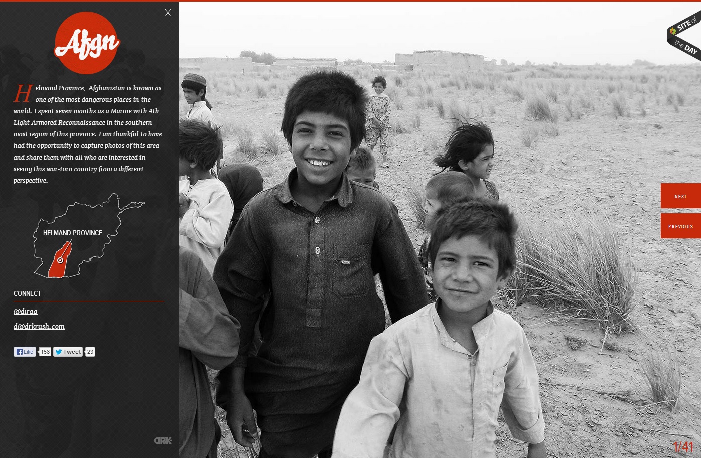
In this website, the photo of the children in grayscale provides a means of emphasis in the orange-red type and graphics. The heat of the color contrasted with the black and white of the photo creates key emphasis of the Afgn logo, the dropcap, the Helmand Province graphic, and the previous and next buttons. All of the emphasized aspects are vital to the webpage. However, they do not stand out from the picture, which creates a friendly face for the area and detracts from the Islamist extremist stereotypes of the region. The photo is covered up by the black transparency on the left, but the whiteness of the boy’s smile captures the initial attention in the site.

