Website Design

Screen Shot 2013-10-02 at 10.37.19 PMScreen Shot 2013-10-02 at 10.37.35 PM

Screen Shot 2013-10-02 at 10.43.20 PM

http://obo.co.nz

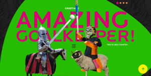
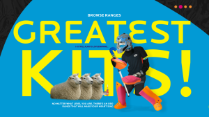
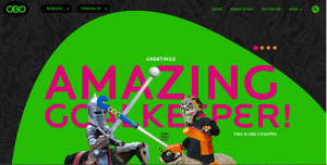
The website I chose to comment on its impressive design is OBO. OBO is a brand of field hockey goalie equipment that makes everything from sticks to goalie pads. I included three screen shots to show the navigation tools and the full images of the home page. To start with the basics, the website is extremely easy to navigate. It’s organized into sections telling you about sizing, where to buy, and shows all of the products. What really makes this website incredible, however, is its awesome graphics. They’re humorous and still relate to the product. The colors are bright and it is all very attractive. Although I have no need for a goalie stick, the website does a great job of advertising them to make me want one.

 

Ben & Jerry’s Website\

Screen Shot 2013-10-02 at 8.18.58 PM

Screen Shot 2013-10-02 at 8.18.34 PM

Screen Shot 2013-10-02 at 8.19.35 PM


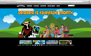
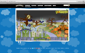
I chose to include three different screen shots because I couldn’t just pick one that represented the whole website. I love this website because it includes so many bright colors but it doesn’t come off as childish or too hectic. Another feature of this website that I like is the interactivity. Almost any image on the page can be clicked. However, these aren’t just simple links to other plain, boring pages. The site almost acts like an online video game. The second screen shot features the “Flavor Graveyard.” Everything on the page moves, from bats flying in the sky to fog floating up from the ground. The user is also able to scroll left and right through the graveyard and click on the tombstones which bring you to a separate page that offers information about the discontinued flavor.
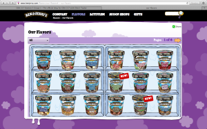
Similarly, the “Our Flavors” page features all of the flavors Ben & Jerry’s currently sells. Instead of just listing the names of these flavors, the flavors are displaying in a freezer in their actual packaging.

And finally, I really appreciate that they update their website regularly. The fact that the homepage says “October is Fairtrade Month” shows that they have updated the website within the last few days and this shows consumers that Ben & Jerry’s is constantly looking to impress, inform and help their consumers.

Flowers

This picture could be created using only the pen tool.  It would not be difficult, but it would definitely require a lot of patience.  First, the actual petals would have to be drawn.  Next, the dotted lines that radiate outwards would be drawn, and the setting changed from a solid line to a dotted line.  The grid view would be helpful, because all of the intricate curves are proportionately spaced out.  In terms of the colors, you would have to open the color palette and then use your mouse to drag the palette down and reveal the large-view spectrum.  From there, it would be easy to experiment with slightly varying shades of green, blue and yellow.

Adobe Illustrator

illustrator_artworks_showcase_57

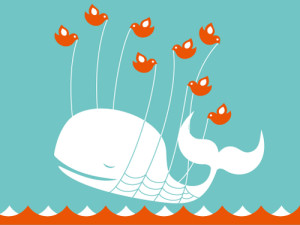
Here’s an image that was created in Adobe Illustrator. The whale could’ve been drawn with the pen tool or had been an original image that was recreated using the trace tool. The same applies to the birds. However, the artist only needed to create one bird and then   the bird could be copied and pasted and mirror flipped to create multiple identical birds. I imagine the waves were created that way as well. This image just involves heavy use of the  pen tool and active paint bucket. I think this is an awesome image, personally.


Week 5 Illustrator

This image looks like it used both the pen and circle tools to create this flower, with a lot of gradient coloring used to fill it in. the color swatch palette might have been used in the center of the flower. The leaves and flower petals look to have a yellow stroke around them to to separate the flower from the white space. The image can be completed in illustrator, But coloring looks lIke it can be done in Photoshop as well.
Illustrator Design

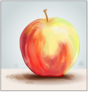
finalThe effect used to create this apple image is very interesting because it looks like a painting, however was just done on illustrator. To do this, you would trace the outline of the apple with the pen tool, then create a bristle brush with the brushes panel and choosing the round fan option. Adjusting the opacity of the brush tool gives variation in the strokes. By overlapping the brush strokes there will be different saturation of color, while changing the color of the stroke to create the multiple colored effect the apple shows. You can paint in white for highlights on the apple to show a 3D effect. I believe you would either delete the image of the apple before painting in the colored strokes, or decrease the opacity so you have a reference to go off of. This whole effect was done with only a few tools on illustrator and gives an image a whole new look. This look is very loose and light and is visually appealing because it resembles a painting.

Adobe Illustrator

5732312725_d11f72ca8a

This image was made in adobe illustrator by scanning or uploading a photo that the artist took. The original image is on the left while the manipulation of the image is on the right. The artist used the pen tool to create the outline of the girl as well as various shape tools to create the details. She may have even have used the pencil tool to create some of the small details such as hte dimples in the girl’s cheeks. I am also assuming that the artist used the paint bucket tool to color in the girl’s hair, shirt, skin, and background color. To create the pop art effect, a lot of different steps were taken. First the entire area, such as the skin, is highlighted in the color that the artist wanted the dots to be. Then the effects button is selected. Effects>Phantasm CS>Halftone. Once this is done a box will pop up with a variety of fine tuning options. The artist selected the shape to be a circle, but I do not know what other specificiations she used with this effect to create this image.


Illustration

cute-and-cuddly-vector-dinosaur

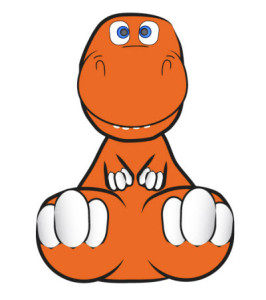
I chose this because it’s cute and is actually something that I think is very doable for anyone to make with the knowledge of Illustrator that we currently have. The dinosaur looks like it is 3D but there actually isn’t even any shading. It looks like this way the picture uses two point perspective. The things that are “closer” to us are bigger than the things “farther” back. For example, the dinosaur’s hands compared to the dinosaur’s feet. Most parts of the dinosaur could be made with the circle tool. For example, the eyes, the toes and the fingers. The main body parts could be made with the pen tool. Using the pen tool would allow you to get the weirder shapes. And as far the black outlines that really define the depth of the dinosaur, those could also be made with the pen tool or even the blob brush tool or pen tool if you were good at freehand drawing on the computer.

Experimental-Typography-Candy


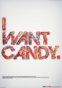
I really like this poster. The designer uses candy to show the words. The candy is very colorful and really attractive. It make me think that “I want candy”. The typeface of the words is very cute. I like the way the “W” and “C” looks.