
Category Archives: Resume
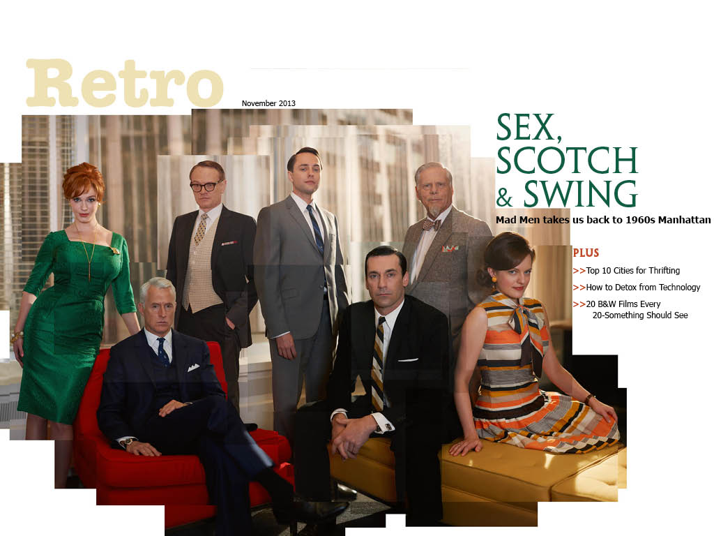
iPad design
Through working on this project I guess I just came to understand that space on an iPad (or any digital surface) is infinite. It’s not like a newspaper where space is the be-all-end-all dictator of content. You can make things as big as you need or even just as big as you want them to be. So when I was designing my pages I tried to keep that in mind and just make everything big and spread out. Places where I would’ve mushed things closer to save space on previous projects, I left spread out on this one. This is also the first project where I’ve dramatically increased the leading for body text. I thought the most important part of this was to have the pages look inviting and not at all overwhelming, I think I was able to do this by taking advantage of the endless amount of room that iPads offer.
Retro magazine
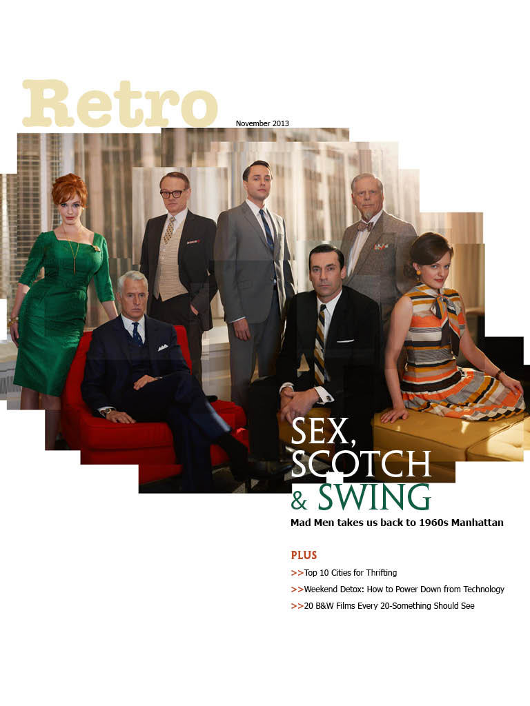


 I learned how to art direct according to a magazine feature, as well as how to incorporate different interactive elements.
iPad Magazine Cover
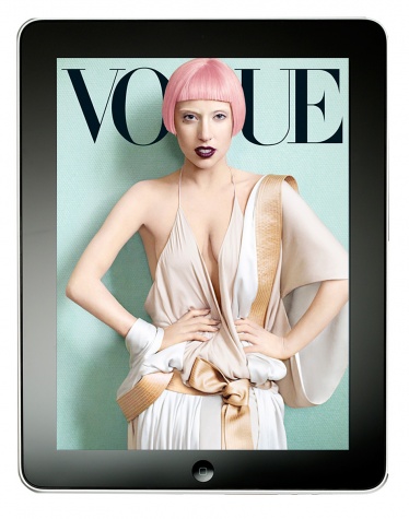
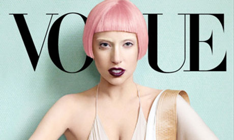
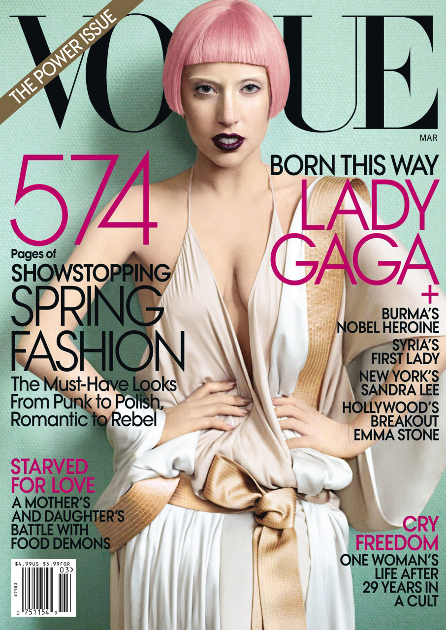
I chose an issue of Vogue with Lady Gaga on the cover for my iPad magazine design. As you can see, the iPad versions of the cover are significantly different than the print cover. The iPad covers are simple with no cover lines – only the magazine name and the image of Lady Gaga are displayed. I think the cover of the print edition looks way more crowded and less appealing due to all of the cover lines, plus the bar code and “The Power Issue” banner. The Lady Gaga image works well both horizontally and vertically. For the horizontal, the designer simply cropped Lady Gaga at her chest so the focus is solely on her head instead of her whole body. With the image cropped so closely, it looks balanced and clean in the middle of the horizontal iPad cover, and there is no need to fill extra white space. The image also works well because Lady Gaga’s head takes the place of the “G” in Vogue. Her shadow makes the cover look dimensional and interesting instead of flat.
Ipad Magazine Cover
The type on this magazine is very readable and modern. I love how they stayed with with black and white. It lends the cover to be very simple and allows will ferrel to really be the focal point of the cover. Also there is relatively very little content on the page. Furthermore, compared to regular magazine covers there isn’t that much type.

Paul Strand: The Mexican Portfolio
Paul Strand’s exhibit of a depressed and desperate world captured through a set of photographs taken during his two year stint in Mexico provided a very interesting viewing experience. There was not a single picture of a person smiling, and many pictures did not have any people at all. While this depressed and dark state is a trademark of Strands, it is significant that he shows the upset faces spanning across a number of different people. There was “Woman with Child” “Man with a hoe” and “Boy-Uruapan” among others of these very serious and upset looking people.
It is unclear as to whether Strand was trying to broadcast some greater point about these people because the pictures in the exhibit of landscapes were not sad or solemn by the same means. These pictures, while not quite beautiful, showed a open and thriving landscape that is uniquely Mexican.
All of the pictures are taken in the same faded brown duotone which also adds to the viewing effect. With this combination of colors it almost seems like there are no colors at all. They do not register because it is so earthy and plain.
Overall, the Strand exhibit does not spark a sense of enjoyment or even pleasure, but it does interest the viewer. The stern faces and the empty but culturally significant landscapes along with the shots of street murals or statues give the viewer a vivid picture of the world Strand lived in for two years. I believe that this is the intention. It is not create a sense of pity for these sad faces, it is to show that this is the life they live and this is what they do.
Bon Appétit Ipad Cover
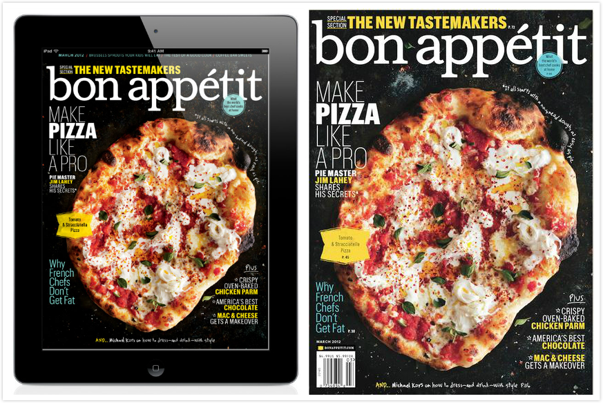
Generally, Bon Appétit’s print cover and ipad cover are almost the same. The only difference is that the ipad cover takes away the barcode, date information and price at the bottom of the magazine. That mainly because the it would makes the ipad cover more clearly. Otherwise, for the ipad edition, people don’t need to know the price information for they have already purchased it.
Print Making Revolution–Extra Credit
In the SU Art Gallery’s current exhibition, “Print Making Revolution,” Mexican art throughout the early 20th century is described as a form of rebellion against the corrupt central government. Print makers intertwine their art with political and social commentary.
The earliest black and white lithograph prints in the collection are small in scale, using negative space to portray ominous illustrations or iconography of skeletons. The prints later progressed into more intricate and more developed scenes. For example, Leopoldo Méndez’s “Tengo Sed” (I Am Thirsty) shows a narrative of a man in a drought, the sky directing the eye toward his face and torso.
Poster prints were later employed by the Mexican government to sway public opinion. The color red was frequently inherent in the propaganda, portraying strength, power, and war–which works well with the government’s intended message.
However, most of the Mexican prints throughout the 20th century remain black and gray, expressing sadness. “Print Making Revolution” displays the sentiments and hardship as many struggled to find work and education. Across many artists’ prints, grief seems to be a consistent sentiment for life in Mexico.

This cover for Billboard magazine features U2 front man Bono mid concert in a cool action shot. Both designs use the photo for several reasons, first Bono’s head fits perfectly into the “o” of Billboard and his arms not only lead our eyes to the title of the magazine but they frame it as well. The only major difference between the two layouts is the horizontal layout crops Bono’s legs out of the picture. This is ok as all of the action, emotion and intensity of the image comes from his top half. Also the typeface of the deck head on the horizontal version is slightly smaller than its vertical counterpart but is still big enough to draw attention and generate interest.
iPad Magazine Cover
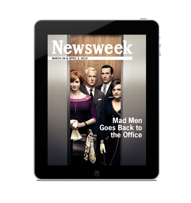
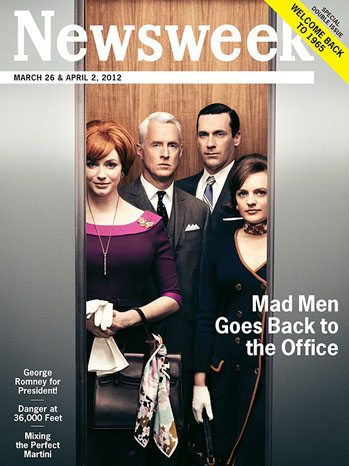
I chose this Newsweek cover because between the print and iPad version, there is very little change, but what does change is interesting. The text in the lower left is removed for the iPad and it makes a huge difference in the cover. For print, you have to show what is offered and intrigue people to buy the issue, but this isn’t true for the iPad version. Being able to remove that extra text keeps the cover clean and focused on the main story. The other change that is clearly apparent is that the print cover advertises that it’s a double issue in the upper right corner. Putting this banner in the upper right is a spot visible at a newsstand. It is important to advertise this in the print version to gain sales, but not necessary for the iPad version. Removing the sales points makes the iPad version more genuine and less like Newsweek is just selling you something.