Category Archives: Resume
Webdesign Photo
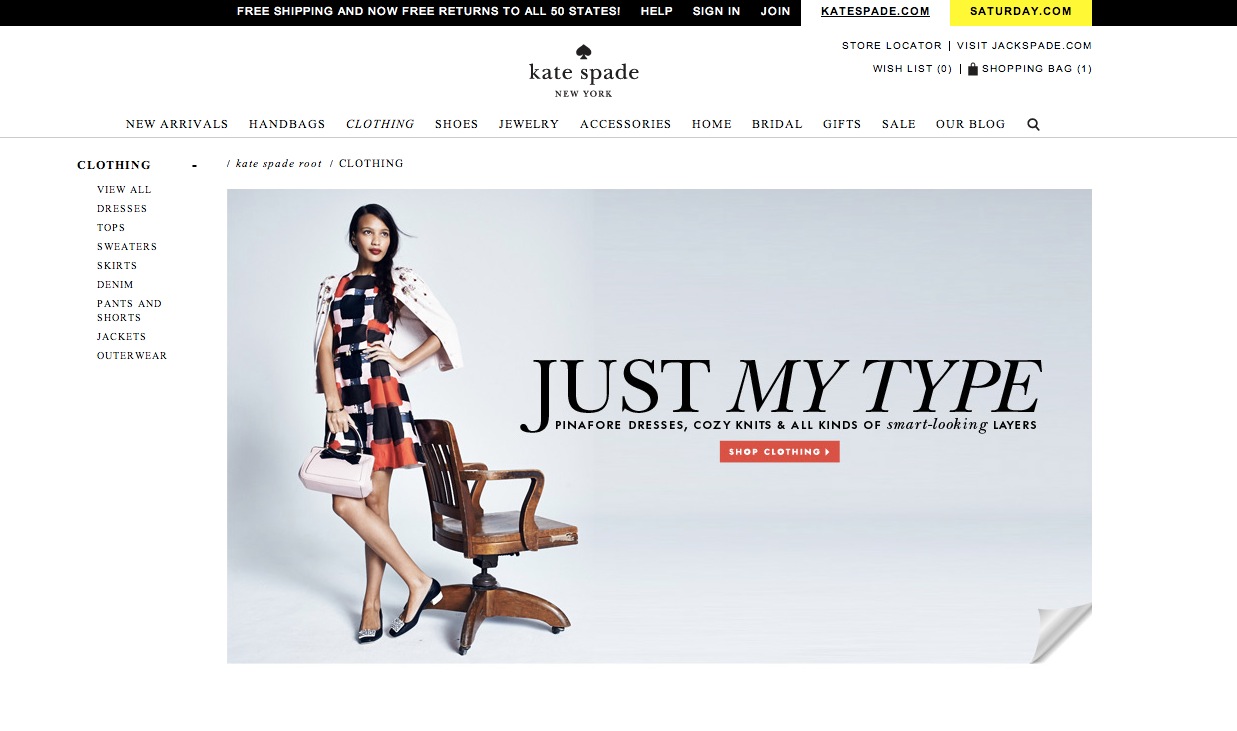
I like this photo in Kate Spade website. The background of this website is very clean. I think the color of the photo matches the whole website.
This photo is shown in the clothing section. The photo is very simple, but the clothes which the model wears is really standout because the model wears a very colorful clothes. The model’s arm and the chair all pointing to “Just My Type”. This is a very good way to lead our visual. The words “shop clothing” using red background really come into viewer’s eyes. In addition, because the whole page is very simple, when I first look at this page I will only noticed by the clothes and the call to the action. There is another thing I really like about the photo is that the right corner at the bottom. Views could click the right corner to explore about more different clothing. It just like open a new page.
Website Photography
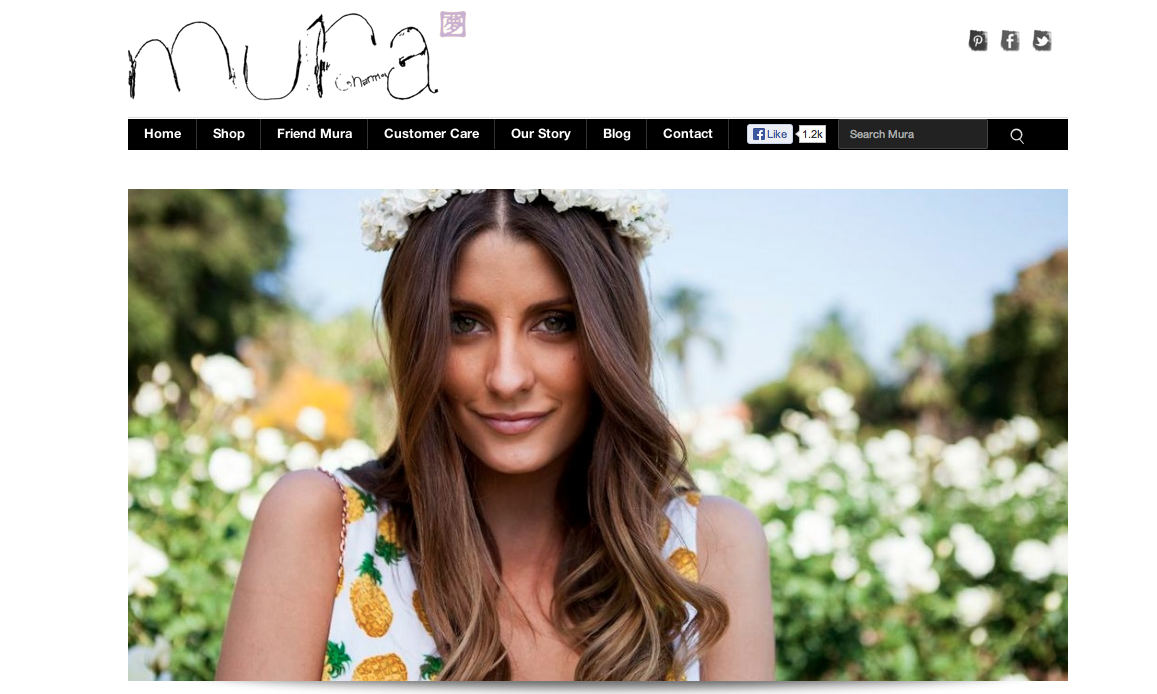
I chose the website for Mura Boutique for this weeks post. The photo here is used to show a model wearing the clothes the website is trying to sell. The photo is lovely and its goal is to make the consumer want to feel that way wearing their clothes. The target audience is girls in their mid teens to early 20’s. The designer probably chose this image because of the setting that it portrays. I think it’s awesome for the homepage of the website.
Resume 1B
Photography
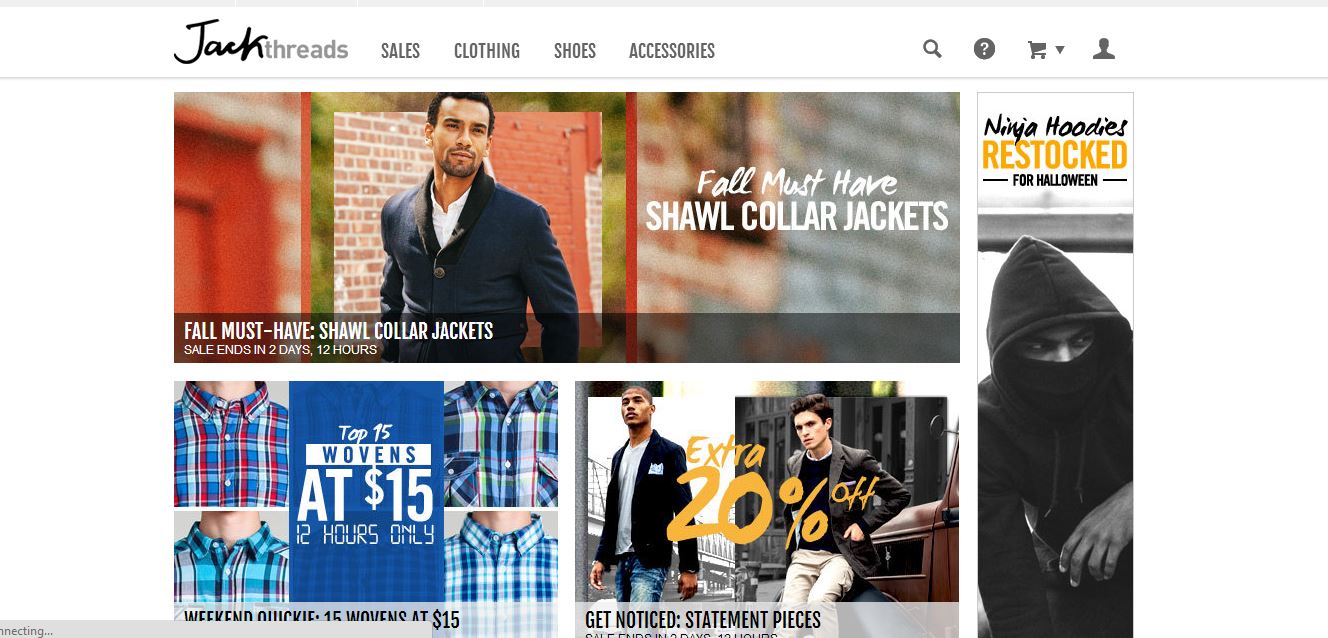
The website Jack Threads has a strong presence with their clothes because of their ability to display them in action. Its unique text illustrates sales that instantly grabs the viewer’s attention and entices them to click and see more. Furthermore, their use of different lenses such as black and white or a faded background gives different categories various feelings such as rustic or classy. Overall, their use of multiple images provides viewer’s a specific insight into not only how their clothes look, but how they look in different situations.
Resume 1B
Updated Resume
Resume 1b
Resume

Website Photography
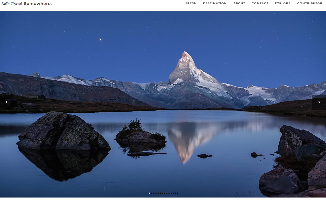
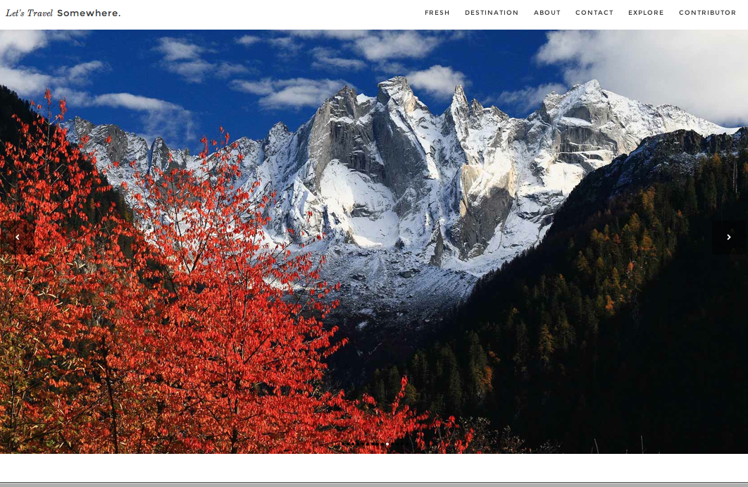
When I found this website I fell in love with its design and use of photos. Let’s Travel Somewhere is a site that features different photographers photos and articles of the places they’ve traveled. This allows the audience to see and “experience” as many places as possible. The idea is that “a single traveler can’t live to see it all” so people can show different parts of the world on this forum. Each page is dominated by photographs. The site setup itself is very simple. All the font is in black and so the main attraction is the beautiful photographs that have very vivid color. The photographs on the home page show a variety of destinations, subjects, and colors. By showing such a wide range of photographs it makes the homepage very interesting and visually appealing. It also guides the audience to click on a photo to see more photos from a particular destination and photographer.