This illustration looks to have been pretty straightforward but at the same time pretty difficult. Since it is black and white, there was no use for color or any sort of gradients. However, using the line tool to create most of the shapes along with the shape tool for the tuning keys and knobs. The creator must have uses the pen tool to create some of the bends in the guitar and help make those tight curves in the body of the guitar. The shape tool was also used to create the pickups on the middle of the guitar along with the little fret markers on the neck of the guitar.
Monthly Archives: September 2013
Illustrator Tool
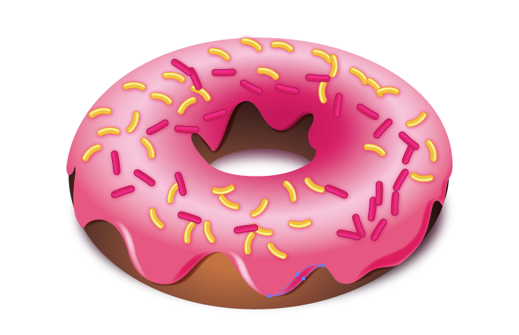
This is a very easy picture to create in Adobe Illustrator CC. The Ellipse tool under the rectangle tool can be used to create the basic shape of the donut. The gradient tool can create the gradient brown color we see on the donut. Besides, the pen tool can help create the irregular shape of the cream on the donut. Then, again, the gradient tool will fill the gradient pink color on the donut. Pencil tool can be used to draw the sprinkles on the donut. Then, it’s easy to fill in colors, create shadows, copy and paste all these sprinkles and put then in the place the designer would like to be.
Adobe Illustrator
This image was made in adobe illustrator by scanning or uploading a photo that the artist took. The original image is on the left while the manipulation of the image is on the right. The artist used the pen tool to create the outline of the girl as well as various shape tools to create the details. She may have even have used the pencil tool to create some of the small details such as hte dimples in the girl’s cheeks. I am also assuming that the artist used the paint bucket tool to color in the girl’s hair, shirt, skin, and background color. To create the pop art effect, a lot of different steps were taken. First the entire area, such as the skin, is highlighted in the color that the artist wanted the dots to be. Then the effects button is selected. Effects>Phantasm CS>Halftone. Once this is done a box will pop up with a variety of fine tuning options. The artist selected the shape to be a circle, but I do not know what other specificiations she used with this effect to create this image.
typewriter illustration
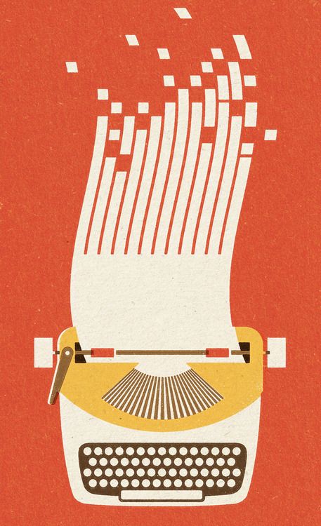
For this illustration, it appears that the illustrator may have scanned in some type of textured paper or used a textured paint fill. For the white keys, the illustrator used the shape tool to create perfect circles (the same technique was probably used for the other basic shapes to create the typewriter). For the splitting paper at the top which morphs into data bits, the artist must have used the curved pen tool. For the slanted squares, the illustrator could’ve transformed the squares by pulling on the corners. I like that it is very minimalist and uses simple geometric shapes to create the illustration.
adobe illustrator
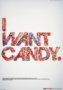
This was created in illustrator quite simply. The designer made a number of different sized circles using the shape tool and then chose a number of different colors. They used the fill tool to change the color of the shapes. Then they changed the opacity of each circle so that some appear more transparent than others. The text colors are the same as some of the dots, so everything works together.
Illustration
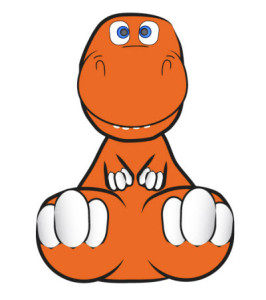
I chose this because it’s cute and is actually something that I think is very doable for anyone to make with the knowledge of Illustrator that we currently have. The dinosaur looks like it is 3D but there actually isn’t even any shading. It looks like this way the picture uses two point perspective. The things that are “closer” to us are bigger than the things “farther” back. For example, the dinosaur’s hands compared to the dinosaur’s feet. Most parts of the dinosaur could be made with the circle tool. For example, the eyes, the toes and the fingers. The main body parts could be made with the pen tool. Using the pen tool would allow you to get the weirder shapes. And as far the black outlines that really define the depth of the dinosaur, those could also be made with the pen tool or even the blob brush tool or pen tool if you were good at freehand drawing on the computer.
Blogging: Adobe Illustrator Techniques
This week you need to select a piece of illustration likely made in Adobe Illustrator and comment on what sorts of Adobe Illustrator tools and techniques the designer may have used to create the artwork. If you are to produce a similar illustration, what are the major steps? The illustration piece can be from a poster, a magazine, a website, or even an Illustrator tutorial (like this one explaining how to use the Live Paint Bucket). Feel free to add Illustrator screenshots if needed.
The deadline is Friday September 27 11:59 PM.
The deadline for comments is Sunday at 11:59 PM.
Also, check this out:
Illustrator Mastery: 25 Techniques Every Designer Must Know
Resume
Red Hot Chili Peppers
I loved this piece of typographic art because I feel that it very accurately portrays the entire attitude of the Red Hot Chili Peppers. The Chili Peppers are my favorite band, and I’ve listened to literally all of their songs over the years. The artist’s typeface is firm and confident, and the band has always been known for their incredible energy and stage presence. Additionally, the words are chaotic and mashed together, which represents the awesome, crazy attitude of all the band members. The picture is of the bass player, Flea, who is by far the wildest out of all the members. Lastly, the words spelled out are all song lyrics and names.