Monthly Archives: October 2013
Gestalt Design
 I chose this website to represent gestalt design because of its simplicity. While there are no pictures or colors to represent similarity, the idea of size and font brings the website together as a whole. The main font creates similarity by size, but also by shape. While “Life” and “Sam” are directly related by font size, the “according to” also can be grouped along with them due to shape of the font. All of the symbols at the bottom also relate well to the rest of the webite not only because they are the same color, but becuase they are geometrically placed in the middle of the page like the rest of the font. The symbols work together as a group themselves but also relate to the rest of the webpage.
Gestalt: Walt Disney World
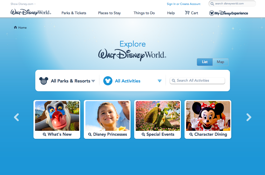
Figure and Ground: The Disney World website establishes differences between the blue background and the links for Disney Princesses, special events, etc. It makes the links stand out by giving them a vivid picture surrounded by a white background that makes it pop. The links at the top also stand out against the white background.
Proximity and alignment: The same font and color is used throughout the entire website. It is mainly a white background with blue accents to stick to Disney’s main colors usually displayed in their logo. The font also comes in many different forms. As seen on this page, it has a bold type and a light or regular type.
Continuation: The headers on the top of the page consist of drop down menus with many different options. The links in the middle of the page also suggest a drop down menu as they have a downward arrow positioned next to them.
Visual Hierarchy: On this page, the designer uses the images to create visual hierarchy and distinguish which links are more important than others. They also include the white boarders around the “All Parks & Resorts” link against the blue background to reiterate which links are more important on the page.
Gestalt Blog Post
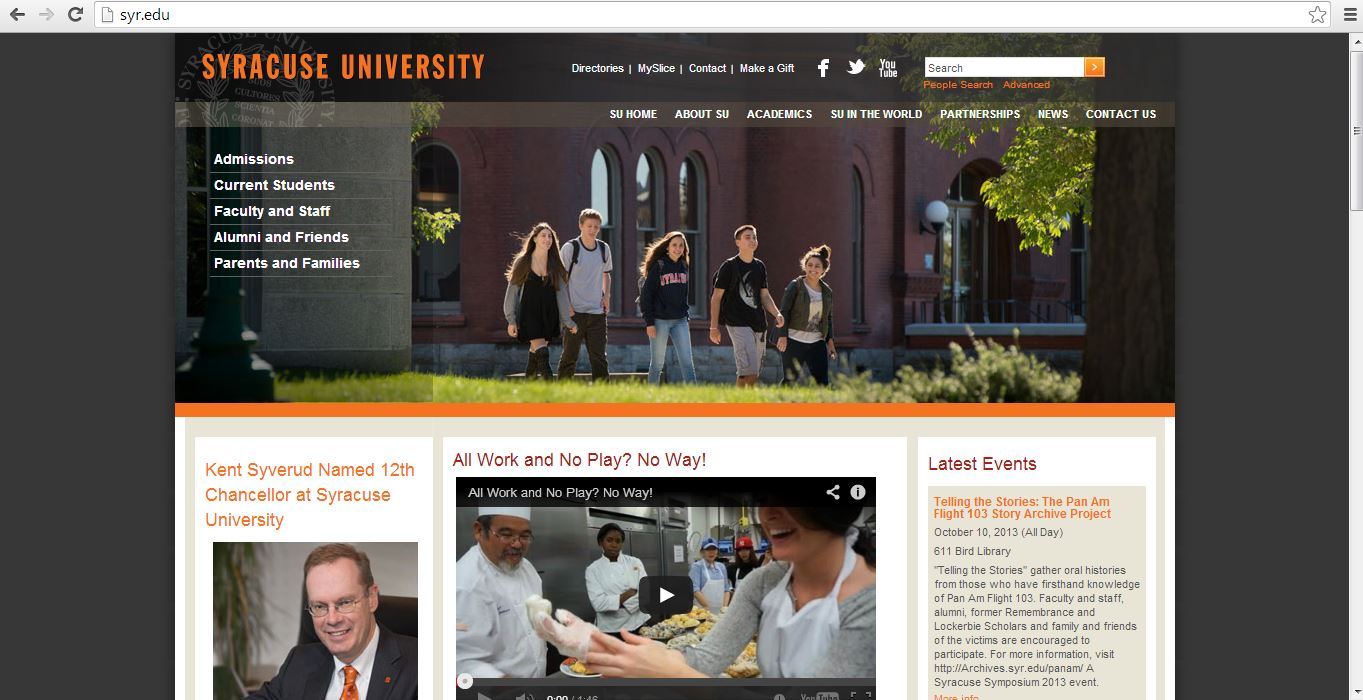
Our own Syracuse University website is a great example of the gestalt principle. First, every important header on the website is the color orange, the school’s main color. Second, all of the headers match in font type and the subtext under each header is consistent throughout the entire page. Third, the constantly change picture at the top of the page takes up a large space in order to attract the attention of the viewer. Lastly, the video link is placed in the center for interactive use with the viewer for the purpose of truly giving him or her a full perspective on Syracuse University.
Gestalt
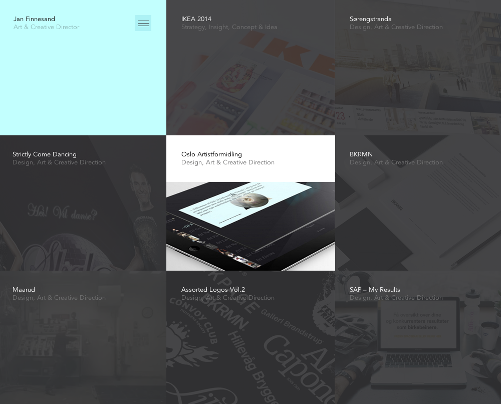
The website I chose is: http://janfinnesand.com/project/oslo-artistformidling. This website caught my eye because of the clean design without having a lot of white space.
Figure and Background: The background on the home page shown above is technically non-existent. Instead, all of the menu items make up the background. When you roll over one of the boxes with your mouse to select it, it turns to full color, like the middle box in the image above. When the one box is highlighted, then it is very clear that this object is standing out and the rest of the boxes that are in grayscale become the background.
Proximity and Alignment/Continuation: The alignment used in this website is very precise. All of the boxes are aligned in a grid on the page to help the user navigate the website. When one of the items are clicked on, the new page shows this menu bar:
The design of the menu bar helps create unity within the site. Also, when you roll over the above home menu bar, another one scrolls down:
The repetition of the strong alignment and color scheme help make the website distinct.
Visual Hierarchy: In this website, the colors drive the visual hierarchy. Because all of the boxes are the same size, the website relies on the colors changing when a user rolls over the item to guide the user around the page.
poster project 2
Poster Project

Gestalt Principle: KitKat 4.4
http://www.kitkat.com/#/home
The website I chose to use was the website for the new KitKat 4.4. The website is designed almost more like an info-graph because instead of navigating you scroll down the page to get the information about the new product. It’s a very creative website because it compares the new candy to technology, for example its “mobility” is represented with the sticks acting as descending bars that resemble cell phone service.
To apply the Gestalt Principle to this website we can look it its figure and ground. For example on the below “page” of the website the red words and piece of chocolate, as well as the navigation scroll bar all stand out against the white background.

As you can see in the below picture stitch of the website, the website is uniform with a common font and color scheme throughout. The proximity and alignment is on point.
The websites entire design is based on continuation considering it is one page and flows down to show all the specs of the new candy.
The visual hierarchy can be represented by the following page. The header of this “page” is written in a larger font and in red to signify that it’s important. There is then color variation when the information about the header is written in black.

National Geographic Website
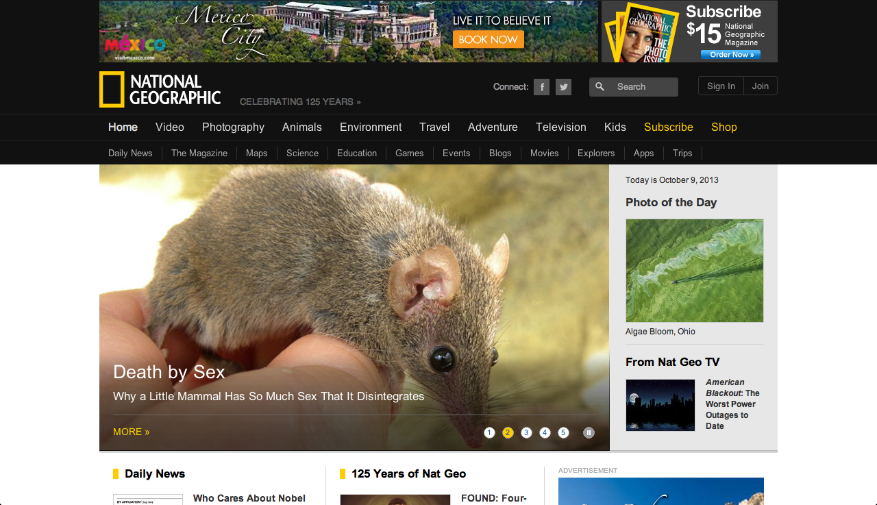
Figure and ground: Nationally Geographic is typically known for its black and yellow colors. However, on the website, black is only present in the navigation bar. The background for the rest of the website it white and the yellow accents don’t stand out very well against it.
Proximity and alignment: The font is a very simple sans serif that looks a lot like Arial. While it is used consistently throughout the website, I don’t think it really engages the viewer. I’d expect a website like National Geographic that is known for its stunning visuals, to choose a more interesting font.
Visual hierarchy: Titles and headlines are bigger than the sub-heads/captions for the things which they are explaining. These main headlines are also highlighted with yellow which does show importance in this case because the other information features no color at all. And for almost every piece of information there is a picture to accompany it. The picture is generally very big and is proportional to the size of the headline. The picture helps to draw readers attention and then their eye will follow below and read the information that goes with the picture.