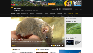
Figure and ground: Nationally Geographic is typically known for its black and yellow colors. However, on the website, black is only present in the navigation bar. The background for the rest of the website it white and the yellow accents don’t stand out very well against it.
Proximity and alignment: The font is a very simple sans serif that looks a lot like Arial. While it is used consistently throughout the website, I don’t think it really engages the viewer. I’d expect a website like National Geographic that is known for its stunning visuals, to choose a more interesting font.
Visual hierarchy: Titles and headlines are bigger than the sub-heads/captions for the things which they are explaining. These main headlines are also highlighted with yellow which does show importance in this case because the other information features no color at all. And for almost every piece of information there is a picture to accompany it. The picture is generally very big and is proportional to the size of the headline. The picture helps to draw readers attention and then their eye will follow below and read the information that goes with the picture.

