Nike Website

Screen shot 2013-10-06 at 9.23.11 PM

The Nike Website is very eye grabbing with its rotating screens to preview its products on the site. The Layout is very clean and the tabs are clearly written out without having to search for them. The absence of space and use of vibrant colors helps to make the products stand out even more to the point where you want to click on it to get more information about it. I think Nike did a very good job with the overall layout of this website and its attention to detail.

Website design

Screen Shot 2013-10-04 at 8.51.12 PMScreen Shot 2013-10-04 at 8.51.29 PM

I have always been in awe of Zara’s website. It is so simple and modern. The minimalism in it makes it very easy to navigate through the website and it also intrigues me to keep looking the website. The website does an excellent job of showing Zara’s culture, and the style that the company is trying to portray. However, my one complaint is that the side bar get s a little lost.

Website

Screen shot 2013-10-04 at 7.50.13 PM Screen shot 2013-10-04 at 7.50.25 PMScreen shot 2013-10-04 at 7.50.56 PMScreen shot 2013-10-04 at 7.51.34 PMScreen shot 2013-10-04 at 7.52.26 PMScreen shot 2013-10-04 at 7.52.52 PMScreen shot 2013-10-04 at 7.53.37 PM


I really love the whole look of this website. Since the company Swell and Ginger is a boutique that sells women’s clothing and accessories, the website appeals to women. The light colors and simple typeface make the website appear very clean and pretty. The use of white space also adds to the page feeling very clean.  I also really like that each page has lots of pictures and that they are all taken in the same light and edited the same way. The design of the website is very consistent and it is a great marketing tool for the company’s logo to appear on every page. I think the fact that the social media is all the way to the right and in a smaller font size separates the information very well.

Web Design Post

Capture

This website uses color scheme and font to appeal to its specific audience of customers.  Lacrosse players commonly wear funky shorts with loud colors in absurd combinations.  In the same way, this website uses sharp designs and vivid clashing colors to look cool to the lax bros.  The menu at the top offers drop options in the same format.  While the color on these is not as loud and prominent as the menu on this main page the font is strong and all caps.  It is the same aggressive and fun format.

Blog Post: Website

gra 217 blog


I truly enjoy this website for several reasons.  The rotating images from all their different product lines initially grabs the viewer’s attention.  Second, it uses images all throughout the entire page instead of words to depict their products in use.  It’s black background contrasts well with the red colors.  Overall, this is a well designed website that allows viewer’s to scroll through very easily.

Website Design

Screen Shot 2013-10-04 at 5.13.22 PM

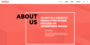
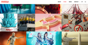
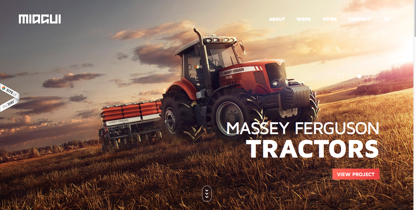
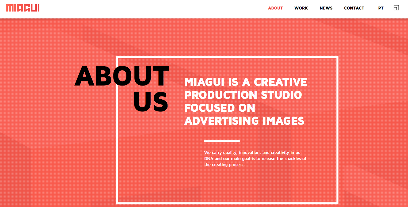
The website I chose was for Miagui Imagevertising, which creates images for advertising. The first thing that drew me to the homepage was its ease and simplicity. The picture of the tractor takes up the entire screen, and the unique perspective and warm, vibrant colors draw you in. Since Miagui specializes in creating images, it is very fitting that the home page of its website relies entirely on images. The white sans-serif text looks clean, fresh and natural across the photo. The only problem I see with it is that some words in the navigation bar (like “contact”) are hard to read against the background. The title of the website, Miagui, stands out in the upper left-hand corner. However, the eye is initially drawn to the featured item, Massey Ferguson Tractors, and the viewer of the site can easily click on the red button to learn more about the project. This feature, combined with the navigation bar, demonstrates the ease of navigation. The menu bar is clean and simple. When you visit a different page, the title in the menu bar switches from white to red. When you scroll down on the homepage, more information about the company appears. This information also relies heavily on images, and includes links to different sections of the website. I also like how the red Miagui color is consistent throughout the website, as shown in the “About” page below. My favorite page on the website is the “work” page (shown below), which is basically a showcase of images created by Miagui. People can scroll down the page to load more images. The design of this page is creative, functional and appealing.

Screen Shot 2013-10-04 at 5.13.39 PM

Screen Shot 2013-10-04 at 5.38.13 PM


Web Design

gra screencap

https://www.fruute.com/

I think the deisgner of this website did a great job of utilizing white space in order to make the viewer pay attention to the main content in the center of the page. They utilized great images of their deserts to be sure to show great details in the foods. Because of the use of the white background, the designer was able to use pops of pastel colors without being overwhelming or annoying (as most pastels can be, in my opinion). I feel that the use of simple fonts allows our attention to once again be able to drift to the photos of the deserts and makes us more inclined to click on them.

Blog Post: Website

LV WEBPAGE


What I found interesting about Louis Vuitton’s webpage design was how convenient it was to the viewer’s eye. The designer uses white space to separate the different articles and objects on the page. In addition, they used a bold san-serif typeface to present an elegant impression of the website, alongside contrasting colors to catch the viewers attention and make it easier to read. I also liked how the rest of the page would fade out and the grey header would get more bold if you moused over a link at the top. Overall, the design works really well.

Website design

Screen Shot 2013-10-06 at 3.46.58 PMScreen Shot 2013-10-06 at 6.36.50 PMThis website design for The Bullitt Agency is really intriguing. First off the home page is visually appealing with plain but contrasting colors. The background is photographs of different cities, representing their global presence. On all the pages, when you hover your mouse over a box it changes appearance giving more information or presenting a different image. Also, the page with the artists and events shows a picture instead of just text, which gives a visual, something that viewers like to see to make a connection. The colors throughout the site are very simple, but it relates to the agency for DJs and Producers, a technologically based company, which the colors mirror. They also have a tab to their blog which is very helpful to viewers. Also, as you move your mouse over the page the page interactively moves with you, which is interesting because it shows that there’s more on the page than the eye can see.

B-Reel

Screen Shot 2013-10-04 at 12.06.19 PM


I chose B-Reel, a production company that has offices all over the world and who recently won an AWWWard in design. Since B-Reel produces films, commercials, etc., it makes sense that they would design their website to be extremely image-heavy. They separated their content into pages that are easy to navigate: Digital, Commercials, Feature Films, Products, and Branded Content. Their site is rich with large images, the largest at the top as features, creating visual hierarchy. It’s also a very clean design, making them look credible and professional.