I like the way Car and Driver has had their layout for years because it tells you whats going to be featured in the main articles of the magazine before you read it. The bold headline of the magazine helps to draw in the reader for car enthusiasts with big company names and popular car brands. Every cover the magazine features vibrant cars dueling it out or in an action shot to further attract the reader.
Favorite Magazine Layout
For my preferred magazine, I chose Complex Magazine’s 2009 Kanye West cover. Personally I am a huge fan of Kanye West not just as a musician, but as an individual and an icon of my generation. But what I felt Complex did that really helped attract the viewers eye was their use of visual hierarchy. They made KANYE WEST the biggest text after “COMPLEX” to help attract the attention of Kanye fans to the magazine, and used the term “MOST INFLUENTIAL BRAND” to further intrigue the reader. In addition, they did a good job of putting white text in front of Kanye’s polarized face, which is something difficult to do because they are both lightly toned.
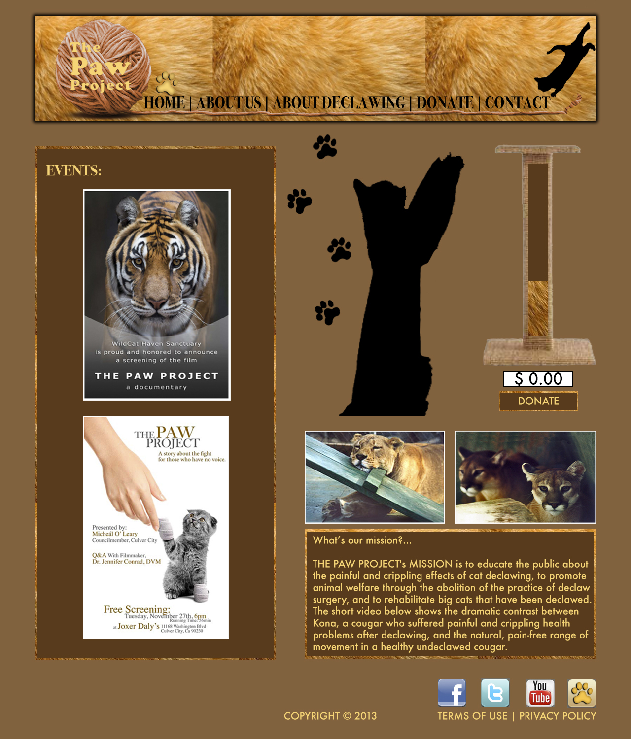
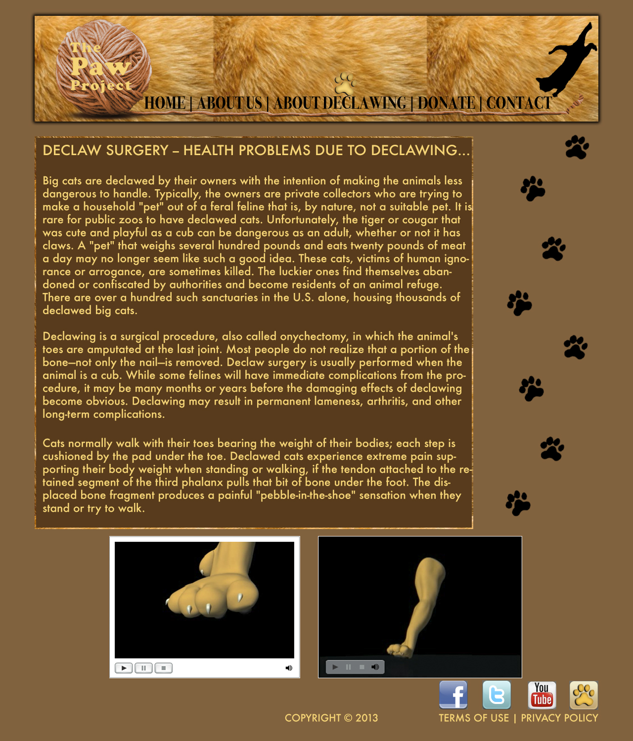
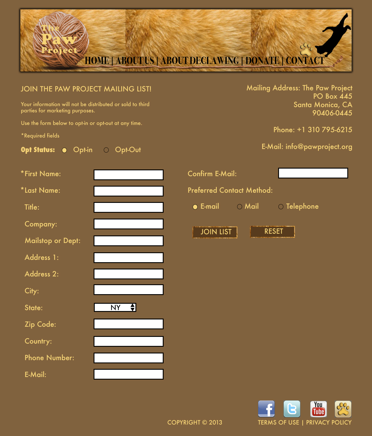
Web Design Pages
Magazine Spread
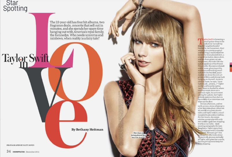
I think this magazine spread is very creative and eye-appealing. Although the feature runs on two pages, the elements work together to create a sense of unity. For example, Taylor Swift runs through the gutter of the spread, connecting both pages together. The image of Taylor also separates the elements in the page. The headline and deck are on her left, while the actual story is on her right. This method ensures that the two elements don’t mix together. The headline design itself is very creative as well. It takes up lots of space and commands reader attention, though doesn’t overpower the photo. The color scheme of the word “love” ties in with Taylor’s dress nicely, and the stacked and overlapped letters create a graphic, artsy feel. The silhouetted photo of Taylor keeps the page simply with its size and lack of background, and her draped hand leads the eye to the headline. Finally, the small elements of the page (like the author’s name placed within the “e” and the red dropcap at the start of the article) make the page look complete against the white background.
Web Interface Project
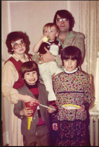
NYT Magazine: “Stephen King’s Family Business
Over the summer the New York Times Magazine published a feature story of The legendary family of authors headed by Stephen King. The spread was very simple but the color scheme was dark and the pictures old and eerie in a similar fashion to his writing style. The article gave timeline info on King’s career and the progression of his family. The pictures are intriguing because they show a very interesting family. They are the main guiding points of the article and most of it is consumed by the text.
Magazine Spread Design
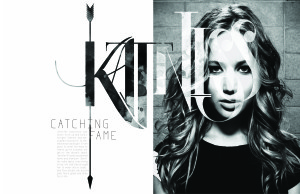
I really love this two page spread, and not just because I love the Hunger Games. Although this design shows no color, it is far from plain and simple. The typeface used for “Katniss” is extremely creative. The designer also incorporated a different picture within the typeface to contrast from the picture of Jennifer Lawrence. The texture seems to be either dirt or blood stained, sticking to the theme of the movie. The arrow going through the K also fits perfectly with the theme of the written piece (which is about Jennifer’s role in the movie) because it is one of the main sources of survival for Katniss. The designer further perfected this design by making the arrow go through the K in Katniss, the I in Catching and the F in Fame. Not to mention that Jennifer Lawrence looks absolutely beautiful.
Web Interface
Magazine Spread Design
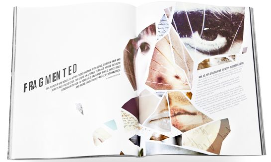
- Principle 2 (Continuation): The hed and dek leads the eye upward toward the visual, then to the text.
- Principle 3 (Closure): I think this spread most heavily uses the Gestalt principle of closure. Although the visual is a collage of random face parts of different people, our eyes are able to close the gaps between the pieces and understand that it’s a complete face. The text container also fills the face, even though it’s completely different from the rest of the objects.
- Principle 5 (Figure/Ground Relationship): Our eyes move through the page in a left to right motion.

