Monthly Archives: October 2013
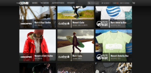
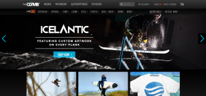
The Clymb is a discount outdoor clothing/gear website. Their business is all web based so it is very important they have an easy and accessible website design.
- figure and ground: The Clymb uses a dark background which allows the viewer to see the products clearly.
- proximity and alignment: The site uses two types of fonts, and the dark and light grey as well as the light blue colors throughout the website which creates unity.
- continuation: The site is very linear and organized. They decided to create square blocks to place the information and products they are selling in.
- visual hierarchy: Their layout is simple which is necessary for the site to place emphasis on the products they are selling. Most everything is uniform in size and color because each thing they are selling is equally important. The Clymb logo is large at the top of the page and the categories begin to decrease in size as you go to another sub category.
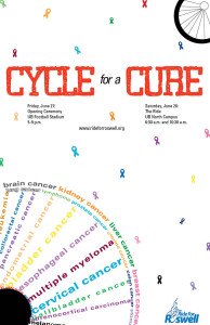
Salvation Army National Command Poster
Richheimer Poster
Gestalt Principle — The New Yorker
The New Yorker website is definitely among those well-designed news websites. The Gestalt Principle is applied throughout the site.
- proximity and alignment: achieved through dividing content into two/three columns and align them neatly.
- similarity: through placing images in square shapes of the same size within each section; same typeface among each section; unified format in each “story box”, following the rule of headline-author-brief summary-section name.
- visual hierarchy: achieved through smaller intro texts following bigger headlines; also achieved through use of difference sizes of images.
Poster project
David’s Refuge Gestalt Principles
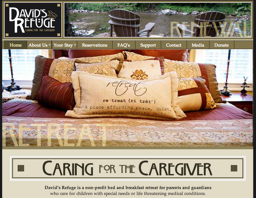 This designer of this website had gestalt principles in mind as he or she was designing. For one, there is figure and ground because the image of the bed stands out against the tan and dark green backgrounds surrounding it. In addition, there is proximity and alignment because the designer used the same typeface in the David’s Refuge logo and in the “Caring for the caregiver” tagline. Furthermore, there is continuation because the faded words “Retreat” and “Renewal” are placed on lines, which indicates continuation and connectedness. Lastly, there is visual hierarchy because the image of the relaxing bed is the first and most important thing that my eyes look at.
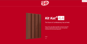
Kit-Kat Gestalt
My love for Kit Kat aside, this website applies many gestalt principles. The Kit Kat bars stand out clearly from the background due to the color difference and three dimensionality aspect. The colors are very consistent on the page. They stick to the classic red and white colors that are associated with the Kit Kat brand. The font is aligned well and gives the look of an organized page. Lastly, the hierarchy is very apparent and visually appealing. The words at the top are the biggest, most bold, and italicized. The following line is much smaller and the following block of text is the smallest. Overall, this page is very appealing and applies the gestalt principles very well.
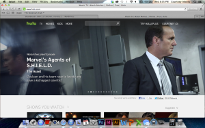
Hulu. Who Knew?
Thinking about the gestalt principles, and because I just had a viewing party of SHIELD in my room 3 hours ago, I decided to use Hulu as my website. Who knew Hulu would have used these principles? Anyway; seeing as these are all video clips, the images themselves stand out against the grey background that Hulu uses on its website. Through all of the clips of what is new that aired this week, the same font is used for the title of the show, the name of the episode, and the description beneath it. The headers of each section, such as “Shows You Watch,” are all the same font, and are all capitalized, creating uniformity. Finally, visual hierarchy is very much used, as the episodes just coming out the day after they air on television take up the entire top half of the website, being the first things that you look at, such as Agent Coulson’s face (#CoulsonLives).
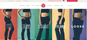
Lululemon Webpage- Gestalt Principles
I think the Lululemon website is very successful with effectively incorporating the gestalt principles of design. First off, their logo shows an exaggerated letter “a”, which when clearly looked at and deciphered displays the continuation element. A viewers eye is drawn from the bottom corner curve, up to the top arch and back down, to the point where our brain can close the “a”. Also the figure ground principle is clear too; the red background allows the white symbol to pop out of the ground.
The website follow similar principles. We see proximity and alignment with the typography on the webpage because all of the drop down lists and bar at the top, are written in the same text and size and located close to each other. Also, the models are close to each other, leaving no white space, helping to draw the eyes up to the top of the webpage. However, the type on the pant styles are all unique, which I think help the different kinds stand out amongst each other. The models also contribute to visual hierarchy, leading the viewers eye up to the top of the webpage where the drop down lists are. The color of the background on the site is also white, allowing not only the logo to pop, but also the colors in each style pant to come off the page and be apparent.
I love this site…and their clothes.

