Headlines and Decks

Sandra Bullock Feature Story


This feature story uses the phrase “on top of the world” as a metaphor for Sandra Bullocks latest notable accomplishment. This use of clever wording in the headline  allows the reader to understand what the story is going to be about and lures them with the knowledge that Bullocks new movie “Gravity” is a huge hit.

In the case that a reader perusing through the pages of Vogue is not aware of Bullocks latest theatrical film, the deck goes on to explain what the story is specifically, filling in the gaps of an unanswered questions.

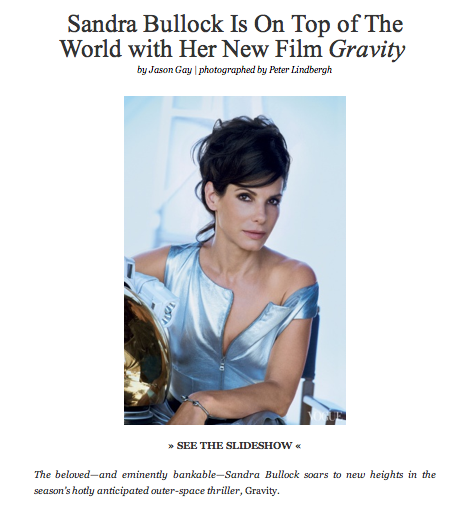
Both the headline and the deck do a really great job of tying Bullocks feature film “gravity” with the story with clever wording including “on top of the world”, “new heights” and “outer-space thriller”. The combination of this language with the picture below work to create a very enticing and effective headline. This is furthermore reinforced with the fact that Bullock is wearing what appears to be some sort of high fashion space suite with her arm resting on a gold space helmet. The sum of the individual parts of this feature story are hugely impacting and work to draw the reader in for more.

Time of Steve Jobs

time-jobs-cover jobs_time

On the left side, it is an iPad cover of Time magazine with Steve Jobs. Steve Jobs’s eyes are look at us, strongly dragging our attentions. “Time” is on the top, covering half of Jobs’s forehead. The visual–his bright face works well with the black background.The feature story’s cover line is at the left bottom, white and bold. Two lines of deck are lower with smaller fonts. This design works well because of strong visual hierarchy.

Compared to the iPad cover, the print cover is a little bit different. It includes four other cover lines on the top, and a barcode. I like the iPad cover more because it looks more succinct


Forge Magazine Ipad Cover

Forge_iPad_Mag1This cover differentiates itself from other Ipad covers by minimalizing text. Instead of having cover lines, there are photos that I presume can be tapped on to reach the story. Also, the cover makes use of only two primary colors. The combination of black and yellow allows for a sense of illumination, especially when used in text. The photo on the cover has a good amount of perspective, driven by the train cars that get smaller as one looks further back. Often times covers forget that having only a little bit of content on the cover can be good. Covers are often crowded and lack a sense of visual hierarchy.


Ipad Magazine Cover

Screen Shot 2013-11-15 at 1.24.54 PM

This is the cover of Vanity Fair Ipad version. The photo is smartly shot and chosen, where Nicole Kidman looks directly into readers’ eyes and connects with readers perfectly. Symmetry doesn’t always work well but in this design, it looks great — with the photo at the center dominating the cover, any asymmetry would break the balance; however, symmetry like we see in this design avoid such imbalance. The colors are kind of simple but the combination of red and black, for most of the time, if not always, is very effective and eye-catching. Also, with Nicole Kidman slightly leaning over, the line “Nicole” is made even more prominent — very smart design.

WIRED iPad Magazine

wired-magazine-sep-2010-e1296614556973

I chose WIRED magazine’s iPad cover. I could not find the vertical version of this photo. The reason I chose this layout is because of its cleverness of the horizontal iPad and layout. The theme of this feature is TV, and the immediate value of association that comes with it is horizontal, rectangular TV. I love how the headlines are unified into one typography that has style that reminds one of technology, IT, and innovation.


iPad magazine – EW

iPad Retina GUI PSD comic-con-2013

There are slight differences on the iPad magazine cover and the actual magazine cover, like the orange circle that says “Go to ew.com/digitalissue to read on your tablet!” because obviously, you would not need that if you are reading the magazine on an iPad. Everything else, however is the same, just scaled down for the size of the iPad. Stylistically, the red circle matching Entertainment was a bold move, and is smarter than using one of the other square colors as the color of the nameplate. The cut outs of the characters of each movie and show with the different color background adds to the effect of the “comic” portion of Comic Con, as it started as a comic convention.

Ipad Magazine Cover

Screen Shot 2013-11-14 at 8.28.44 PM Screen Shot 2013-11-14 at 8.27.58 PM

I could not find the horizontal image of this magazine on the iPad.

I like the iPad version better because the colors seem brighter. However, the layout of the images and words are identical in both versions. Even though the text seems clear and easier to read in the print version, I still prefer the iPad colors and overall appearance. The only thing I am not too fond of with this magazine is the multiple headlines all over the cover, I think they distract from the big image on the cover. And there are too many article titles to follow, overall just distracting the reader. Maybe for the iPad version the multiple headlines are safer because they hyperlink to the article but for the print magazine, I think they aren’t as valuable.

Solar Storm iPad Cover

Ipad Horizontal Solar-Storms Print


I couldn’t find the vertical version of the iPad design cover, but I did find the print version. I really like the design because the picture is extremely powerful, and the nameplate is cool because it’s opacity is not 100%. There are slight differences between the iPad design and the print. For example the size of the typeface is bigger in print, and the spacing and cropping of the picture is slightly different due to the vertical and horizontal spaces used. I really like how the burst of the solar storm leads to the headline of the article, and I like the leading done on the headline as well. Overall, I really like the cover design done on this National Geographic issue.

Slugger iPad Magazine Cover

iPad Magazine Cover:screen568x568

Print Magazine Cover:bmwmm13-spread-2

Unfortunately, this magazine cover only had a horizontal layout. I like it a lot though, especially because it resembles what I want my iPad designs to look like. The way the motorcycle bleeds off the top and bottom of the design really gives way to the engine and the pipes. The typography is well-chosen as well because it is sleek and silver; similar to the pipes of the motorcycle. The biggest difference between the digital cover and the print cover is that the type in the digital cover is larger. In addition, the image in the print cover appears to larger than the image in the digital cover.

Blog Assignment: iPad Magazine Cover

wiredmaggallery-0

This week please upload an image of an iPad magazine cover, ideally with both horizontal and vertical layout, and briefly comment on its choices of photo/illustration and typography. It would be great if you could compare the digital cover with the original print cover and see if there is any significant changes.

Deadlines stay the same.