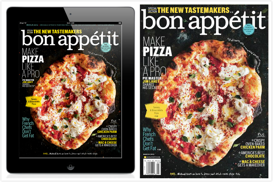
Generally, Bon Appétit’s print cover and ipad cover are almost the same. The only difference is that the ipad cover takes away the barcode, date information and price at the bottom of the magazine. That mainly because the it would makes the ipad cover more clearly. Otherwise, for the ipad edition, people don’t need to know the price information for they have already purchased it.
Print Making Revolution–Extra Credit
In the SU Art Gallery’s current exhibition, “Print Making Revolution,” Mexican art throughout the early 20th century is described as a form of rebellion against the corrupt central government. Print makers intertwine their art with political and social commentary.
The earliest black and white lithograph prints in the collection are small in scale, using negative space to portray ominous illustrations or iconography of skeletons. The prints later progressed into more intricate and more developed scenes. For example, Leopoldo Méndez’s “Tengo Sed” (I Am Thirsty) shows a narrative of a man in a drought, the sky directing the eye toward his face and torso.
Poster prints were later employed by the Mexican government to sway public opinion. The color red was frequently inherent in the propaganda, portraying strength, power, and war–which works well with the government’s intended message.
However, most of the Mexican prints throughout the 20th century remain black and gray, expressing sadness. “Print Making Revolution” displays the sentiments and hardship as many struggled to find work and education. Across many artists’ prints, grief seems to be a consistent sentiment for life in Mexico.
iPad Cover
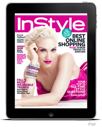
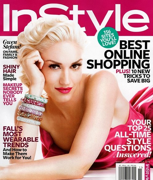
These two covers are essentially the same, minus the iPad design excluding the barcode and date on the cover of the magazine. However, I don’t think that all of the headers look bad on both the print and iPad designs. All of the text surrounds the subject, and though it is mostly taking up white space, it makes the cover look very cluttered. The pop of color that her dress gives is the only thing that would make me want to pick up the magazine.
This cover for Billboard magazine features U2 front man Bono mid concert in a cool action shot. Both designs use the photo for several reasons, first Bono’s head fits perfectly into the “o” of Billboard and his arms not only lead our eyes to the title of the magazine but they frame it as well. The only major difference between the two layouts is the horizontal layout crops Bono’s legs out of the picture. This is ok as all of the action, emotion and intensity of the image comes from his top half. Also the typeface of the deck head on the horizontal version is slightly smaller than its vertical counterpart but is still big enough to draw attention and generate interest.
iPad Magazine Cover
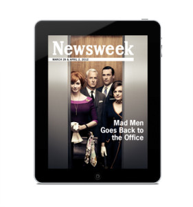
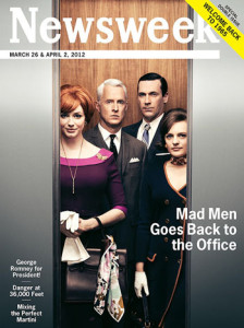
I chose this Newsweek cover because between the print and iPad version, there is very little change, but what does change is interesting. The text in the lower left is removed for the iPad and it makes a huge difference in the cover. For print, you have to show what is offered and intrigue people to buy the issue, but this isn’t true for the iPad version. Being able to remove that extra text keeps the cover clean and focused on the main story. The other change that is clearly apparent is that the print cover advertises that it’s a double issue in the upper right corner. Putting this banner in the upper right is a spot visible at a newsstand. It is important to advertise this in the print version to gain sales, but not necessary for the iPad version. Removing the sales points makes the iPad version more genuine and less like Newsweek is just selling you something.
iPad Magazine Cover
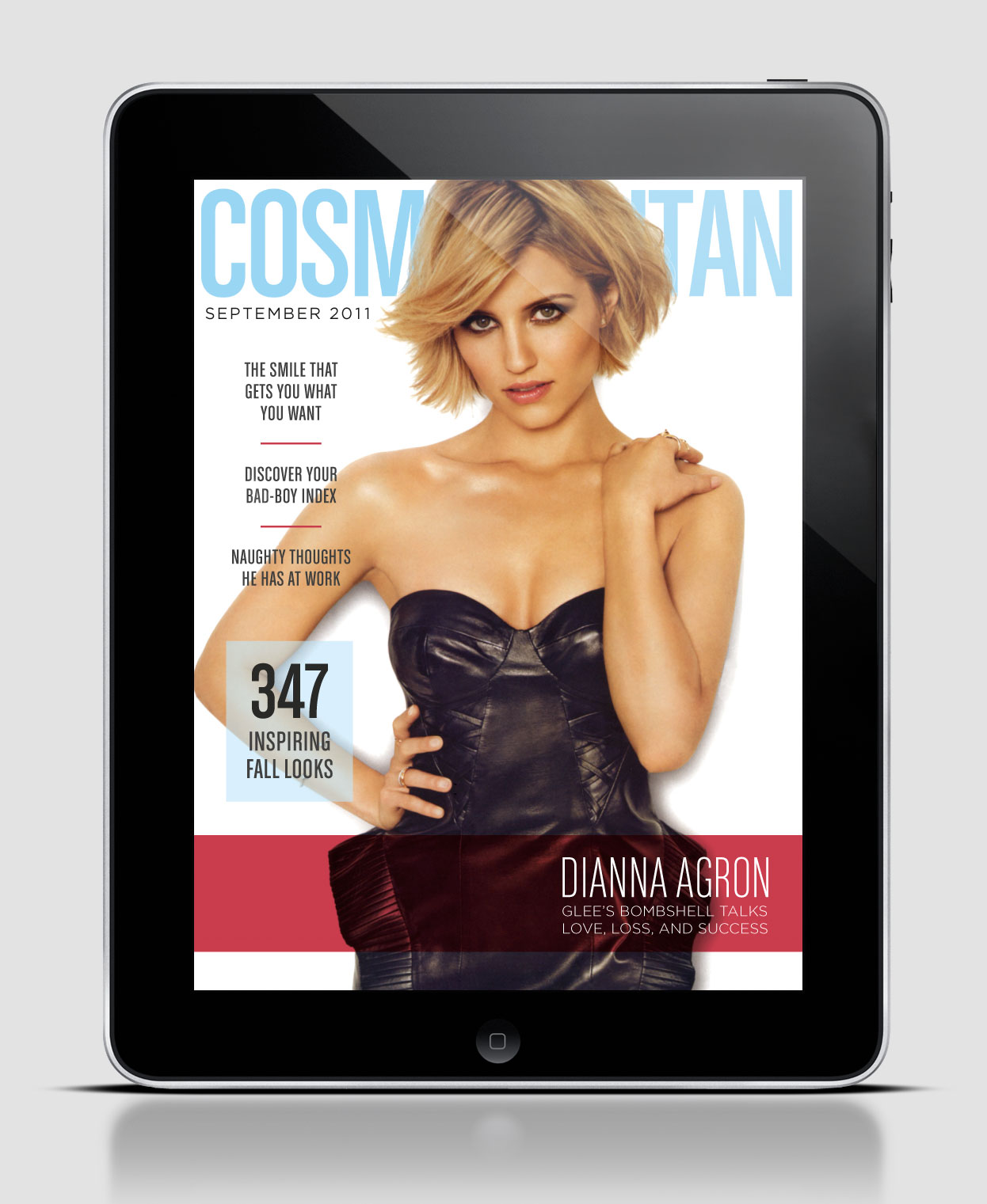
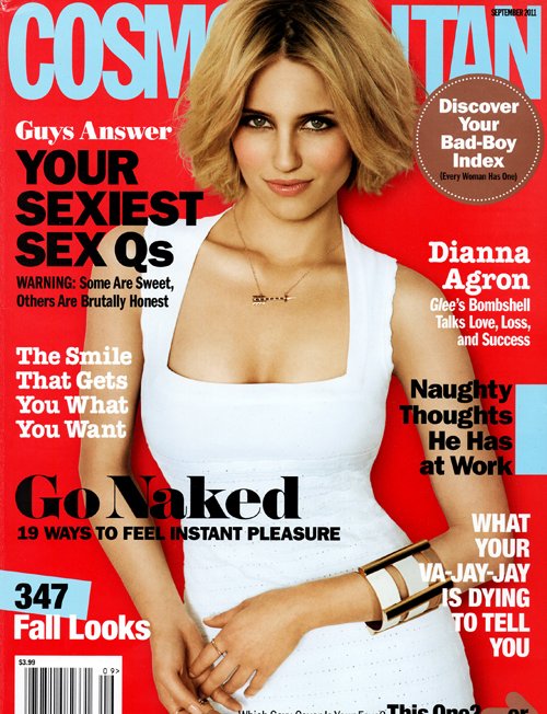
As you can see the digital and print cover for this particular issue are completely different. Although the color scheme stays consistent, where the color is placed is different as well as the picture itself. Another difference is the amount of white space from cover to cover. For the digital design 6 stories were picked to spotlight, whereas the print version has 8. On the digital version the only type that is in bold is the title of the magazine, but on the print version the majority of type is bold. I also thought it was interesting to see the difference in where the type was placed. The print version surrounded the picture with type, whereas the digital version clustered it all to the left except for the story that goes with the cover picture, which is located at the bottom left and highlighted. Although this example is of the same issue the design is so different it almost appears to be a different magazine. Do you think this is good or bad?
Wired iPad Design
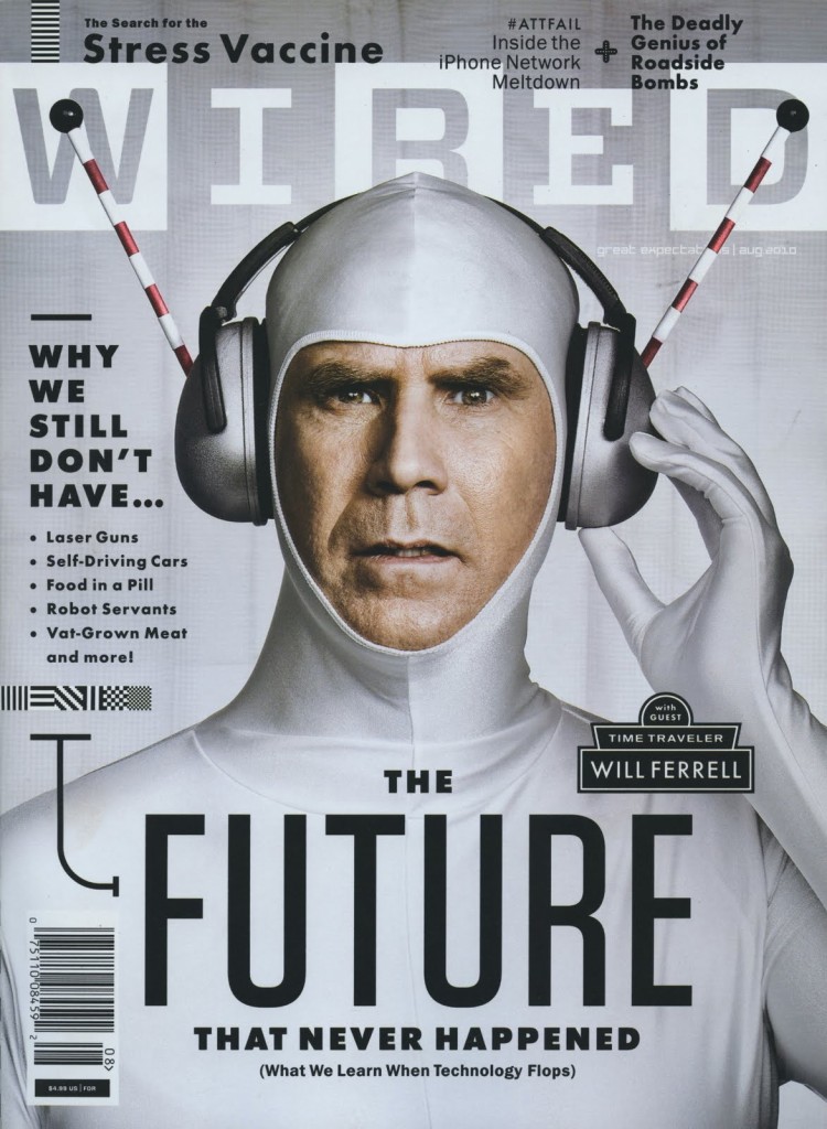
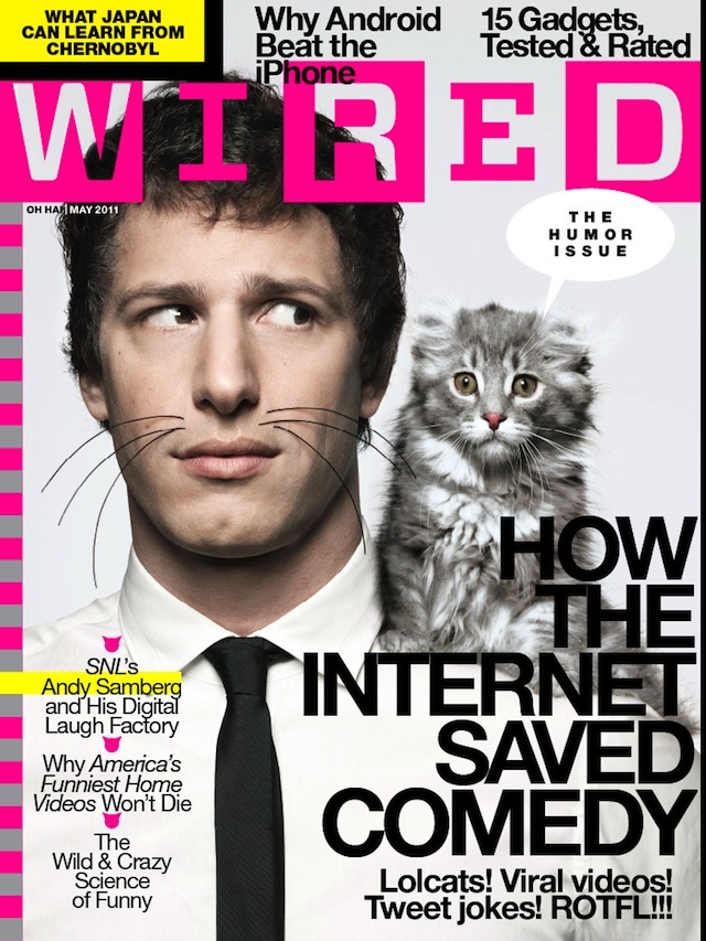
I couldn’t find the horizontal layout for this Wired cover that features Will Ferrell. But I did find the print version, which, as you can see, is identical except for the newsstand barcode. The consistent white-silver color scheme is very effective in this photo illustration since silver represents technology and the future. Ferrell’s headphones point upwards, directing the eye to the WIRED nameplate. Since sans serif is considered more modern than serif typefaces, the elongated font also fits well with the cover story. This issue has more cover lines than you would normally see on an iPad issue, so it surprises me that they kept all of them between the print and digital versions.
Magazine Cover
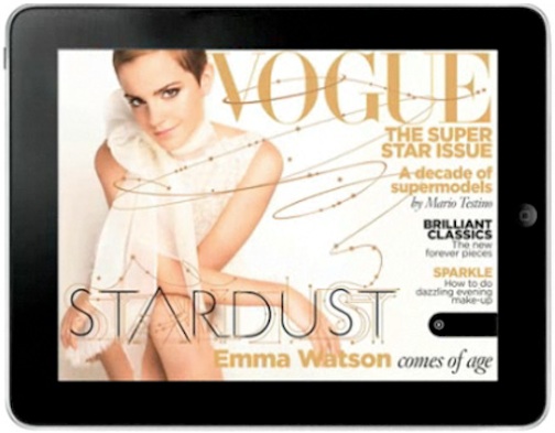
I chose this specific magazine cover because I felt that the designer kept design principles in mind when shooting the photo. The image works both horizontally and vertically in my opinion because the overall image is kept the same, and does not look distorted in the horizontal version. I also liked how the designer used the rule of thirds when creating the horizontal version. I favor the horizontal version because it is less cluttered. I like how type isn’t placed over Emma Watson as much as it is in the vertical version. I also am captivated by the extension of the typography that weaves and winds over the cover. It brings Emma’s potrait in contact with the type, and unifies them which gives the cover an overall more connected feeling.
Blog Assignment: iPad Magazine Cover
This week please upload an image of an iPad magazine cover, ideally with both horizontal and vertical layout, and briefly comment on its choices of photo/illustration and typography. It would be great if you could compare the digital cover with the original print cover and see if there is any significant changes.
Deadlines stay the same.
Headline&Deck
From TIME Magazine 10/28/13
Headline: The United States of Texas
Deck: The Lone Star State is America’s future
I think the headline and the deck do their job very well. In combination with the artwork on the cover I am very interested as to why Texas is apparently America’s future.

