
I loved this piece of typographic art because I feel that it very accurately portrays the entire attitude of the Red Hot Chili Peppers. The Chili Peppers are my favorite band, and I’ve listened to literally all of their songs over the years. The artist’s typeface is firm and confident, and the band has always been known for their incredible energy and stage presence. Additionally, the words are chaotic and mashed together, which represents the awesome, crazy attitude of all the band members. The picture is of the bass player, Flea, who is by far the wildest out of all the members. Lastly, the words spelled out are all song lyrics and names.
Category Archives: Resume
Typography Design

I find this typographic image particularly interesting because it creates an image using primarily three letters: X,Y, and K and one typeface to compose the image. I think the Serif typeface the designer chose really adds a elegant and fashion feel to the design. In order to create this image, the designer used an array of sizes for the letters, stretched the letters, and flipped them. I find the small x on the women’s check particularly interesting. At first I thought it was a mistake, but then I realized the designer used it as a beauty mark. Another interesting aspect of the design is that the girl has no distinct ears, yet because of the placing of the letters it does not detract from the design. The one thing I did not understand was why the designer chose to have a Y coming off the women’s chin because the chin is already defined without it.
Typography
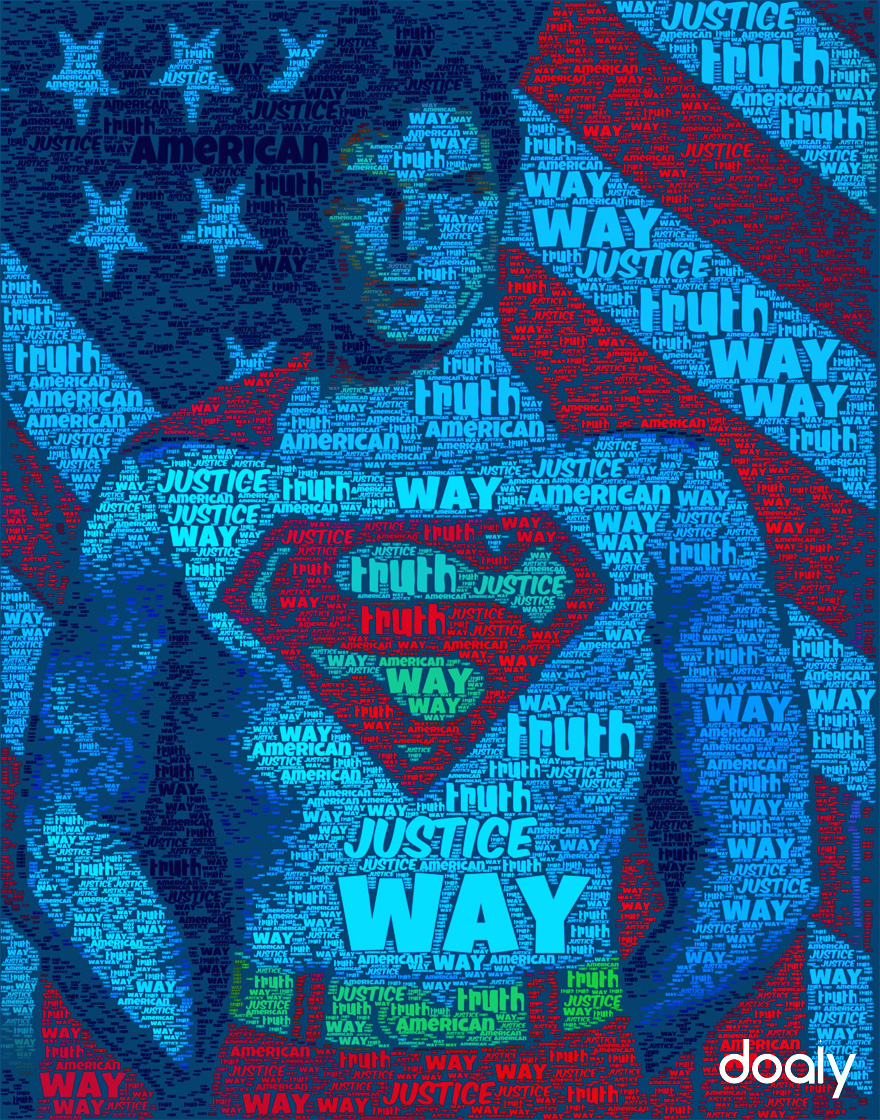
I really enjoy this poster because it uses the same words (truth, way, justice, American) to make a picture of Superman in front of the American Flag. This image both brings out the child in everyone and their patriotic beliefs. In no way whatsoever does the words ever describe what the image actually is, just what it stands for. Furthermore, the colors themselves instantly attract the eye right to Superman’s chest where is classic S insignia lies.
This image is creative in the fact that it is simply made from words in different text colors. When someone sees this poster, he or she instantly wishes it was them in front of the flag.
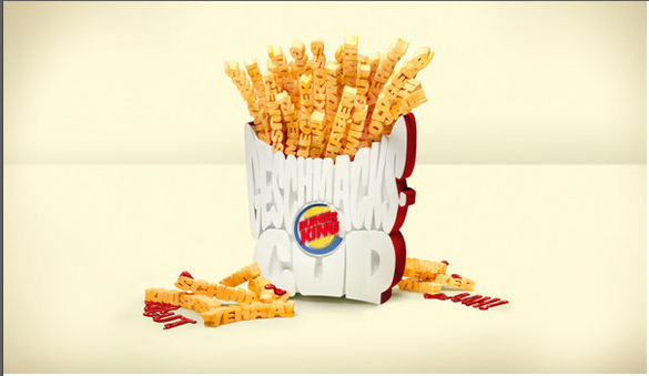
This typographical deign of an order of fires from burger king uses a clever set of bold all caps typeface to represent the popular side order. The typeface is big and fun, just like an order of fries at burger king. However, the design is not spectacular because it is quite difficult to read what the fries are saying. This makes it difficult to interpret exactly how the order of fries is meant to appear. This is actually a fairly major flaw in the design because it interferes with our understanding of the poster. While the idea is clever, the poster itself simply does not work.
Resume
Typography
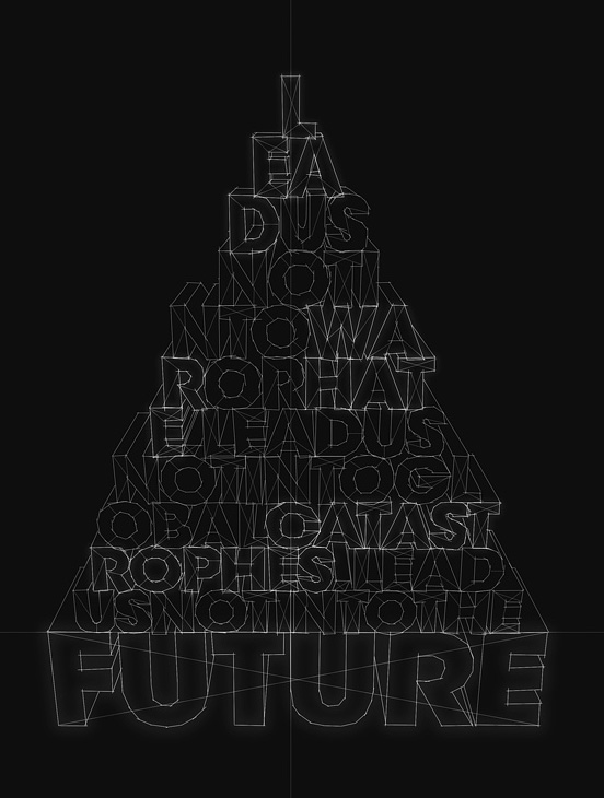 I was drawn to this typography design because at first glance you see letters constructed into the shape of a pyramid. Looking closer, the letters form words into the phrase, “Lead us not into war or hate, lead us not into global catastrophes, lead us not into into the future.” The words get bigger as the sentence continues, ending with the word future as the largest in the pyramid. This ties in with the overall look of the type, the letters being formed by constructive lines, as if they could actually form a 3D object. Also, having the black background and clean cut white lines seems futuristic.
Dean Carney
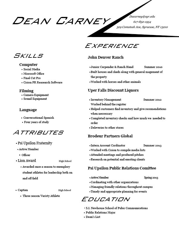
Dean Carney Resume
Typography
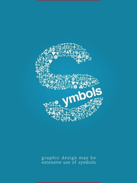
I really like the use of symbols in this typography. The font is interesting enough, and the fairly professional typeface along with the use of symbols to make the S in the word “symbol” is extremely creative and eye-catching. I also love the use of open space, with the placement of “symbol” in the very middle of the poster. The open space around the typography draws the eye to the center, and contrary to the rule or thirds, the placement of the typography works perfectly on this poster.