Bon Appétit feature layout


bon1 bon2


Bon Appétit is one of my favorite magazines. It’s a food magazine and publish stories including food recipes, restaurant recommendations etc. Almost all the photos in the magazine is beautiful and attractive. People will always be attrated by these pictures. For the feature layout, the magazine also relies heavily on photos. The food always look fresh in the pictures. The picture also applies wonderful colors.

Magazine Layout

Layout Design

This layout stood out to me because the art direction was so on point. The headline, “Promote yourself” goes perfectly with the visual because the visual has so much life and personality to it. I also like how they didn’t conform to the gutter. They spread the illustration out over two-thirds of the spread rather than stopping at one page–it definitely works to their advantage. Their is very clear visual hierarchy and I really like how the color is integrated with the white background. Catchy and clear.

Magazine Feature Layout

c7665c863052cace33c0f3e4511b56a4

I think the design of this layout is very successful. I really like the way the photo was cropped. The fact that you can not see the women’s face makes the picture very interesting and familiar, kind of like you could know her. I also like that the image portrays movement, by doing so it draws the reader in because the page is dynamic. Another reason this layout is so good is that the picture uses the rule of thirds as well as depth of field. The positioning of the text also really adds to the success of the layout. The readers eye is drawn to the text by having it directly above the peak of the mountain. I also like that the title/text mimics the curve of the mountain. Overall what makes this layout so successful is the use of a strong image and smart placement of text.

Magazine spread

magazine-ads-macbook

magazine-layout-13

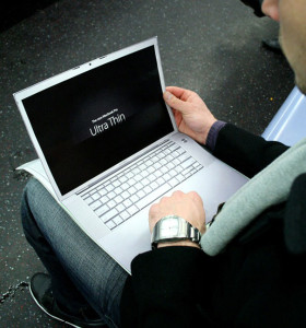
I chose to include a double page ad as well as a magazine spread. As an advertiser, its really hard to cut through the clutter. Its especially hard to make your magazine ad stand out from all the other ads in a magazine. A good way to do this is to really take advantage of the medium you’re using. In this Apple ad, they created a completely new ad from any ad they had existing in order to fully take advantage of the fold of the magazine as well as the double sidedness.

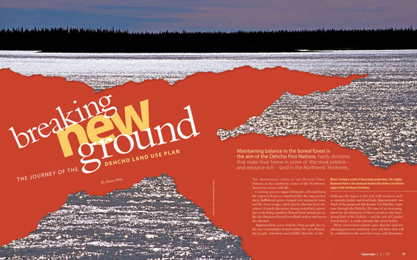
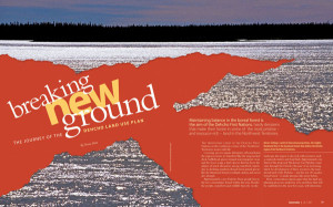
I also picked a regular magazine spread as well. Spreads that stand out to me are ones that have content streaming across the two pages. I feel like a lot of times, despite the two facing pages, content is kept pretty segregated to the left and the right side. Here, content crosses over from left to right and is also filled with a full picture. Magazines are a really good medium for pictures so I really like when magazines feature very big, high quality pictures.

Logo

In my first draft of my resume, I used this as my watermark, but it was considered too logo-like. So I would possibly use this for my logo. I really like monograms and this is a good representation of myself because its bright and its my handwriting.

Screen Shot 2013-10-28 at 11.36.06 AM

LOGO

logoBefore sketching my logo I first thought about what I wanted it to communicate. I’ve always loved to travel and would like to do PR for company or organization that works internationally. I thought the perfect symbol to represent my love for travel and work goal would be a globe. I realized that if I made my last initial wide enough it could work as both a globe and G. I then noticed that by simply adding a line in front of the globe I would also represent my first initial.

Logo

logo

I wanted to keep my logo very simple so I decided to work with just the “O” from my first name and the ‘A’ from my last name. After looking at the letter for a while i realized that I could over lap the letters and have part of the O be the middle stem of the A.

Logo

logo


When thinking about my logo, I wanted to incorporate my area of study somehow: magazine journalism. My initials are “LG,” so I drew a fountain pen with a line drawn to appear as the “L.” I connected the line to the bottom of the “G,” so it looks like it was just drawn as well. I would obviously place this near my wordmark on my resume or a business card, so readers would understand it’s my initials. As for my identity, I wanted to portray that I think of writing stories as a craft. I hoped that choosing a fountain pen instead of a modern one will show this.