Category Archives: Projects
Poster
Resume 1B
Week 8 Post
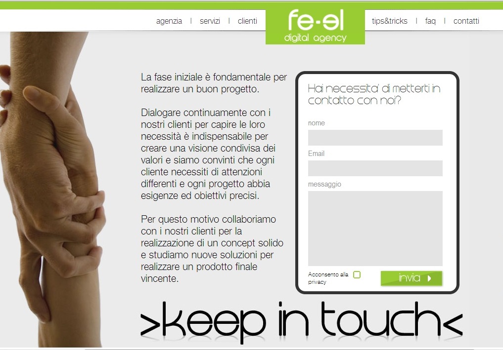
fe-el.com is a web design agency that focuses mostly on highly interactive webpages that focuses strongly on interaction and communication with customers. Their website does not focus much on photography, but it is relying very heavily on elements of graphic design to bring their website together. It’s a very deep website with the user having to continue to scroll which might be a turn off to some viewers. The one photo that they do have on their website is under the “Keep in Touch” option, which shows an image of two people literally “keeping in touch”. I think it works well because it conveys the message fe-el thinks that their partnership with customers is important in order to achieve success.
Resume 1B
Webdesign Photo
I like this photo in Kate Spade website. The background of this website is very clean. I think the color of the photo matches the whole website.
This photo is shown in the clothing section. The photo is very simple, but the clothes which the model wears is really standout because the model wears a very colorful clothes. The model’s arm and the chair all pointing to “Just My Type”. This is a very good way to lead our visual. The words “shop clothing” using red background really come into viewer’s eyes. In addition, because the whole page is very simple, when I first look at this page I will only noticed by the clothes and the call to the action. There is another thing I really like about the photo is that the right corner at the bottom. Views could click the right corner to explore about more different clothing. It just like open a new page.
Website Photography
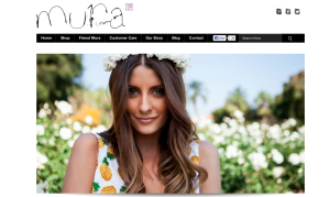
I chose the website for Mura Boutique for this weeks post. The photo here is used to show a model wearing the clothes the website is trying to sell. The photo is lovely and its goal is to make the consumer want to feel that way wearing their clothes. The target audience is girls in their mid teens to early 20’s. The designer probably chose this image because of the setting that it portrays. I think it’s awesome for the homepage of the website.
Resume 1B
Photography
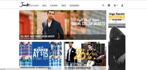
The website Jack Threads has a strong presence with their clothes because of their ability to display them in action. Its unique text illustrates sales that instantly grabs the viewer’s attention and entices them to click and see more. Furthermore, their use of different lenses such as black and white or a faded background gives different categories various feelings such as rustic or classy. Overall, their use of multiple images provides viewer’s a specific insight into not only how their clothes look, but how they look in different situations.

