
Monthly Archives: October 2013
Blog Assignment: Gestalt Principles in Web Design
Gestalt is a psychology term describing how people tend to organize visual elements into groups or “unified wholes” based on certain principles.
Some of the gestalt principles include:
- figure and ground: establish significant differences between the object and its background, making the object stand out from its surroundings.
- proximity and alignment: use the same font, color, or alignment to create unity.
- continuation: elements were positioned on a line or a curve to indicate continuation or connectedness.
- visual hierarchy: use size, shape or color variation to tell viewers which part are important, and which part are supplemental.
This week for the blog, you need to choose a website and talk about how the designer of that website applied those gestalt principles.
To learn more about gestalt principles and web design, read here.
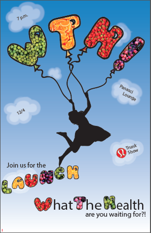
Poster
Kicks For A Cause
Slow Food Baltimore
Poster-Slow Food Baltimore (click)
Poster Project

Poster Project

Web Design: Smucker’s

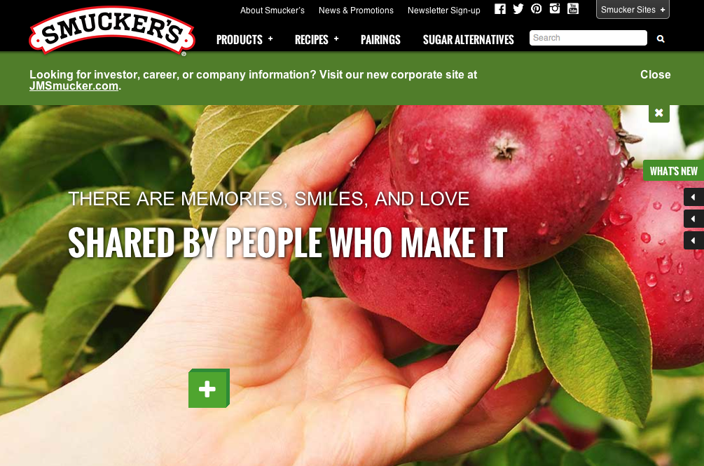


I personally love Smucker’s web design. They use a lot of colors and stick to a certain theme by incorporating a lot of pictures that have to do with each section of the website. I love how on the home page, as you scroll down the page it tells you Smucker’s mission and what they are truly about. It incorporates beautiful pictures of fruits and and foods that you can make with their products. This web design also gives off a happy feeling making you want to explore the website even more, essentially becoming more aware of the company and their products, which could lead to purchasing the product. This website gives me a lot of ideas that I could use in my web design.
Nike Website
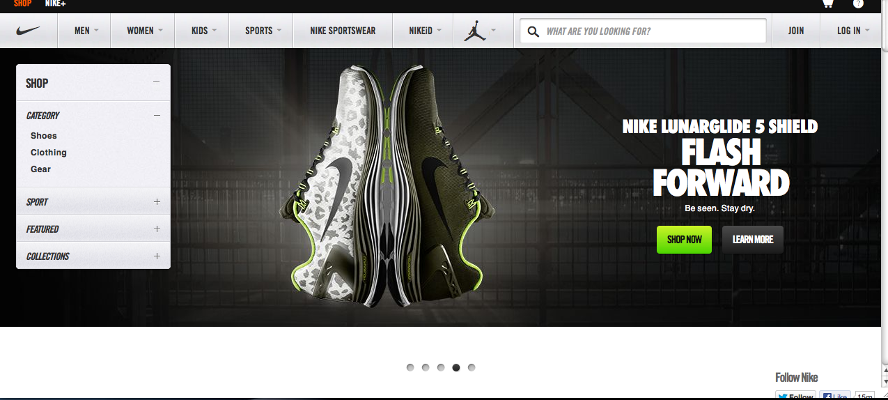
The Nike Website is very eye grabbing with its rotating screens to preview its products on the site. The Layout is very clean and the tabs are clearly written out without having to search for them. The absence of space and use of vibrant colors helps to make the products stand out even more to the point where you want to click on it to get more information about it. I think Nike did a very good job with the overall layout of this website and its attention to detail.
Website design
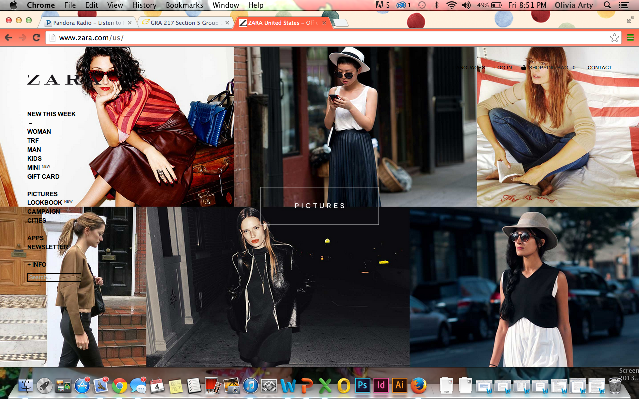
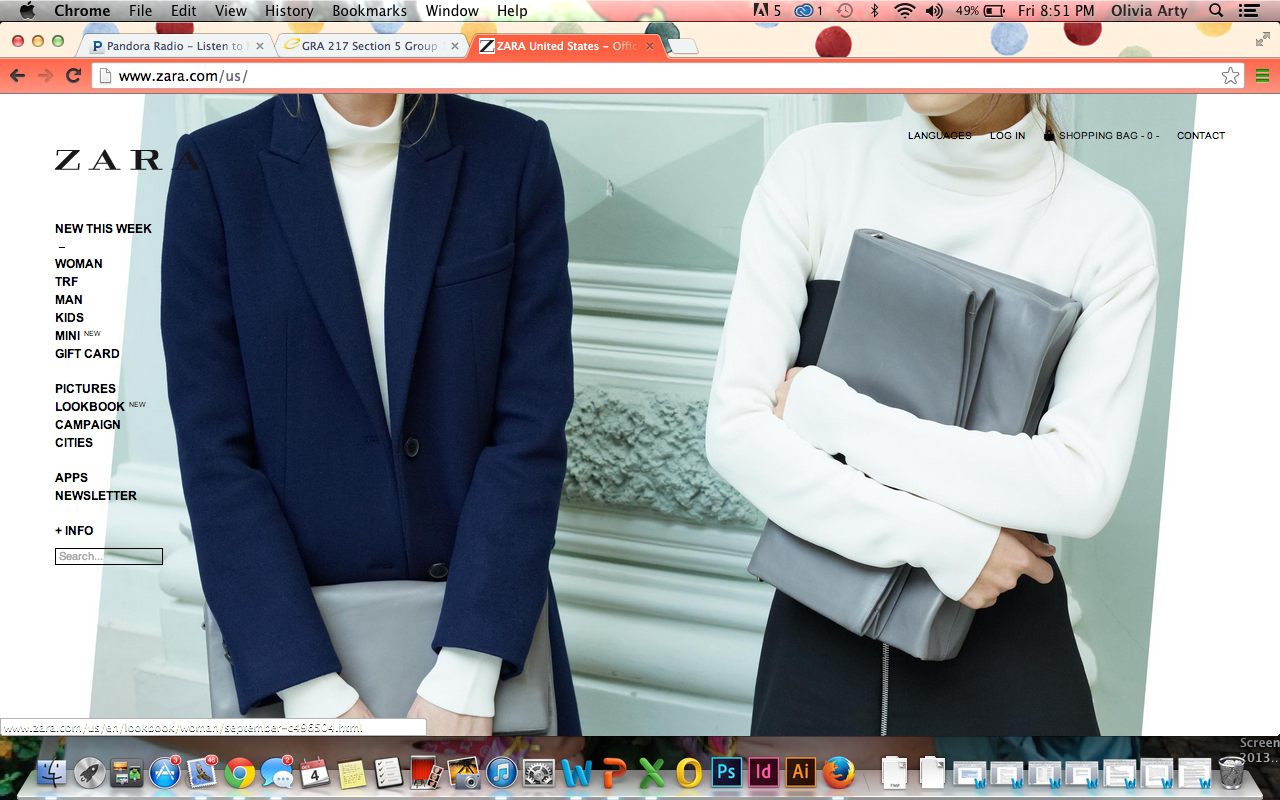
I have always been in awe of Zara’s website. It is so simple and modern. The minimalism in it makes it very easy to navigate through the website and it also intrigues me to keep looking the website. The website does an excellent job of showing Zara’s culture, and the style that the company is trying to portray. However, my one complaint is that the side bar get s a little lost.