


Website photography
For the fashion website, it’s extremely important for them to use the photos to show the beauty of the products and attract customer’s attention. Particularly for the wedding dress, the website have to show the elegance and the beauty of the products and unconsciously connect the product to the happiness of love and marriage.
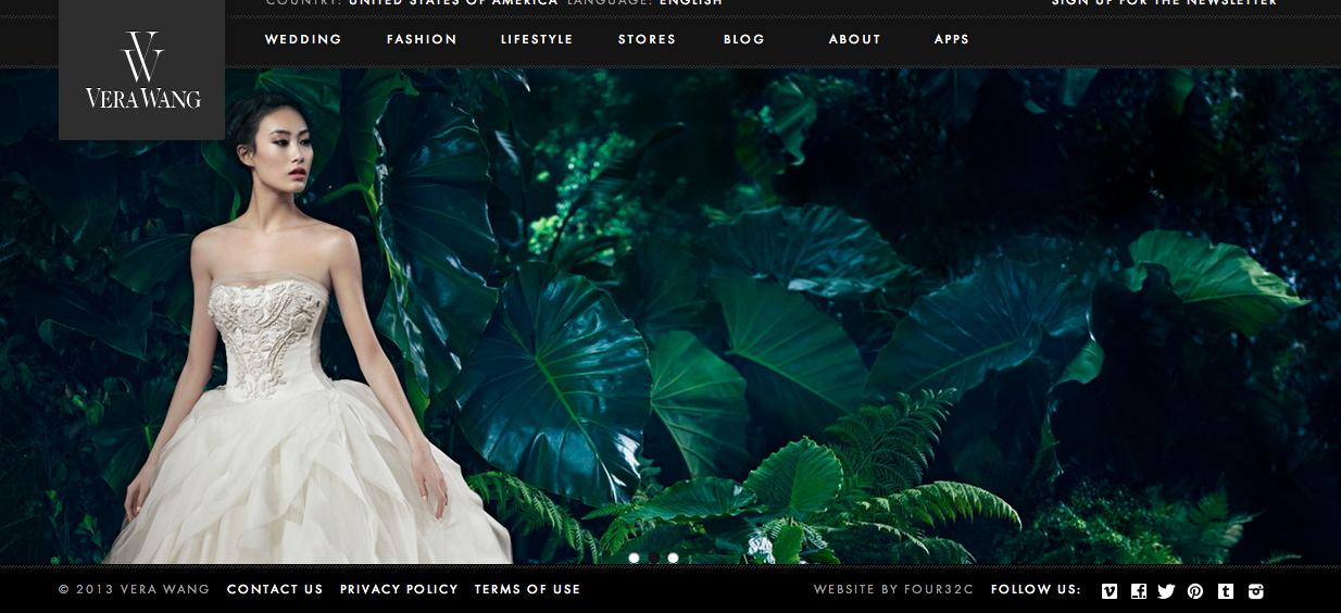
For the famous Vera Wang wedding dress, the website highly rely on the photography. On the front page, they only apply one big photo, applying beautiful photography. The bride will easily attract customers for she is the only one person in the photo and she is very bright. The photo also clearly shows the look of the wedding dress especially the unique design on collar and layered cuts of the leg opening. The customers can see the good quality of the products as well. All the background image make the bride and the wedding dress stand out easily. Customers interested in wedding photo will addict to nothing but just the wedding dress for its beauty and elegance.
Resume 1b
Resume

Website Photography
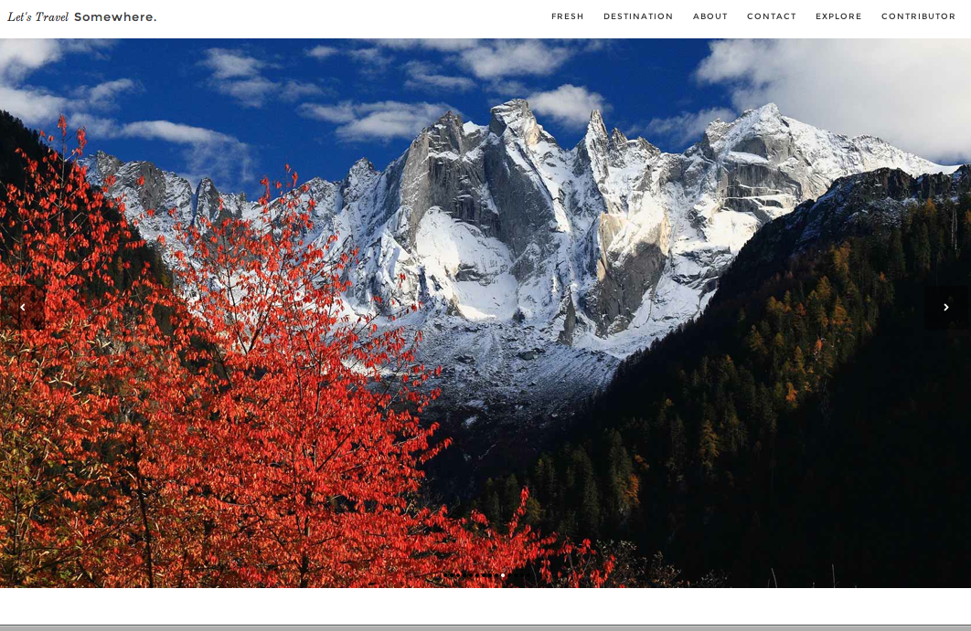
When I found this website I fell in love with its design and use of photos. Let’s Travel Somewhere is a site that features different photographers photos and articles of the places they’ve traveled. This allows the audience to see and “experience” as many places as possible. The idea is that “a single traveler can’t live to see it all” so people can show different parts of the world on this forum. Each page is dominated by photographs. The site setup itself is very simple. All the font is in black and so the main attraction is the beautiful photographs that have very vivid color. The photographs on the home page show a variety of destinations, subjects, and colors. By showing such a wide range of photographs it makes the homepage very interesting and visually appealing. It also guides the audience to click on a photo to see more photos from a particular destination and photographer. 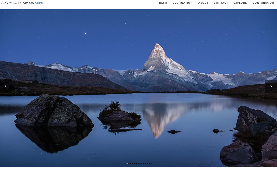
Photos in Web Design
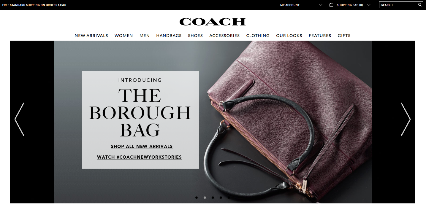
The Coach website relies on photographs to display the products and create visual appeal. The home page is basically a collage of many different photographs. The top photograph, which fits the width of the page, advertises a new or popular product. The colors are warm and neutral, which makes the photo stand out of the page and draws the eye. Since the photo consists of many colors and patterns, black text is placed in a semi-transparent cream-colored textbook to ensure the text can easily be seen and read. The photograph also balances the page because the text box and woman are placed in the correct locations in accordance with the rule of thirds.
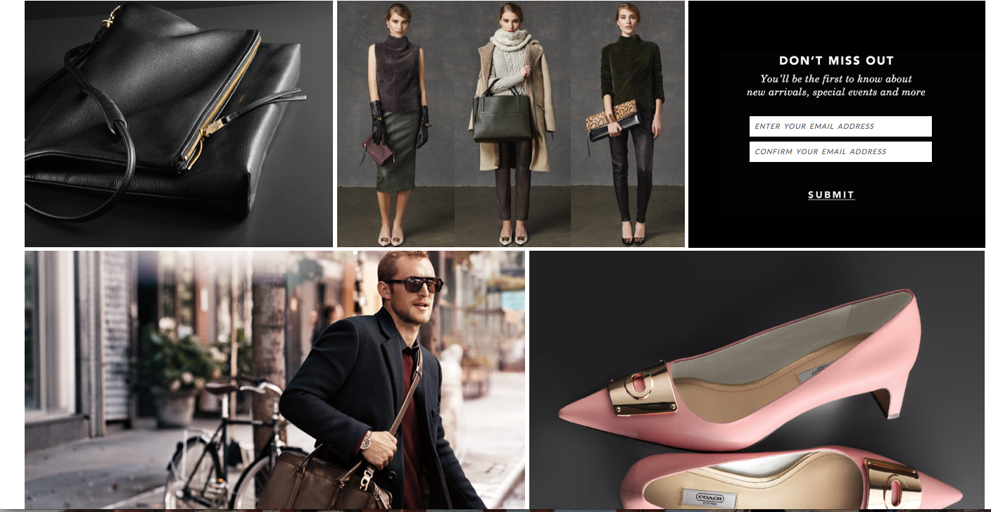
Under the large main photograph are other photos placed in a collage-like way with thin white borders between them. The color scheme of these photos is the same as the color scheme of the main photo, which creates connection and visual appeal. Lack of text ensures that the site looks pretty and simple instead of overwhelming.
The target audience of the website is women with enough money to buy expensive handbags, shoes, accessories, etc. The designer chose these images because they display the products and also show the class and sophistication of the brand with darker lighting, neutral colors and simplicity. The photos work together with all of the other elements on the page to create a sense of unity.
Website photo
I know I have used this website as an example before but Zara’s website fit this assignment perfectly! They use this photo on the home page of the website. I think it really shows the personality of the brand. Zara is a very trendy, modern, clean-cut brand, and this background describes that perfectly with the movement in the photo and very neutral color scheme.

Website Photography
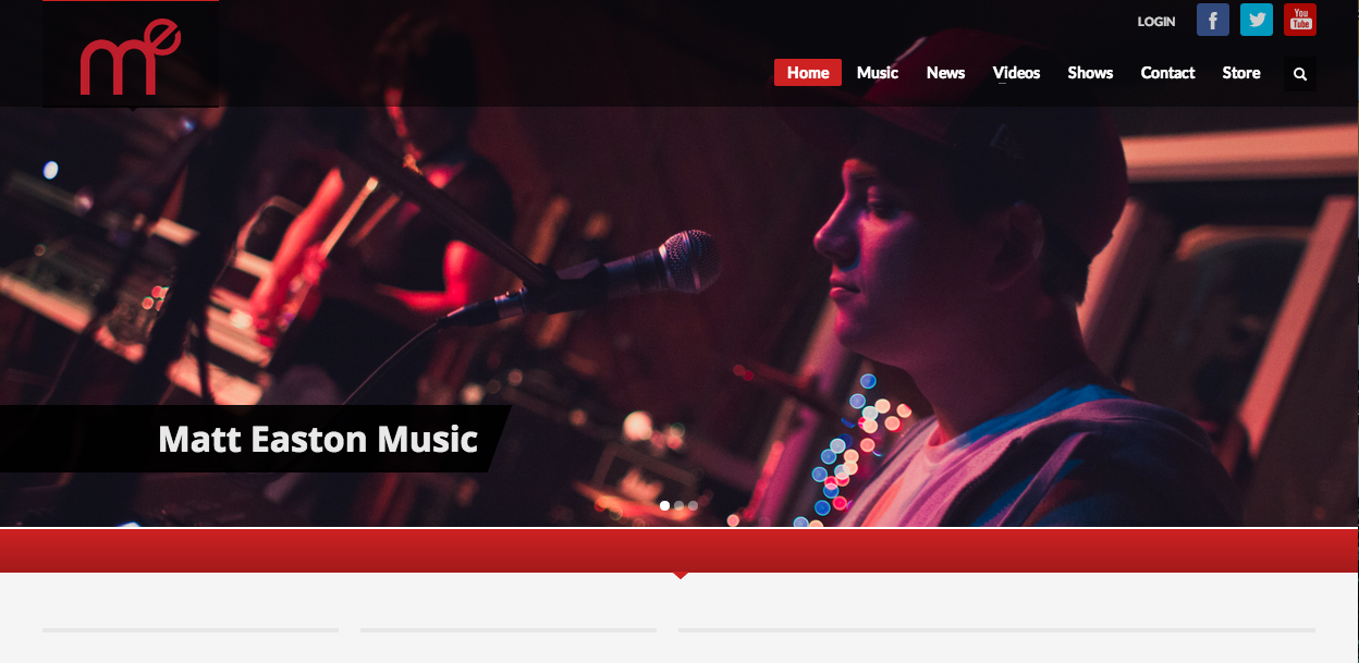
I love all types of music, and I’ve been playing guitar for the past seven years. As a result, I’ve seen tons of artists’ web pages, and all of them take slightly different approaches. Matt Easton is a relatively new rap/alternative artist, and his website is one of my favorites. Besides the great image, his graphic in the upper lefthand corner is great. It’s a stylized initial mark, which punnily spells “me.” Furthermore, the color scheme of the graphic, the website, and the photo all work very well together. The image is focused just on Easton’s form and the microphone, channeling attention on him. However, the viewer can make out the band and sound equipment in the fuzzy background. The effect gives the picture great depth, and also shows that even though Easton is the subject, he’s not the only thing going on. The navigation links are all very simplistic, allowing the viewer to focus on the graphic. I also love that the navigation bar on the top is not a solid color, allowing the graphic to show through.
images in webdesign
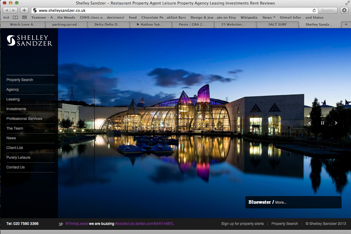
The website i chose to use as an example is Shelley Sandzer, a restaurant/leisure property agency based out of the UK. I think the image is effectively used because it captures the viewer’s eye and brings it right to the center of the page. Additionally, the image demonstrates the prestigious nature of the company and the scale and price of properties that they work on. The colors are vibrant and the image is sharp.
Website photography

Toms is a company that sells shoes. However, they are unique in the fact that with every product that is purchased, TOMS helps one person in need – their one for one movement. The photography that’s used on their site for the One for One homepage is very effective. It is showing three young kids laughing and smiling that seem to not be in a wealthy society. But even still their happy, which portrays the image that the One for One mission brings kids in need happiness. This creates sympathy and shows people that they should buy Toms products to give back and help others. The colors are incorporated throughout the page, the orange in the header and text, the blue and green for the fill of text boxes. The colors of the photograph itself are cohesive and is an aesthetically pleasing image to look at. Warmer colors are easier to look at – the color palette of this photograph. This creates a cohesiveness throughout the page. It is also on the top portion of the page which immediately draws the eye in.