Apple – Web Design

屏幕快照 2013-10-11 下午11.06.43

Apple’s website is one of the best websites.

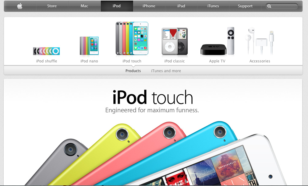
First of all, apple use the color dark grey and silver as its main color in the web design. The color looks similar to black and white, which is the best contract color. However, grey and silver comforts people’s eyes. And also, when introducing products, Apple always uses big and high-definition pictures that usually occupy the whole page. It makes the object stands out easily. Besides, apple products are usually in black, white or silver. These three color are easily stand out on a white web page.

Secondly, all the pages are applied the same font- myriad, the similar color – grey, white and silver and the same alignment. Apple website makes a good example of consistency and proximity.

Besides, apple also gives good example of visual hierarchy. The toolbar on the top is in grey. It’s not annoying or attract too much information while still gives its own function – navigate the users to different pages they want. They always put the big pictures of the latest product the company wants to advertise or promote on the particular pages. No other pictures will be bigger. It clearly attracts customer’s attention and would be distracted.

Web Design Gestalt

JJ's

FIGURE AND BACKGROUND: The obvious figure in this case is the sandwich.  The background is completely empty which lends further focus to the details of the sandwich and how delicious it looks.

PROXIMITY AND ALIGNMENT: The header, which lies next to the sandwich is in a font that carries all capitals that are thick and strong.  There is a slight tilt to the right which suggests motion.  These sandwiches are FAST.  The menu comes in a different typeface and different color.  This creates a contrast to let the viewer know exactly what each component is

CONTINUATION: There is not a lot of content on this page and the simplicity lends to the viewing pleasure.  All of the information is grouped neatly at the top right corner in the information bar.  To the left is the Jimmy Johns logo and then there is nothing else.  Everything is tied together in one continuous form.

VISUAL HIERARCHY: The clear and dominant component of this web page is the sandwich.  It dominates the scene with all of its colorful greasy and delicious detail.  The web page is an advertisement for the product itself.  This is the first and last thing you will see with continued glances back at it during the visual scan of the rest of the page.

Gestalt

figure and ground: Buzzfeed uses a white background, therefore all of the objects on the page are distinct from the background and makes the page and the articles alluring to its readers. This especially true when they put the headers in red or yellow.

proximity and alignment: the same font is used throughout the whole website which creates a sense of unity, and works very effectively for this website.

continuation: Everything on the buzzfeed website is very aligned and linear. They do a great job on this idea of continuation. In my opinion, this further adds to the websites unity.

visual hierarchy: The website definitely follows the visual hierarchy principle since all the all eye catching parts of the website are on the top of the page and lead your eyes to the main and most important content of the site.
Screen Shot 2013-10-11 at 9.08.56 PM

Gestalt Design

Screen shot 2013-10-11 at 1.30.41 PMI chose this website to represent gestalt design because of its simplicity. While there are no pictures or colors to represent similarity, the idea of size and font brings the website together as a whole. The main font creates similarity by size, but also by shape. While “Life” and “Sam” are directly related by font size, the “according to” also can be grouped along with them due to shape of the font. All of the symbols at the bottom also relate well to the rest of the webite not only because they are the same color, but becuase they are geometrically placed in the middle of the page like the rest of the font. The symbols work together as a group themselves but also relate to the rest of the webpage.


Gestalt Principle: KitKat 4.4

http://www.kitkat.com/#/home

The website I chose to use was the website for the new KitKat 4.4. The website is designed almost more like an info-graph because instead of navigating you scroll down the page to get the information about the new product. It’s a very creative website because it compares the new candy to technology, for example its “mobility” is represented with the sticks acting as descending bars that resemble cell phone service.

To apply the Gestalt Principle to this website we can look it its figure and ground. For example on the below “page” of the website the red words and piece of chocolate, as well as the navigation scroll bar all stand out against the white background.

Screen Shot 2013-10-09 at 10.04.09 PM


As you can see in the below picture stitch of the website, the website is uniform with a common font and color scheme throughout. The proximity and alignment is on point.gra


The websites entire design is based on continuation considering it is one page and flows down to show all the specs of the new candy.

The visual hierarchy can be represented by the following page. The header of this “page” is written in a larger font and in red to signify that it’s important. There is then color variation when the information about the header is written in black.

Screen Shot 2013-10-09 at 10.20.00 PM

National Geographic Website

Screen Shot 2013-10-09 at 9.33.51 PM

Figure and ground: Nationally Geographic is typically known for its black and yellow colors. However, on the website, black is only present in the navigation bar. The background for the rest of the website it white and the yellow accents don’t stand out very well against it.

Proximity and alignment: The font is a very simple sans serif that looks a lot like Arial. While it is used consistently throughout the website, I don’t think it really engages the viewer. I’d expect a website like National Geographic that is known for its stunning visuals, to choose a more interesting font.

Visual hierarchy: Titles and headlines are bigger than the sub-heads/captions for the things which they are explaining. These main headlines are also highlighted with yellow which does show importance in this case because the other information features no color at all. And for almost every piece of information there is a picture to accompany it. The picture is generally very big and is proportional to the size of the headline. The picture helps to draw readers attention and then their eye will follow below and read the information that goes with the picture.