magazine feature layout

fb002c13517c35003c41561d3b5d06a5

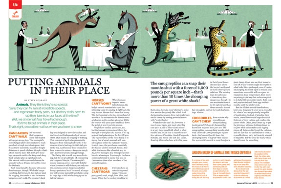
The magazine I chose was Mental Floss magazine because I believe their feature stories are always well designed. I think the use of the large image at the top of the page with interesting content catches the readers eye, and makes the large amount of text less daunting to read. Bringing out the interesting/funny quote from the article helps attract the reader to the content of the story. Additionally, the use of orange, which is a color that pops, helps bring the reader’s eye to the headings of the different parts of the story and also to the sidebar, which includes relevant interesting information.

Logo

Scan 1


At first I came up with this generic logo, but I didn’t like it because it had no character and seemed like a boring micro processing company logo. Then I came up with this….

Scan


There were many different drafts of my logo before I finally came to this one. I tried to incorporate the A of my last name into the C of my first name and I came up with this cool, colorful, and fun shape. I plan to make this on illustrator and incorporate it into future projects or business cards.

Logo

024


My thought process behind my logos were that I wanted them to be simple, yet grab attention.  In my first logo, I made it similar to the fast food chain KFC because I thought people would look at the logo, realize it is not KFC and be curious to see what this new brand is.  The three letters stand for the initials of my name and I connected them all to create fluid motion between letters.

For my second logo, I cut my last name in half and drew it in cursive.  The cursive font gives the logo a level of elegance and high quality.  It is short and sweet and depicts myself in a manner that would impress others.

Logo Design

logo

The font used for this logo is “Segoe Script”. I personally think that my initials and my name is boring, so I wasn’t able to use any images or variations of my initials to be creative, so I instead decided to use one “C” for my first and last name while doing an outer glow (softer stroke) of a different color to differentiate my middle initial from my first and last name. I hope that this handwritten font would give off the impression that I’m personable and maybe even flexible, rather than using a computer generated serif. I used the drop shadow feature in Photoshop to give the entire logo dimensionality.

Logo

I have already designed my personal logo in the resume project. I want like to keep it very simple and recognized. The simplest design is the best design. I put the first letter of my first name and surname, “n” and “d” together. I tired different combination of these two letters like “ND”,”nd”,”nD” etc. At the end, I choose the combination of “nD”.

logo

Personal Logo

photo(1)

Since the my initials (N and H) both have long straight edges, I decided to combine them so one side of each letter is connected. In my logo, you can easily distinguish between the N and the H but still see them as one unit visually. I wanted to incorporate a symbol of writing in my logo, since I’m majoring in magazine journalism. I made the other edge of the H into a pencil. The squiggly line coming out of the tip makes the pencil look like it’s writing. I also wrote out my name underneath the design, aligning each letter since my first and last name form a true perfect and both have 6 letters.

logo

photo

To create my logo I used my initials and the image of a pencil, because I like to write (and my major is magazine). Had I used a computer, I would have probably made the “h” out of a bullet shell instead (because I want to be a war correspondent).

Personal Logo

Mike Logo


What I enjoy about the logo I created is that it’s simple, yet different; I feel like the use of this text allows me to create a feeling of individuality and creativity in my logo, but convery a sense of professionalism.

Week 8 Post

webdesignwww.fe-el.com

fe-el.com is a web design agency that focuses mostly on highly interactive webpages that focuses strongly on interaction and communication with customers. Their website does not focus much on photography, but it is relying very heavily on elements of graphic design to bring their website together. It’s a very deep website with the user having to continue to scroll which might be a turn off to some viewers. The one photo that they do have on their website is under the “Keep in Touch” option, which shows an image of two people literally “keeping in touch”. I think it works well because it conveys the message fe-el thinks that their partnership with customers is important in order to achieve success.

Website photography

For the fashion website, it’s extremely important for them to use the photos to show the beauty of the products and attract customer’s attention. Particularly for the wedding dress, the website have to show the elegance and the beauty of the products and unconsciously connect the product to the happiness of love and marriage.

For the famous Vera Wang wedding dress, the website highly rely on the photography. On the front page, they only apply one big photo, applying beautiful photography. The bride will easily attract customers for she is the only one person in the photo and she is very bright. The photo also clearly shows the look of the wedding dress especially the unique design on collar and layered cuts of the leg opening. The customers can see the good quality of the products as well. All the background image make the bride and the wedding dress stand out easily. Customers interested in wedding photo will addict to nothing but just the wedding dress for its beauty and elegance.


屏幕快照 2013-10-18 下午11.05.09