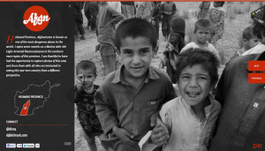
This website is designed to teach people the dangers of living in the featured province in Afghanistan. The website features only black and white pictures that are the full size of the page. I think this is powerful because the image dominates the page and there is no captions/thumbnails/frames/other text to detract from them. The black and white also limits the amount of things the eye needs to look at. A person’s eye isn’t darting around the pictures looking at all the different colors, instead they can settle in and focus on the closeups of the children’s faces. Also, this website uses just pictures to teach people and convey a message. Aside from the one paragraph of text that is set over the image on the left, there is nothing else besides this.
Category Archives: Projects
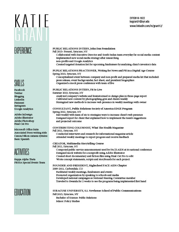
Resume 1B
Website and Photography
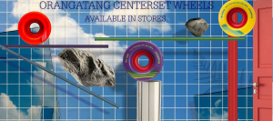
This website for a long board skateboard company advertises a new set of wheel. The photo used is the sky background with clouds along with rocks in the page. This photo effectively communicates because longboarding is a very outdoor activity and the background captures that nicely. The wheels are what directly contact the ground or outside when your out skateboarding so its a good connection to make with nature and the sense of being outdoors. The target audience of this website is definitely the adventurous type that enjoy going out and seeing nice scenic views while out skating around. My guess as to why the creator included rocks its to also key in to the nature aspect of skating itself but also the durability of these new wheels they are advertising.
Lincoln Website
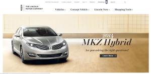
As a brand, Lincoln is known for class, prestige, and luxury. Their website perfectly reflects this image through various techniques. In terms of figure and ground, the picture is set against a white background, and the color scheme of the picture allows the juxtaposition of the picture on the background to be less harsh. Furthermore, the black headers are clearly visible.
In terms of proximity and alignment, the Lincoln all-caps font and logo are present for a wordmark effect, and the font used on the site maintains the image of elegance. The new car within the picture is clearly the newest, best design, and the italicized and bold font help show that it exemplifies the brand while still displaying an aggressive feeling as it bursts into the car market.
In terms of continuation, the website flows very smoothly. This is due to the color scheme, the way the fonts work together, and how those two things are complemented by the picture that was chosen for the new car model.
For visual heirarchy, navigation links are present all along the top of the page. Following the “Z” formation, the reader’s eye hits the left-aligned text within the picture at the middle of the page. Although it was cut out in the screenshot for the post, the bottom of the page has further navigational links that deal with incentive plans, contacting employees, and personalized shopping.
Poster
Poster Design
Apple – Web Design
Apple’s website is one of the best websites.
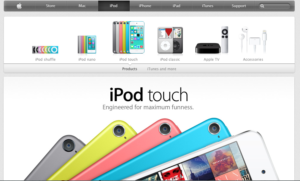
First of all, apple use the color dark grey and silver as its main color in the web design. The color looks similar to black and white, which is the best contract color. However, grey and silver comforts people’s eyes. And also, when introducing products, Apple always uses big and high-definition pictures that usually occupy the whole page. It makes the object stands out easily. Besides, apple products are usually in black, white or silver. These three color are easily stand out on a white web page.
Secondly, all the pages are applied the same font- myriad, the similar color – grey, white and silver and the same alignment. Apple website makes a good example of consistency and proximity.
Besides, apple also gives good example of visual hierarchy. The toolbar on the top is in grey. It’s not annoying or attract too much information while still gives its own function – navigate the users to different pages they want. They always put the big pictures of the latest product the company wants to advertise or promote on the particular pages. No other pictures will be bigger. It clearly attracts customer’s attention and would be distracted.
Web Design Gestalt
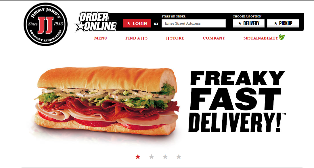
FIGURE AND BACKGROUND: The obvious figure in this case is the sandwich. The background is completely empty which lends further focus to the details of the sandwich and how delicious it looks.
PROXIMITY AND ALIGNMENT: The header, which lies next to the sandwich is in a font that carries all capitals that are thick and strong. There is a slight tilt to the right which suggests motion. These sandwiches are FAST. The menu comes in a different typeface and different color. This creates a contrast to let the viewer know exactly what each component is
CONTINUATION: There is not a lot of content on this page and the simplicity lends to the viewing pleasure. All of the information is grouped neatly at the top right corner in the information bar. To the left is the Jimmy Johns logo and then there is nothing else. Everything is tied together in one continuous form.
VISUAL HIERARCHY: The clear and dominant component of this web page is the sandwich. It dominates the scene with all of its colorful greasy and delicious detail. The web page is an advertisement for the product itself. This is the first and last thing you will see with continued glances back at it during the visual scan of the rest of the page.
Gestalt
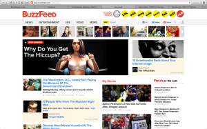
figure and ground: Buzzfeed uses a white background, therefore all of the objects on the page are distinct from the background and makes the page and the articles alluring to its readers. This especially true when they put the headers in red or yellow.
proximity and alignment: the same font is used throughout the whole website which creates a sense of unity, and works very effectively for this website.
continuation: Everything on the buzzfeed website is very aligned and linear. They do a great job on this idea of continuation. In my opinion, this further adds to the websites unity.
visual hierarchy: The website definitely follows the visual hierarchy principle since all the all eye catching parts of the website are on the top of the page and lead your eyes to the main and most important content of the site.
