Website photo

I know I have used this website as an example before but Zara’s website fit this assignment perfectly! They use this photo on the home page of the website. I think it really shows the personality of the brand. Zara is a very trendy, modern, clean-cut brand, and this background describes that perfectly with the movement in the photo and very neutral color scheme.

Screen Shot 2013-10-18 at 10.06.46 PM

Website Photography

Screen Shot 2013-10-18 at 9.37.31 PM


I love all types of music, and I’ve been playing guitar for the past seven years.  As a result, I’ve seen tons of artists’ web pages, and all of them take slightly different approaches.  Matt Easton is a relatively new rap/alternative artist, and his website is one of my favorites.  Besides the great image, his graphic in the upper lefthand corner is great.  It’s a stylized initial mark, which punnily spells “me.”  Furthermore, the color scheme of the graphic, the website, and the photo all work very well together.  The image is focused just on Easton’s form and the microphone, channeling attention on him.  However, the viewer can make out the band and sound equipment in the fuzzy background.  The effect gives the picture great depth, and also shows that even though Easton is the subject, he’s not the only thing going on.  The navigation links are all very simplistic, allowing the viewer to focus on the graphic.  I also love that the navigation bar on the top is not a solid color, allowing the graphic to show through.

images in webdesign

Screen Shot 2013-10-18 at 7.55.30 PM


The website i chose to use as an example is Shelley Sandzer, a restaurant/leisure property agency based out of the UK. I think the image is effectively used because it captures the viewer’s eye and brings it right to the center of the page. Additionally, the image demonstrates the prestigious nature of the company and the scale and price of properties that they work on. The colors are vibrant and the image is sharp.

Web Design/Photography

Screen Shot 2013-10-18 at 11.15.45 AM


This is the home page for Pure Fix Cycles, a company that sells bicycles. The photo changes every time you refresh the page, but each is cut across the middle by the navigation bar. Because you can’t fully see the cycler’s face in this one, it focuses more on the bike. Since it’s a photo of a person, it’s also great that it makes use of a warm color palette. It employs the rule of thirds as well, positioning the cycler in the right part of the photo.

Website Photography

Screen Shot 2013-10-17 at 6.44.28 PM

This website is designed to teach people the dangers of living in the featured province in Afghanistan. The website features only black and white pictures that are the full size of the page. I think this is powerful because the image dominates the page and there is no captions/thumbnails/frames/other text to detract from them. The black and white also limits the amount of things the eye needs to look at. A person’s eye isn’t darting around the pictures looking at all the different colors, instead they can settle in and focus on the closeups of the children’s faces. Also, this website uses just pictures to teach people and convey a message. Aside from the one paragraph of text that is set over the image on the left, there is nothing else besides this.

Website and Photography

Screen shot 2013-10-17 at 11.43.34 AM

This website for a long board skateboard company advertises a new set of wheel. The photo used is the sky background with clouds along with rocks in the page. This photo effectively communicates because longboarding is a very outdoor activity and the background captures that nicely. The wheels are what directly contact the ground or outside when your out skateboarding so its a good connection to make with nature and the sense of being outdoors. The target audience of this website is definitely the adventurous type that enjoy going out and seeing nice scenic views while out skating around. My guess as to why the creator included rocks its to also key in to the nature aspect of skating itself but also the durability of these new wheels they are advertising.

Lincoln Website

Screen Shot 2013-10-14 at 11.10.19 PM

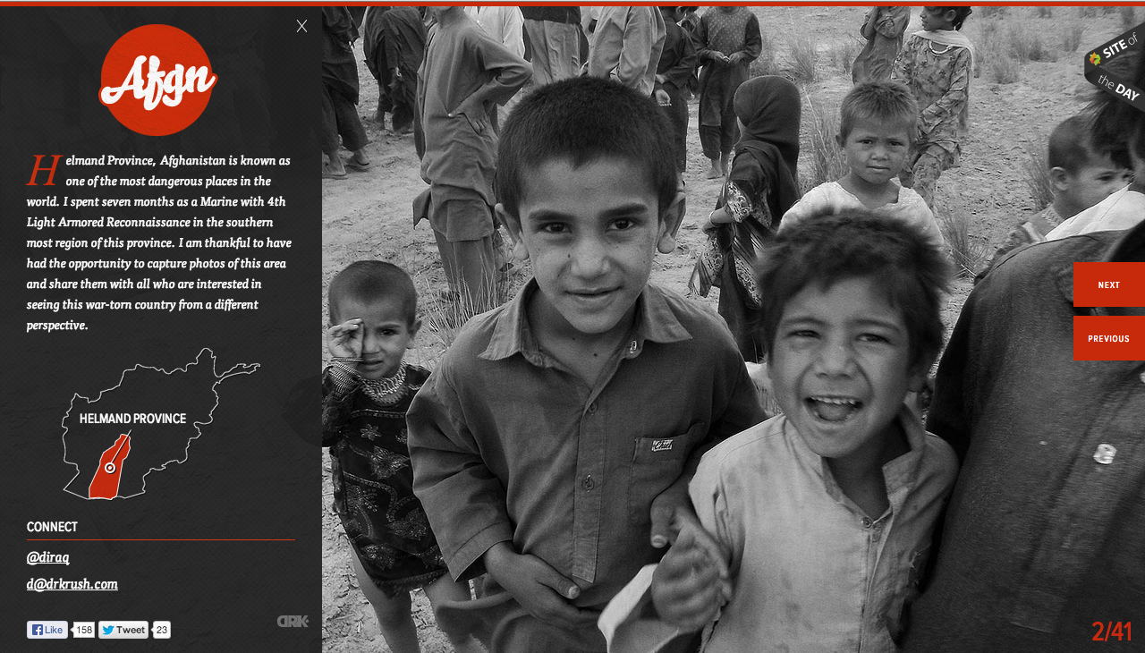
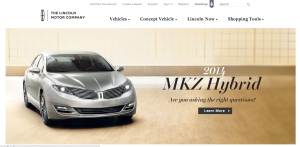
As a brand, Lincoln is known for class, prestige, and luxury. Their website perfectly reflects this image through various techniques. In terms of figure and ground, the picture is set against a white background, and the color scheme of the picture allows the juxtaposition of the picture on the background to be less harsh. Furthermore, the black headers are clearly visible.

In terms of proximity and alignment, the Lincoln all-caps font and logo are present for a wordmark effect, and the font used on the site maintains the image of elegance. The new car within the picture is clearly the newest, best design, and the italicized and bold font help show that it exemplifies the brand while still displaying an aggressive feeling as it bursts into the car market.

In terms of continuation, the website flows very smoothly. This is due to the color scheme, the way the fonts work together, and how those two things are complemented by the picture that was chosen for the new car model.

For visual heirarchy, navigation links are present all along the top of the page. Following the “Z” formation, the reader’s eye hits the left-aligned text within the picture at the middle of the page. Although it was cut out in the screenshot for the post, the bottom of the page has further navigational links that deal with incentive plans, contacting employees, and personalized shopping.