
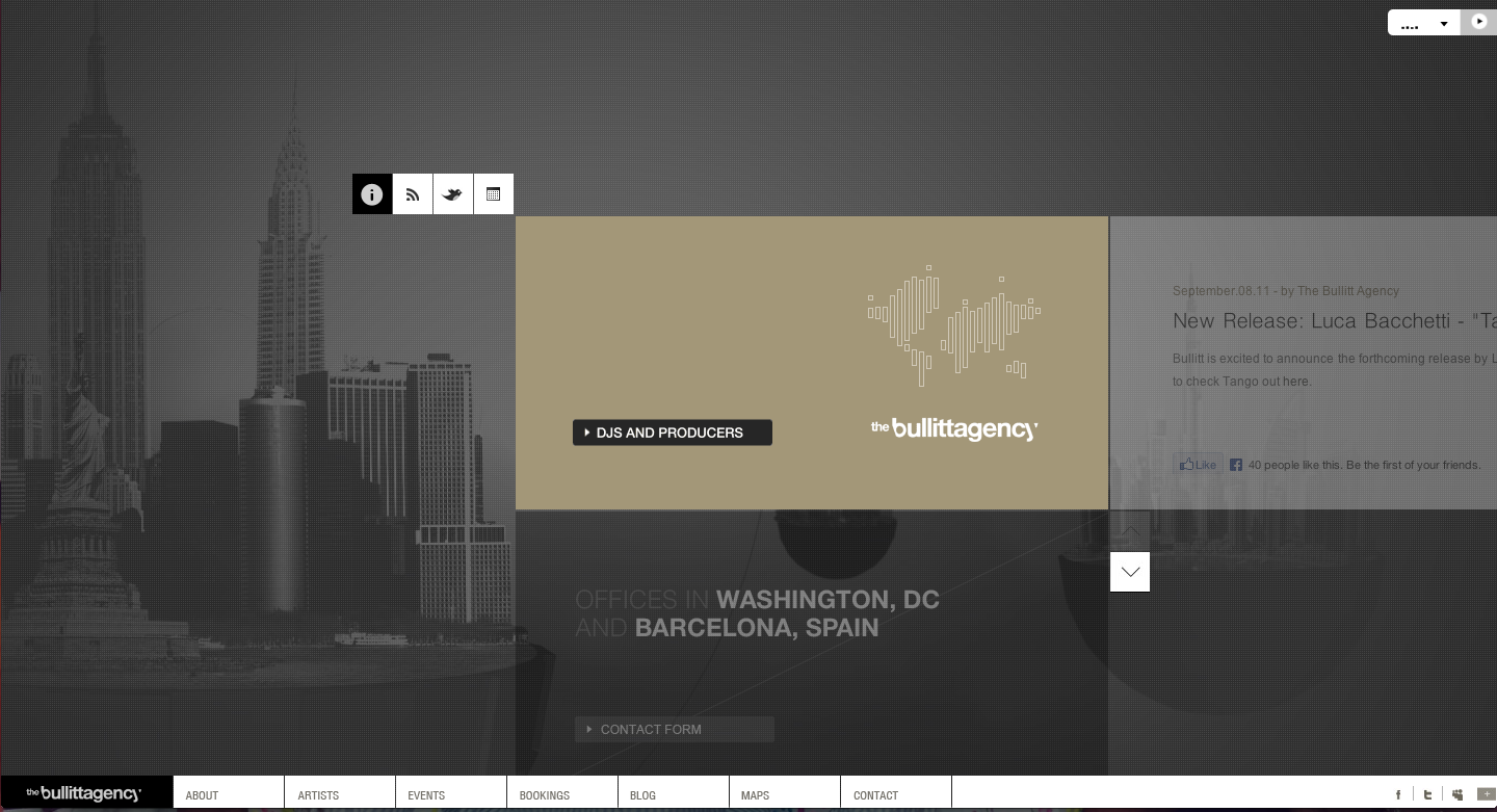
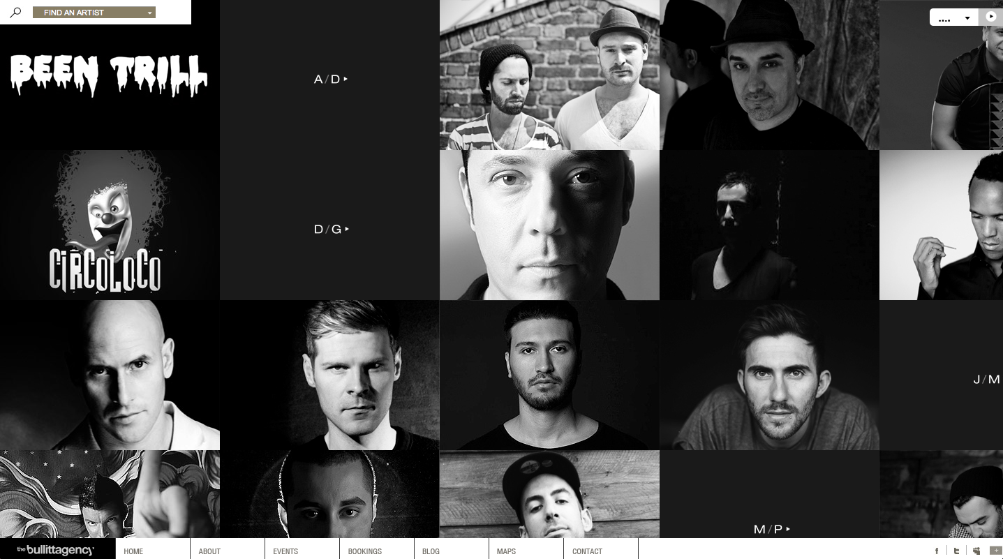
 This website design for The Bullitt Agency is really intriguing. First off the home page is visually appealing with plain but contrasting colors. The background is photographs of different cities, representing their global presence. On all the pages, when you hover your mouse over a box it changes appearance giving more information or presenting a different image. Also, the page with the artists and events shows a picture instead of just text, which gives a visual, something that viewers like to see to make a connection. The colors throughout the site are very simple, but it relates to the agency for DJs and Producers, a technologically based company, which the colors mirror. They also have a tab to their blog which is very helpful to viewers. Also, as you move your mouse over the page the page interactively moves with you, which is interesting because it shows that there’s more on the page than the eye can see.
Category Archives: Posts
Website – Roger Vivier
![]()
Roger Vivier’s website is one of my favorite website. As a fashion website, its very clean and elegant designed. The first page pop up is just its brand name in deep cherry pink in a white background. The wordmark is very elegant and classic which serves well as a fashion brand. The design makes people remember its brand at the first instant.
After choosing the language the customers would like to use, it pops up a funny cartoon video, which is also in red and black. People can choose to skip or watch the video. It attracts the eyeballs but not annoying (because you can just skip it) as well.
After that, you can see the homepage. The website has clear toolbars on the top including news, stores etc. You can find product information, location information, event information very easily just by clicking the titles. All the pages have either videos to help understand and explain the content or 3D cartoons to arouse customer’s interests. It also has some puzzle games to have fun on their website.
Some people complain they cannot shop on RV’s official website. However, personally I believe as a company’s official website, its main function to be promote the brand, introduce the products successfully and arouse customers’ interests. It serves very well. Once the customers have interests in it, they will always find their ways to buy products. This romantic, clean and elegant website is really good to visit.
Interaction is key
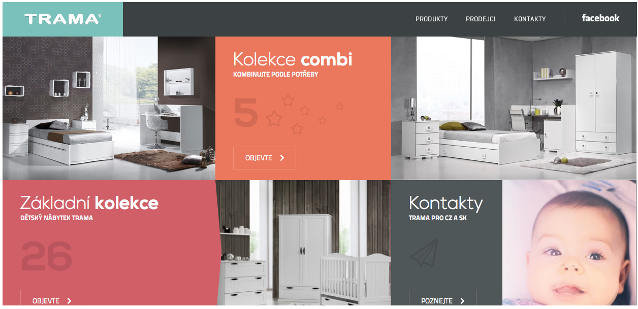

The reason that I chose this website was because even though it is in a different language, it easy really simple to navgate. I was initially drawn to the home page which contained a combination of moving visuals, pictures, and automatic videos. The baby in the bottom left of the home screen is actually in motion when you visit the site. Another aspect that I liked was the color scheme through out the entire website. The organization deals with children, and because of this I felt that the warm colors that were used were appropriate. One of my favorite things about the website overall was the way it allows you to interact with everything on the screen. The hexagons above all twist and reveal a bigger part of the image when you hover over them with your mouse. The website is very interactive and makes it fun to navigate through all of the pages because you never know what is going to happen next. Overall I feel as if this website gets the point across with easy to read type, encompasses a personality of its own, and keeps the viewer interested at all times.
Website Design
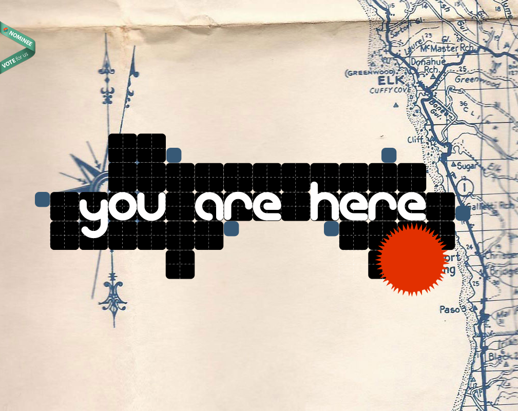
I was immediately attracted to this design because of it’s creative feel. Some of the other websites that I visited were very creative, but also slightly overwhelming. This one clearly features a map in the background that helps the viewer makes sense of the “you are here” graphic. A small critique–the menu did not show up until one scrolls down on the page, and then it is apparent. It was a little confusing at first. But it was also nice that when I did click on one of the menu options, it scrolled down to the section of the screen that corresponded with the menu item. It didn’t open a new page. All of the content is essentially on one really long page. The typeface was also a nice choice to contribute to the creative feel of the website.
Illustrator

This strawberry would be very easy to make in illustrator by mainly utilizing the pen tool. First, I would create an ellipsis then drag down the bottom anchor point to create a more strawberry-esque shape. Then I would drag down the top anchor point to flatten the top. Then I would fill the shape with a red color. To make the seeds, I would create a smaller ellipsis then copy and paste the shape all over the strawberry. Then I would have to select portions of the strawberry to adjust the gradient to create the shadow that it has. In addition, I would use the pencil tool to draw the shape of the chocolate dripping off of the strawberry. Then using the ellipsis shape tool I could drag the anchor points to create the stem/leaves of the strawberry. Afterwards, I would use the pen tool to draw the shape for the stem of the strawberry.
Illustrator

This image would be fairly easy to complete in Illustrator. The woman’s face can be used with the pen tool and making curved vectors and making sure that it’s not exactly perfect so it comes out slightly abstract. These curved vectors can be used for all part of the face. Even the shadows on her face can be made with the pen tool. Her hair can be made with drawing curved lines. The color in her lips and eyes can be used with the paintbucket tool and the color in her hair along with the color in the back are all used with the pen tool and making vectors. The very background color could be made with the shape tool. The colors’ opacity has been altered and the vector shapes overlapped to get a more abstract look.
Adobe Illustrator

This image was most likely done in Adobe Illustrator using primarily the pen, paint bucket, and text tool. The designer most likely used the shape tool to draw a rectangle for the background and then filled the shape in with blue using the color tool. The the designer probably used the text tool to write D’OH! in white. Having completed the backdrop the designer then probably used the pen tool to draw the outline of Homer and used the color tool to fill in the different sections of his face and upper body. The pen tool was also most likely used to create the details within the outline like his hair, eyes, shirt, etc. This image is simple yet conveys emotion very well and is a great representation of Homer Simpson.
Illustrator Drawing
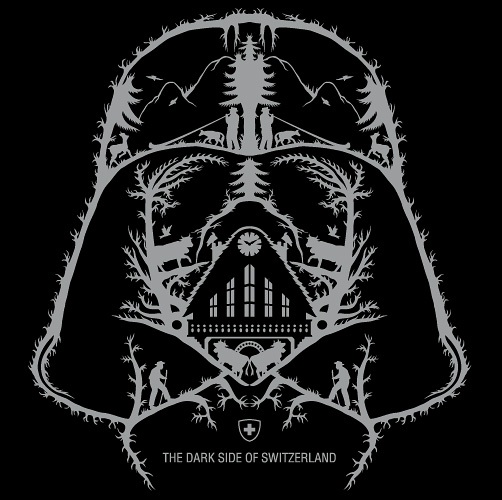
What intrigues me about this image is it’s simplicity, but it’s ability to still send a concise and direct message. I can imagine that this image was made simply by tracing over an image of Darth Vader with paper and pencil and scanning it into Adone Illustrator. Then using the pen tool, the artist can easily draw over the image and add the additional details to Darth Vader’s face. Once the image is complete, it would simply be a matter of chanjng the pen’s color to grey and adding whatever text is needed at the bottom. The logo could simply be added by drawing it with the pen tool in a grey color scheme. With those simple tools, the image is completed and sends a clean, concise message.
Adobe Illustrator

This is a piece of art that was created in Adobe Illustrator. From my perspective, I believe that this image was created with the pen tool. It particularly catches my attention because the lines are not straight, but curved to give off the idea that this image was hand drawn. Furthermore, the use of the black background makes the other three colors of the image pop to the viewer. Overall, this image is extremely well done.
Week 5 Illustrator
 This image looks like it used both the pen and circle tools to create this flower, with a lot of gradient coloring used to fill it in. the color swatch palette might have been used in the center of the flower. The leaves and flower petals look to have a yellow stroke around them to to separate the flower from the white space. The image can be completed in illustrator, But coloring looks lIke it can be done in Photoshop as well.