Logo

In my first draft of my resume, I used this as my watermark, but it was considered too logo-like. So I would possibly use this for my logo. I really like monograms and this is a good representation of myself because its bright and its my handwriting.

Screen Shot 2013-10-28 at 11.36.06 AM

Logo

Scan 1


At first I came up with this generic logo, but I didn’t like it because it had no character and seemed like a boring micro processing company logo. Then I came up with this….

Scan


There were many different drafts of my logo before I finally came to this one. I tried to incorporate the A of my last name into the C of my first name and I came up with this cool, colorful, and fun shape. I plan to make this on illustrator and incorporate it into future projects or business cards.

LOGO

logoBefore sketching my logo I first thought about what I wanted it to communicate. I’ve always loved to travel and would like to do PR for company or organization that works internationally. I thought the perfect symbol to represent my love for travel and work goal would be a globe. I realized that if I made my last initial wide enough it could work as both a globe and G. I then noticed that by simply adding a line in front of the globe I would also represent my first initial.

Logo

024


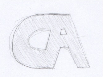
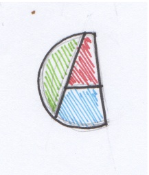
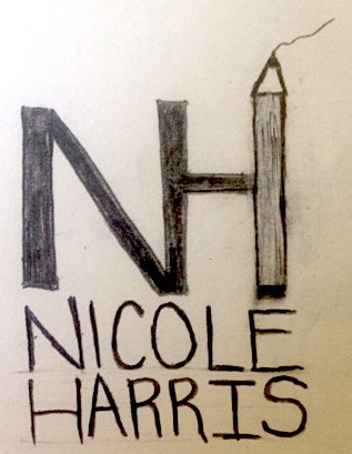
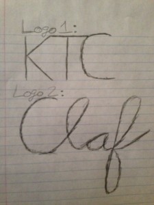
My thought process behind my logos were that I wanted them to be simple, yet grab attention.  In my first logo, I made it similar to the fast food chain KFC because I thought people would look at the logo, realize it is not KFC and be curious to see what this new brand is.  The three letters stand for the initials of my name and I connected them all to create fluid motion between letters.

For my second logo, I cut my last name in half and drew it in cursive.  The cursive font gives the logo a level of elegance and high quality.  It is short and sweet and depicts myself in a manner that would impress others.

Logo

logo

I wanted to keep my logo very simple so I decided to work with just the “O” from my first name and the ‘A’ from my last name. After looking at the letter for a while i realized that I could over lap the letters and have part of the O be the middle stem of the A.

Logo Design

logo

The font used for this logo is “Segoe Script”. I personally think that my initials and my name is boring, so I wasn’t able to use any images or variations of my initials to be creative, so I instead decided to use one “C” for my first and last name while doing an outer glow (softer stroke) of a different color to differentiate my middle initial from my first and last name. I hope that this handwritten font would give off the impression that I’m personable and maybe even flexible, rather than using a computer generated serif. I used the drop shadow feature in Photoshop to give the entire logo dimensionality.

Logo

I have already designed my personal logo in the resume project. I want like to keep it very simple and recognized. The simplest design is the best design. I put the first letter of my first name and surname, “n” and “d” together. I tired different combination of these two letters like “ND”,”nd”,”nD” etc. At the end, I choose the combination of “nD”.

logo

Personal Logo

photo(1)

Since the my initials (N and H) both have long straight edges, I decided to combine them so one side of each letter is connected. In my logo, you can easily distinguish between the N and the H but still see them as one unit visually. I wanted to incorporate a symbol of writing in my logo, since I’m majoring in magazine journalism. I made the other edge of the H into a pencil. The squiggly line coming out of the tip makes the pencil look like it’s writing. I also wrote out my name underneath the design, aligning each letter since my first and last name form a true perfect and both have 6 letters.

logo

photo

To create my logo I used my initials and the image of a pencil, because I like to write (and my major is magazine). Had I used a computer, I would have probably made the “h” out of a bullet shell instead (because I want to be a war correspondent).

Personal Logo

Mike Logo


What I enjoy about the logo I created is that it’s simple, yet different; I feel like the use of this text allows me to create a feeling of individuality and creativity in my logo, but convery a sense of professionalism.