Category Archives: Resume
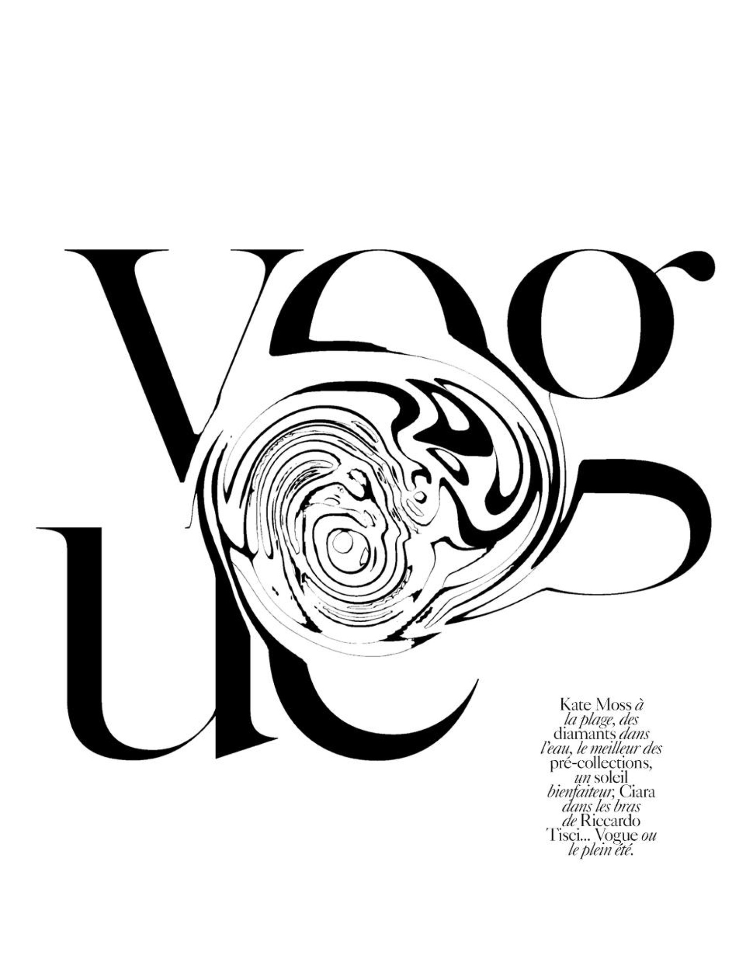
This a page from Vogue Paris and I selected it because of it’s simplicity and boldness. There isn’t much done to the letters, they are plain black and read as they typically do in Vogue, however my swirling even just part of every letter a completely new image is created. I also like that despite the fact that you can’t quite make out that the “E” is an “E” and the other letters are obscured as well, a person is still completely able to tell that this is vogue. A person may have more freedom when it comes to altering something as well known and legendary as Vogue because pretty much no matter what you do to it, people know the name well enough that they will still know it as vogue. I also like that while yes, this is a type of wordmark (kind of), it is strong enough to stand on its own as a graphic as well.
Typography
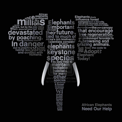
I really like this poster because it uses typography to be informational for a good cause. I think the sans serif typeface was ideal because it makes each word fit its place better. I also think the strategic sizing of different words help to spread more information at first look. It is very clear that the picture is of an elephant. But with ‘elephants’, ‘poaching’, ‘in danger’ and ‘millions’ all written in large letters its very clear what this poster is suggesting that we do. I find this poster to be very creative and effective.
Bicycle Typography
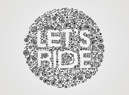
I love that this designer thought to use negative space to form the type. The doodle-like illustrations surrounding the letters give it a playful, childlike feel. Riding your bike has an element of a youthful mentality, and I think this typography executes that very well with the illustrations of children. It’s hard to notice at first, but there’s phrases like, “I want to ride my bike” and “Ride Bike” in small serif type. It’s interesting that the designer included type within the typography, but it works because there’s a contrast between the white and black.
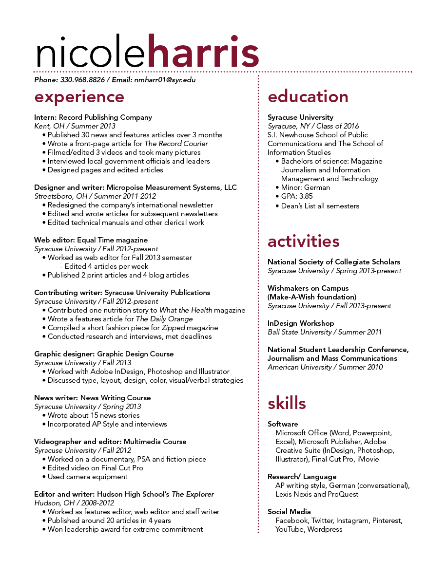
Resume
Nan Ding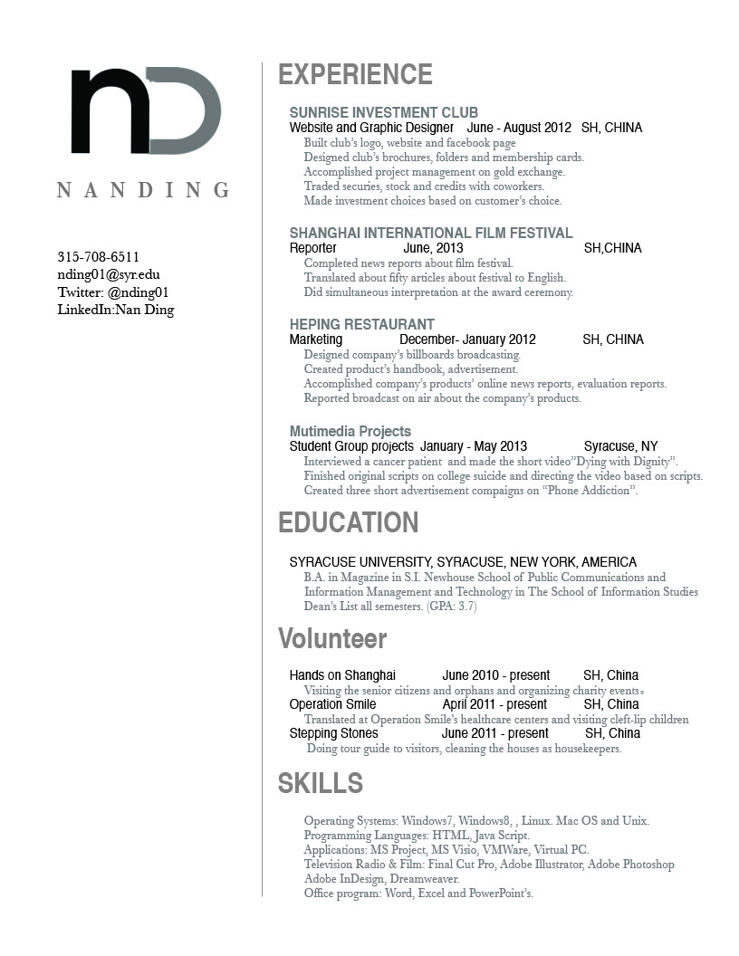
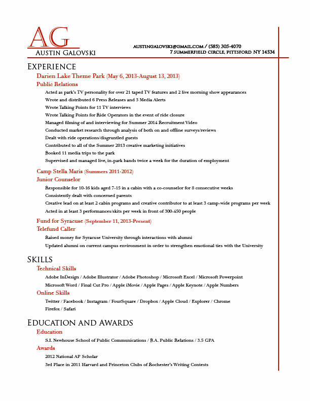
Galovski Resume
Resume Project