Photos in Web Design

Screen Shot 2013-10-18 at 10.40.58 PM

Screen Shot 2013-10-18 at 10.41.07 PM

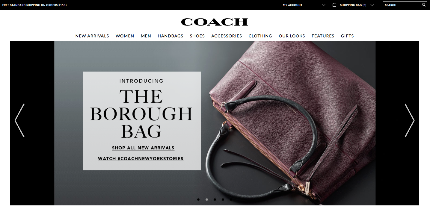
The Coach website relies on photographs to display the products and create visual appeal. The home page is basically a collage of many different photographs. The top photograph, which fits the width of the page, advertises a new or popular product. The colors are warm and neutral, which makes the photo stand out of the page and draws the eye. Since the photo consists of many colors and patterns, black text is placed in a semi-transparent cream-colored textbook to ensure the text can easily be seen and read. The photograph also balances the page because the text box and woman are placed in the correct locations in accordance with the rule of thirds.

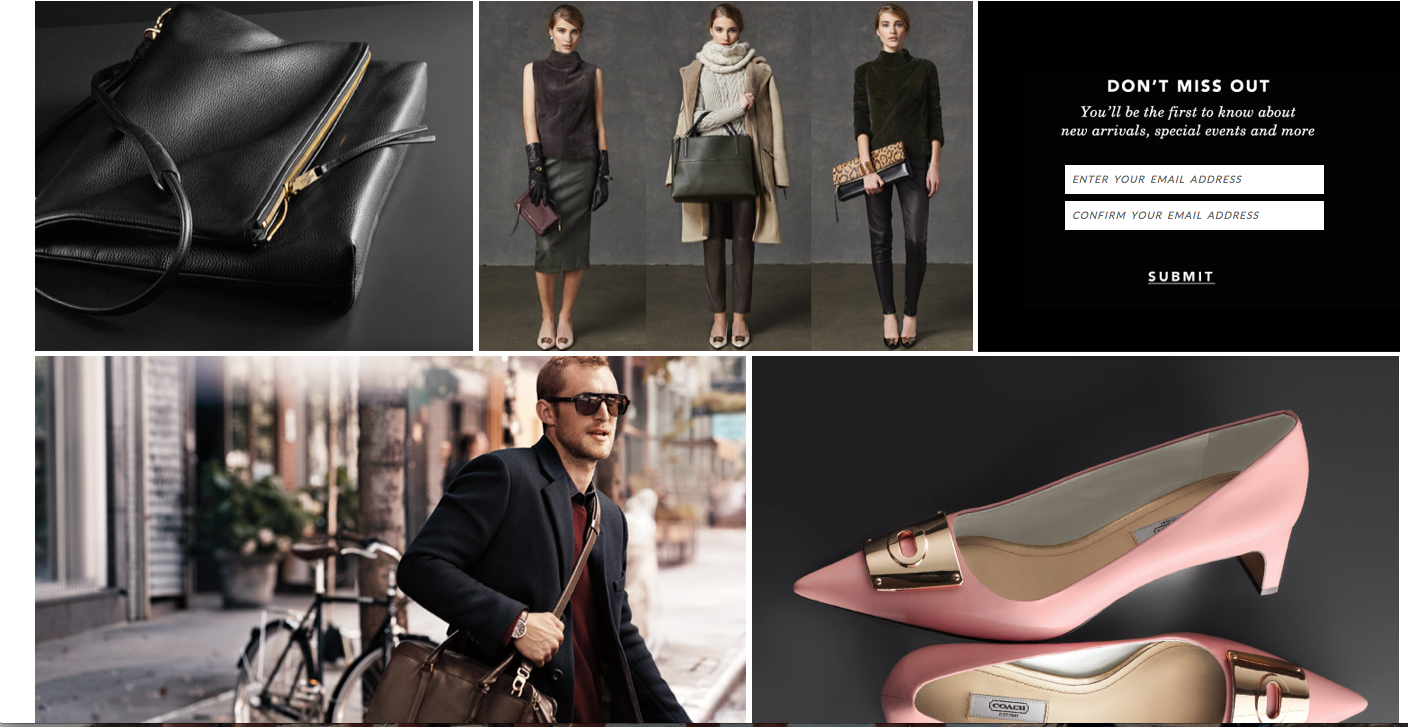
Under the large main photograph are other photos placed in a collage-like way with thin white borders between them. The color scheme of these photos is the same as the color scheme of the main photo, which creates connection and visual appeal. Lack of text ensures that the site looks pretty and simple instead of overwhelming.

The target audience of the website is women with enough money to buy expensive handbags, shoes, accessories, etc. The designer chose these images because they display the products and also show the class and sophistication of the brand with darker lighting, neutral colors and simplicity. The photos work together with all of the other elements on the page to create a sense of unity.

Website photography

Screen Shot 2013-10-20 at 5.20.48 PM

Toms is a company that sells shoes. However, they are unique in the fact that with every product that is purchased, TOMS helps one person in need – their one for one movement. The photography that’s used on their site for the One for One homepage is very effective. It is showing three young kids laughing and smiling that seem to not be in a wealthy society. But even still their happy, which portrays the image that the One for One mission brings kids in need happiness. This creates sympathy and shows people that they should buy Toms products to give back and help others. The colors are incorporated throughout the page, the orange in the header and text, the blue and green for the fill of text boxes. The colors of the photograph itself are cohesive and is an aesthetically pleasing image to look at. Warmer colors are easier to look at – the color palette of this photograph. This creates a cohesiveness throughout the page. It is also on the top portion of the page which immediately draws the eye in.

Week 8 Post: Photo

Screen shot 2013-10-06 at 10.25.58 PM


For this week’s post, I decided to use the Smucker’s webpage again because it has such wonderful photos. All of the photos on this page have a center of interest, they are clear with vivid colors, and they display what Smucker’s is all about. These photos show that Smucker’s is a family oriented company and that their products are meant to bring families together. The designer chose these photos because they most likely attract the attention of family oriented mothers and fathers with young children. The photos aren’t necessarily the lightest, however, the white font is readable against the photo and adds some contrast to the image and page.

Website Photography

Screen Shot 2013-10-17 at 7.41.05 PM


This screenshot is from a portfolio website of Jim Ramsden. His home page features this picture of himself, and then the silhouette of his picture with imposed pictures in the background. It works well as his home page picture. 1. His tagline is “logically minded, creative at heart.” Instead of just telling his audience this, he shows it through his picture and creatively adding the pictures in his silhouettes. 2. He positioned himself well with his eyes leading the audience down to his name. 3. It is clean cut and professional so any possible employers looking at his portfolio would be more apt to look further into this experience and talent. 4. The two images that he chose to fill his silhouettes seem to juxtapose east coast and west coast which gives a hint into his career, interests and personalities.

Website Photography

Screen shot 2013-10-17 at 1.30.26 PMI chose spalding as a representation of a website with good photography because there home page caught my attention with all of the differnet pictures that it displayed. The photograph above is one in a set of images that rotate on the home page. I took a screen shot of this image in particular because I feel like it grabs the viewers attention from the start. The concrast between the man’s body and the background gives the image an over all feeling of accomplishment. It makes it seem as if the man is workign really hard to achieve some aspect of physical fitness. The light highlights his athletic features which is what spalding is about. The photograph effectively communicates to the viewers that Spalding is an athletic company, and targets viewers who are into physical fitness or sports. I feel like the designer chose this image because it is general enough to make the viewer understand the object of the website, but not so specific that the viewer may think the website is for a specific sport. The picture adds depth to the website’s overall design by giving it a casual/determined tone which is what the target audience is looking for.


Gestalt Principles

Screen Shot 2013-10-11 at 8.34.43 PM

The apparel website Billabong shows the qualities of the gestalt principles, and how the site is organized with visual elements.

  • figure and ground: The image in the background makes the text in the foreground stand out. The background is muted colored images, providing a strong contrast with the bold white text over it.
  • proximity and alignment: The same font, color, and alignment are used to create unity. This sans serif all caps text creates cohesiveness, and isn’t overwhelming because it is a simple font.
  • continuation: The line of larger text, also in line with the logo, creates the first line for the eye to follow. The line of text underneath, in the smaller font, provides a second line to follow.
  • visual hierarchy: The two lines as stated previously show readers the order of what is important. The larger words, MENS and WOMENS, show the main categories that the website is organized by. Underneath these words, in the smaller font, show the subcategories of the words in larger font. These provide a breakdown to follow after you have decided to focus on the MENS or WOMENS category.

Gestalt Site Post

supreme store


The Supreme online store uses a great deal of the gestalt strategy to attract the eye of the viewer; for instance the use of Visual Hierarchy is apparent in the placement of the brand over the main menu, as the brand is bolded and surrounded by red. The rest of the menu uses a plain black, san serif font indefinitely separating the menu from the brand logo. The use of figure (logo) to the white background also creates a sense of attraction from the viewers eye to the text.

Gestalt

Screen shot 2013-10-10 at 11.15.19 AMScreen shot 2013-10-11 at 11.16.02 PM

  • figure and ground: The company’s products stand out very clearly from the background. By making the background black and white the color of the products really pop out at the viewer.
  • proximity and alignment: Black and white are the only two colors used for the website’s typefaces. The majority of the site is in San Serif however the name of the site and some of the titles use different typefaces to draw attention to certain words.
  • continuation:  All of the different product categories are listed on one line below the title. Any other pertinent information is in a line on the top right and all the social media is in a line on the bottom left corner.
  • visual hierarchy:  Lulu’s website does a good job at this. Any words that are in white and on a black background are links and will connect you to a different page. The home page goes through a slide show of different images,  the type paired with a image is significantly bigger than the type on the rest of the site. This draws your attention to the middle of the page and to the collections they are trying to sell.

Apple – Web Design

屏幕快照 2013-10-11 下午11.06.43

Apple’s website is one of the best websites.

First of all, apple use the color dark grey and silver as its main color in the web design. The color looks similar to black and white, which is the best contract color. However, grey and silver comforts people’s eyes. And also, when introducing products, Apple always uses big and high-definition pictures that usually occupy the whole page. It makes the object stands out easily. Besides, apple products are usually in black, white or silver. These three color are easily stand out on a white web page.

Secondly, all the pages are applied the same font- myriad, the similar color – grey, white and silver and the same alignment. Apple website makes a good example of consistency and proximity.

Besides, apple also gives good example of visual hierarchy. The toolbar on the top is in grey. It’s not annoying or attract too much information while still gives its own function – navigate the users to different pages they want. They always put the big pictures of the latest product the company wants to advertise or promote on the particular pages. No other pictures will be bigger. It clearly attracts customer’s attention and would be distracted.

Gestalt Principles

Screen Shot 2013-10-10 at 11.11.10 PM

Screen Shot 2013-10-11 at 7.42.04 PM

Screen Shot 2013-10-11 at 8.27.43 PM

The website I chose was Asos, an online fashion store. The website design relies on simplicity and a black/white color scheme, and incorporates gestalt principles.

Figure and ground: Asos uses simple black text, which stands out against the white background. Occasionally, white text is placed against a colored background, such as red or white, to make the text pop.

Proximity and alignment: A clean, round sans-serif font is used throughout the website. The typeface is the same as that of the Asos wordmark. All of the text is aligned to the left. Almost all of the type is black against a white background.

Continuation: Two drop down menus (“women” and “men”) display different types of clothing that people can shop for. Also, news is placed in a sidebar down the right side of the home page, and also in a horizontal box along the bottom of the page. The viewer of the website can scroll down to access more content.

Visual hierarchy: The headlines are bolded and capitalized, which shows dominance over the body text, which uses a lighter weight and a mix of caps/lower case letters. Although most of the website uses black text over a white background, important content uses white text over a red or colored background. Also, key information is much larger on the page.­­­