Screen shot 2013-10-11 at 6.16.26 PM

  • figure and ground: The zerbra style shoes work both in tandem with the backround while seperating itself from it with the contrasting colors. The backround is displayed as soft earthy colors of the sahara while the vibrant black and white stripes help the shoes to stand out.
  • proximity and alignment: The same font to advertise the shoes is used in the adiadas logo. They are the same lower case typeface and it makes for them to really work well together
  • continuation: The layout of the entire page looks like animals on a safari. The shoes are zebras and look as if they are just standing in the grass with some of it even surrounding the sole of the shoe.
  • visual hierarchy: The stripes of a zebras make them stand out in the wild and the same rule applies to these shoes. they make the shoes the largest thing in the screen compared to a tree in the background to help them stand out. The shoes take up most of the space of the screen.

Gestalt: Walt Disney World

Screen shot 2013-10-11 at 11.58.22 AM


Figure and Ground: The Disney World website establishes differences between the blue background and the links for Disney Princesses, special events, etc. It makes the links stand out by giving them a vivid picture surrounded by a white background that makes it pop. The links at the top also stand out against the white background.

Proximity and alignment: The same font and color is used throughout the entire website. It is mainly a white background with blue accents to stick to Disney’s main colors usually displayed in their logo. The font also comes in many different forms. As seen on this page, it has a bold type and a light or regular type.

Continuation: The headers on the top of the page consist of drop down menus with many different options. The links in the middle of the page also suggest a drop down menu as they have a downward arrow positioned next to them.

Visual Hierarchy: On this page, the designer uses the images to create visual hierarchy and distinguish which links are more important than others. They also include the white boarders around the “All Parks & Resorts” link against the blue background to reiterate which links are more important on the page.

Gestalt Blog Post

gra 217 blog


Our own Syracuse University website is a great example of the gestalt principle.  First, every important header on the website is the color orange, the school’s main color.  Second, all of the headers match in font type and the subtext under each header is consistent throughout the entire page.  Third, the constantly change picture at the top of the page takes up a large space in order to attract the attention of the viewer.  Lastly, the video link is placed in the center for interactive use with the viewer for the purpose of truly giving him or her a full perspective on Syracuse University.

Gestalt

Screen Shot 2013-10-10 at 11.30.55 AM


The website I chose is: http://janfinnesand.com/project/oslo-artistformidling. This website caught my eye because of the clean design without having a lot of white space.

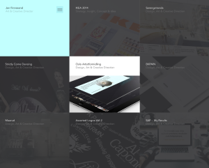
Figure and Background: The background on the home page shown above is technically non-existent. Instead, all of the menu items make up the background. When you roll over one of the boxes with your mouse to select it, it turns to full color, like the middle box in the image above. When the one box is highlighted, then it is very clear that this object is standing out and the rest of the boxes that are in grayscale become the background.

Proximity and Alignment/Continuation: The alignment used in this website is very precise. All of the boxes are aligned in a grid on the page to help the user navigate the website. When one of the items are clicked on, the new page shows this menu bar:

Screen Shot 2013-10-10 at 11.45.05 AM

The design of the menu bar helps create unity within the site. Also, when you roll over the above home menu bar, another one scrolls down:

Screen Shot 2013-10-10 at 11.46.38 AM


The repetition of the strong alignment and color scheme help make the website distinct.

Visual Hierarchy: In this website, the colors drive the visual hierarchy. Because all of the boxes are the same size, the website relies on the colors changing when a user rolls over the item to guide the user around the page.


Web Design: Smucker’s

Screen shot 2013-10-06 at 10.25.17 PMScreen shot 2013-10-06 at 10.25.41 PMScreen shot 2013-10-06 at 10.25.58 PMScreen shot 2013-10-06 at 10.26.22 PM


I personally love Smucker’s web design. They use a lot of colors and stick to a certain theme by incorporating a lot of pictures that have to do with each section of the website. I love how on the home page, as you scroll down the page it tells you Smucker’s mission and what they are truly about. It incorporates beautiful pictures of fruits and and foods that you can make with their products. This web design also gives off a happy feeling making you want to explore the website even more, essentially becoming more aware of the company and their products, which could lead to purchasing the product. This website gives me a lot of ideas that I could use in my web design.

Nike Website

Screen shot 2013-10-06 at 9.23.11 PM

The Nike Website is very eye grabbing with its rotating screens to preview its products on the site. The Layout is very clean and the tabs are clearly written out without having to search for them. The absence of space and use of vibrant colors helps to make the products stand out even more to the point where you want to click on it to get more information about it. I think Nike did a very good job with the overall layout of this website and its attention to detail.

Blog Post: Website

gra 217 blog


I truly enjoy this website for several reasons.  The rotating images from all their different product lines initially grabs the viewer’s attention.  Second, it uses images all throughout the entire page instead of words to depict their products in use.  It’s black background contrasts well with the red colors.  Overall, this is a well designed website that allows viewer’s to scroll through very easily.

Website Design

Screen Shot 2013-10-04 at 5.13.22 PM

The website I chose was for Miagui Imagevertising, which creates images for advertising. The first thing that drew me to the homepage was its ease and simplicity. The picture of the tractor takes up the entire screen, and the unique perspective and warm, vibrant colors draw you in. Since Miagui specializes in creating images, it is very fitting that the home page of its website relies entirely on images. The white sans-serif text looks clean, fresh and natural across the photo. The only problem I see with it is that some words in the navigation bar (like “contact”) are hard to read against the background. The title of the website, Miagui, stands out in the upper left-hand corner. However, the eye is initially drawn to the featured item, Massey Ferguson Tractors, and the viewer of the site can easily click on the red button to learn more about the project. This feature, combined with the navigation bar, demonstrates the ease of navigation. The menu bar is clean and simple. When you visit a different page, the title in the menu bar switches from white to red. When you scroll down on the homepage, more information about the company appears. This information also relies heavily on images, and includes links to different sections of the website. I also like how the red Miagui color is consistent throughout the website, as shown in the “About” page below. My favorite page on the website is the “work” page (shown below), which is basically a showcase of images created by Miagui. People can scroll down the page to load more images. The design of this page is creative, functional and appealing.

Screen Shot 2013-10-04 at 5.13.39 PM

Screen Shot 2013-10-04 at 5.38.13 PM


Web Design

gra screencap

https://www.fruute.com/

I think the deisgner of this website did a great job of utilizing white space in order to make the viewer pay attention to the main content in the center of the page. They utilized great images of their deserts to be sure to show great details in the foods. Because of the use of the white background, the designer was able to use pops of pastel colors without being overwhelming or annoying (as most pastels can be, in my opinion). I feel that the use of simple fonts allows our attention to once again be able to drift to the photos of the deserts and makes us more inclined to click on them.

Blog Post: Website

LV WEBPAGE


What I found interesting about Louis Vuitton’s webpage design was how convenient it was to the viewer’s eye. The designer uses white space to separate the different articles and objects on the page. In addition, they used a bold san-serif typeface to present an elegant impression of the website, alongside contrasting colors to catch the viewers attention and make it easier to read. I also liked how the rest of the page would fade out and the grey header would get more bold if you moused over a link at the top. Overall, the design works really well.