Monthly Archives: October 2013
Gestalt Principles
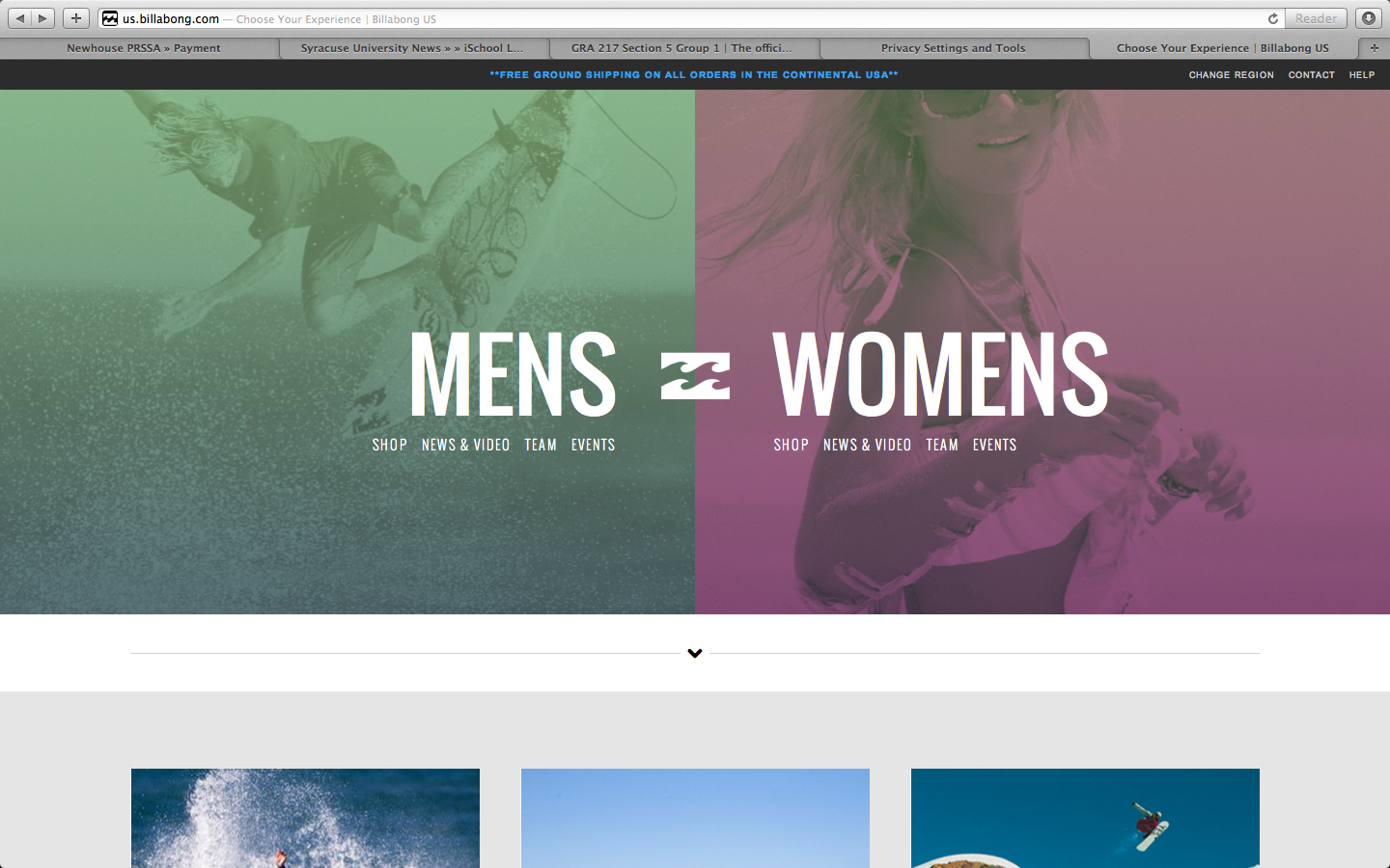
The apparel website Billabong shows the qualities of the gestalt principles, and how the site is organized with visual elements.
- figure and ground: The image in the background makes the text in the foreground stand out. The background is muted colored images, providing a strong contrast with the bold white text over it.
- proximity and alignment: The same font, color, and alignment are used to create unity. This sans serif all caps text creates cohesiveness, and isn’t overwhelming because it is a simple font.
- continuation: The line of larger text, also in line with the logo, creates the first line for the eye to follow. The line of text underneath, in the smaller font, provides a second line to follow.
- visual hierarchy: The two lines as stated previously show readers the order of what is important. The larger words, MENS and WOMENS, show the main categories that the website is organized by. Underneath these words, in the smaller font, show the subcategories of the words in larger font. These provide a breakdown to follow after you have decided to focus on the MENS or WOMENS category.
Gestalt Site Post
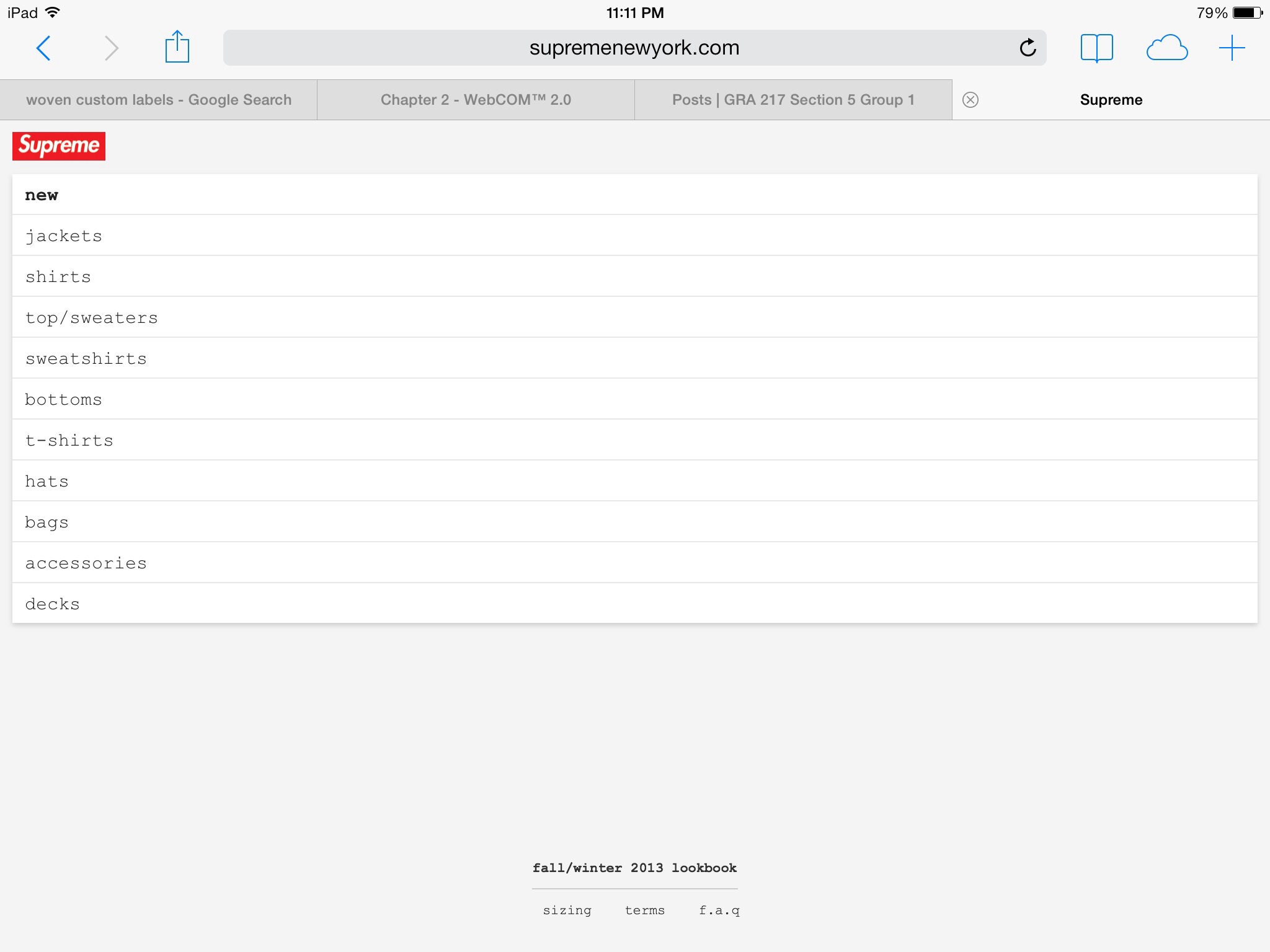
The Supreme online store uses a great deal of the gestalt strategy to attract the eye of the viewer; for instance the use of Visual Hierarchy is apparent in the placement of the brand over the main menu, as the brand is bolded and surrounded by red. The rest of the menu uses a plain black, san serif font indefinitely separating the menu from the brand logo. The use of figure (logo) to the white background also creates a sense of attraction from the viewers eye to the text.
Gestalt
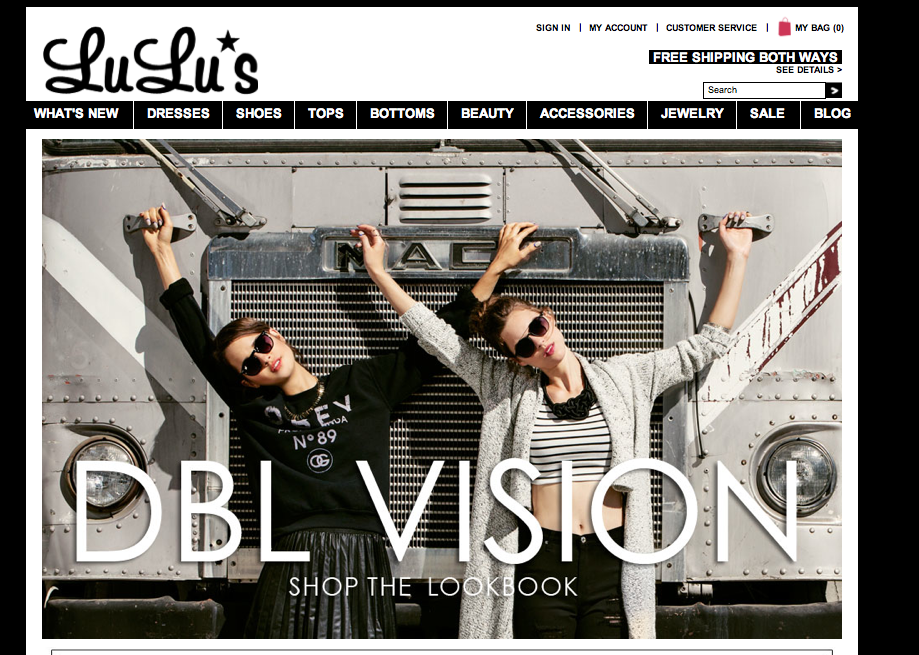
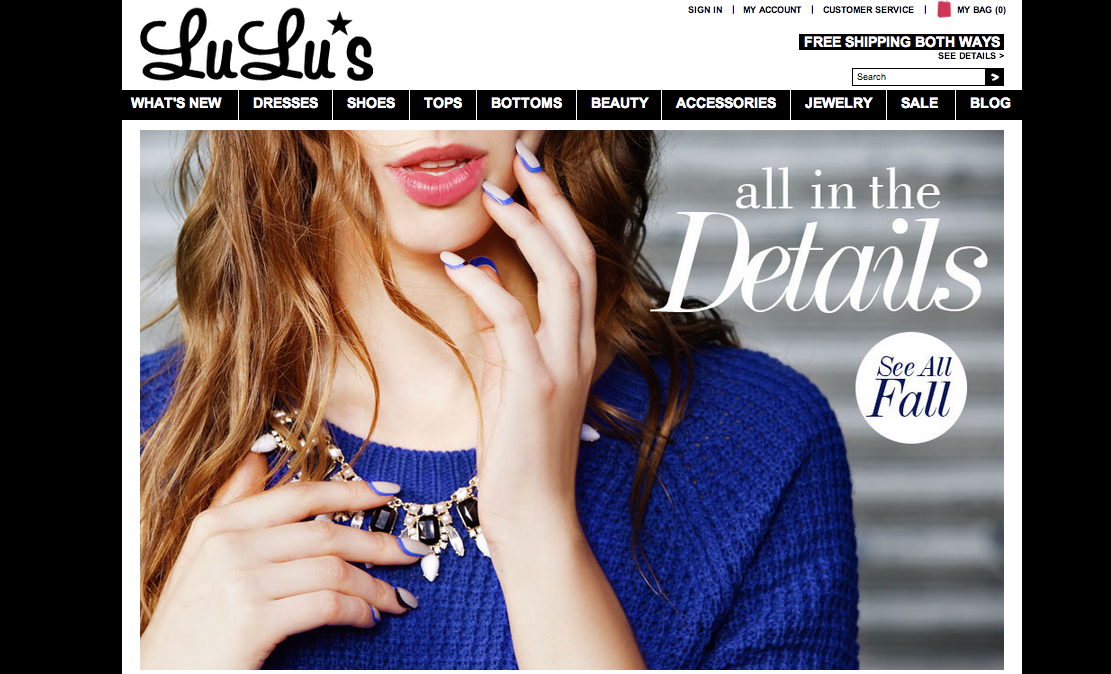
- figure and ground: The company’s products stand out very clearly from the background. By making the background black and white the color of the products really pop out at the viewer.
- proximity and alignment: Black and white are the only two colors used for the website’s typefaces. The majority of the site is in San Serif however the name of the site and some of the titles use different typefaces to draw attention to certain words.
- continuation: All of the different product categories are listed on one line below the title. Any other pertinent information is in a line on the top right and all the social media is in a line on the bottom left corner.
- visual hierarchy: Lulu’s website does a good job at this. Any words that are in white and on a black background are links and will connect you to a different page. The home page goes through a slide show of different images, the type paired with a image is significantly bigger than the type on the rest of the site. This draws your attention to the middle of the page and to the collections they are trying to sell.
Apple – Web Design
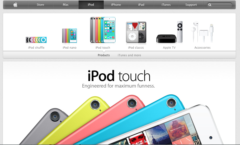
Apple’s website is one of the best websites.
First of all, apple use the color dark grey and silver as its main color in the web design. The color looks similar to black and white, which is the best contract color. However, grey and silver comforts people’s eyes. And also, when introducing products, Apple always uses big and high-definition pictures that usually occupy the whole page. It makes the object stands out easily. Besides, apple products are usually in black, white or silver. These three color are easily stand out on a white web page.
Secondly, all the pages are applied the same font- myriad, the similar color – grey, white and silver and the same alignment. Apple website makes a good example of consistency and proximity.
Besides, apple also gives good example of visual hierarchy. The toolbar on the top is in grey. It’s not annoying or attract too much information while still gives its own function – navigate the users to different pages they want. They always put the big pictures of the latest product the company wants to advertise or promote on the particular pages. No other pictures will be bigger. It clearly attracts customer’s attention and would be distracted.
Web Design Gestalt
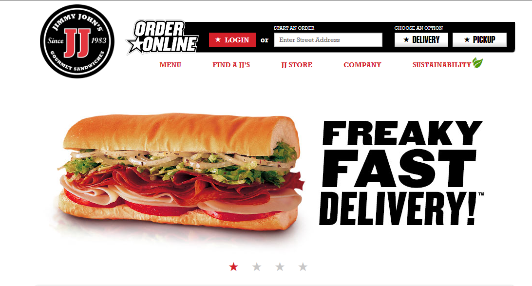
FIGURE AND BACKGROUND: The obvious figure in this case is the sandwich. The background is completely empty which lends further focus to the details of the sandwich and how delicious it looks.
PROXIMITY AND ALIGNMENT: The header, which lies next to the sandwich is in a font that carries all capitals that are thick and strong. There is a slight tilt to the right which suggests motion. These sandwiches are FAST. The menu comes in a different typeface and different color. This creates a contrast to let the viewer know exactly what each component is
CONTINUATION: There is not a lot of content on this page and the simplicity lends to the viewing pleasure. All of the information is grouped neatly at the top right corner in the information bar. To the left is the Jimmy Johns logo and then there is nothing else. Everything is tied together in one continuous form.
VISUAL HIERARCHY: The clear and dominant component of this web page is the sandwich. It dominates the scene with all of its colorful greasy and delicious detail. The web page is an advertisement for the product itself. This is the first and last thing you will see with continued glances back at it during the visual scan of the rest of the page.
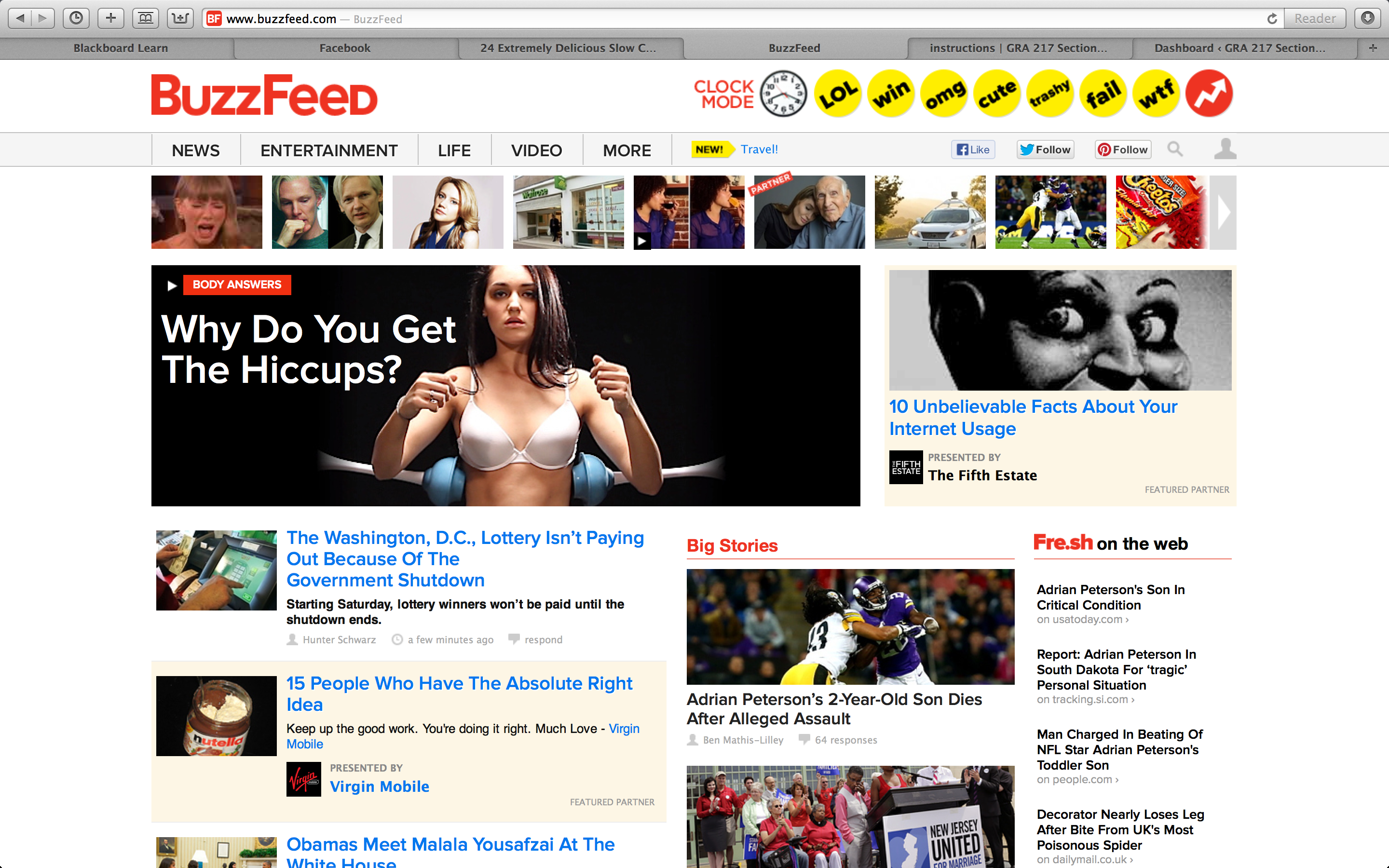
Gestalt
figure and ground: Buzzfeed uses a white background, therefore all of the objects on the page are distinct from the background and makes the page and the articles alluring to its readers. This especially true when they put the headers in red or yellow.
proximity and alignment: the same font is used throughout the whole website which creates a sense of unity, and works very effectively for this website.
continuation: Everything on the buzzfeed website is very aligned and linear. They do a great job on this idea of continuation. In my opinion, this further adds to the websites unity.
visual hierarchy: The website definitely follows the visual hierarchy principle since all the all eye catching parts of the website are on the top of the page and lead your eyes to the main and most important content of the site.
Gestalt Principles
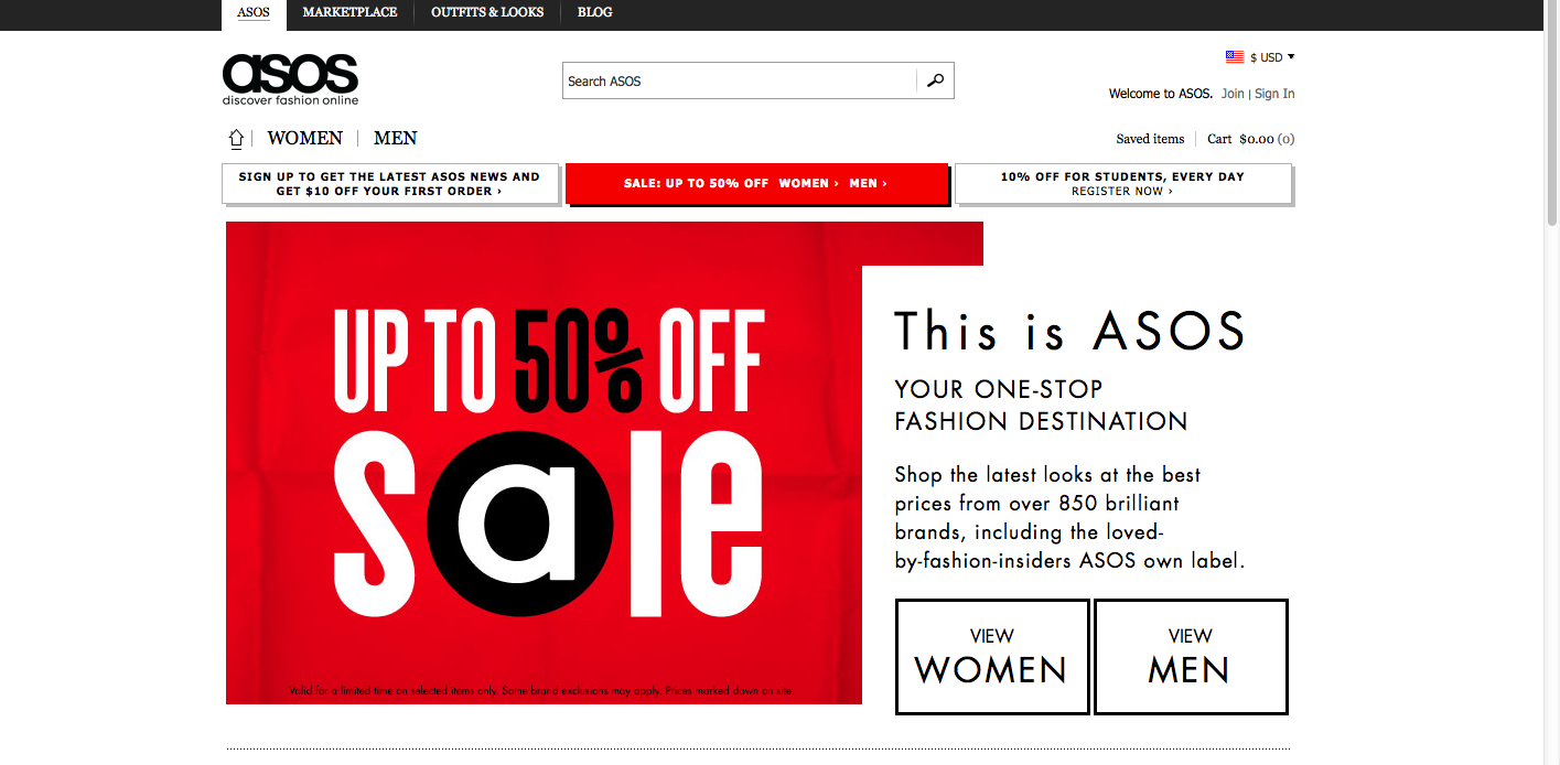

The website I chose was Asos, an online fashion store. The website design relies on simplicity and a black/white color scheme, and incorporates gestalt principles.
Figure and ground: Asos uses simple black text, which stands out against the white background. Occasionally, white text is placed against a colored background, such as red or white, to make the text pop.
Proximity and alignment: A clean, round sans-serif font is used throughout the website. The typeface is the same as that of the Asos wordmark. All of the text is aligned to the left. Almost all of the type is black against a white background.
Continuation: Two drop down menus (“women” and “men”) display different types of clothing that people can shop for. Also, news is placed in a sidebar down the right side of the home page, and also in a horizontal box along the bottom of the page. The viewer of the website can scroll down to access more content.
Visual hierarchy: The headlines are bolded and capitalized, which shows dominance over the body text, which uses a lighter weight and a mix of caps/lower case letters. Although most of the website uses black text over a white background, important content uses white text over a red or colored background. Also, key information is much larger on the page.
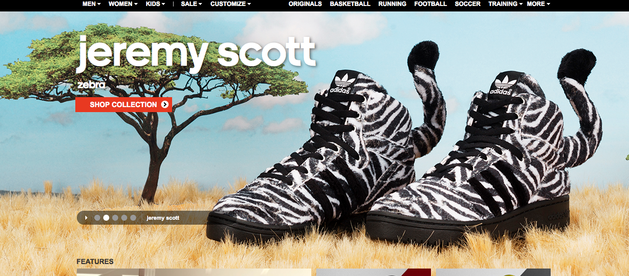
- figure and ground: The zerbra style shoes work both in tandem with the backround while seperating itself from it with the contrasting colors. The backround is displayed as soft earthy colors of the sahara while the vibrant black and white stripes help the shoes to stand out.
- proximity and alignment: The same font to advertise the shoes is used in the adiadas logo. They are the same lower case typeface and it makes for them to really work well together
- continuation: The layout of the entire page looks like animals on a safari. The shoes are zebras and look as if they are just standing in the grass with some of it even surrounding the sole of the shoe.
- visual hierarchy: The stripes of a zebras make them stand out in the wild and the same rule applies to these shoes. they make the shoes the largest thing in the screen compared to a tree in the background to help them stand out. The shoes take up most of the space of the screen.
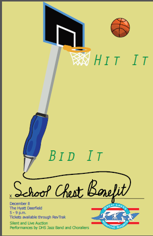
Eric Gordon Poster