The website I chose was the homepage for the brand Chanel. When you first get to the site a video plays of women walking down the catwalk wearing the brand. When you drag your cursor to the bottom of the page, however, the page changes to a regular homepage with links to direct the user to other places. I think the design of the page is effective because the brand is simple and elegant, and so is the page. Additionally, the designer used the font that chanel always uses, so even though there is no large logo on the page, it is obvious what brand’s site they’re on.
Website – Roger Vivier
Roger Vivier’s website is one of my favorite website. As a fashion website, its very clean and elegant designed. The first page pop up is just its brand name in deep cherry pink in a white background. The wordmark is very elegant and classic which serves well as a fashion brand. The design makes people remember its brand at the first instant.
After choosing the language the customers would like to use, it pops up a funny cartoon video, which is also in red and black. People can choose to skip or watch the video. It attracts the eyeballs but not annoying (because you can just skip it) as well.
After that, you can see the homepage. The website has clear toolbars on the top including news, stores etc. You can find product information, location information, event information very easily just by clicking the titles. All the pages have either videos to help understand and explain the content or 3D cartoons to arouse customer’s interests. It also has some puzzle games to have fun on their website.
Some people complain they cannot shop on RV’s official website. However, personally I believe as a company’s official website, its main function to be promote the brand, introduce the products successfully and arouse customers’ interests. It serves very well. Once the customers have interests in it, they will always find their ways to buy products. This romantic, clean and elegant website is really good to visit.
Interaction is key
The reason that I chose this website was because even though it is in a different language, it easy really simple to navgate. I was initially drawn to the home page which contained a combination of moving visuals, pictures, and automatic videos. The baby in the bottom left of the home screen is actually in motion when you visit the site. Another aspect that I liked was the color scheme through out the entire website. The organization deals with children, and because of this I felt that the warm colors that were used were appropriate. One of my favorite things about the website overall was the way it allows you to interact with everything on the screen. The hexagons above all twist and reveal a bigger part of the image when you hover over them with your mouse. The website is very interactive and makes it fun to navigate through all of the pages because you never know what is going to happen next. Overall I feel as if this website gets the point across with easy to read type, encompasses a personality of its own, and keeps the viewer interested at all times.
Chobani Go Real Website
On the Chobani website’s home page, the design is clean and simple while maintaining a bold edge. Emphasizing the white space, the page is dominated by a specific blue color and white as it creates continuity of the colors of their plain original yogurt. Next to the Chobani wordmark there are three headings: “What is real?” “Real Process” and “Tastes Real.” By clicking on each of these tabs, it automatically scrolls you down to a further down section of the page.
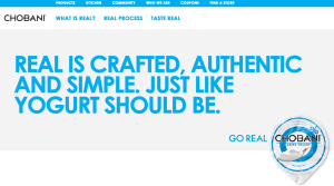
“What is real?”
In the words of the Chobani founder and CEO, customers are offered to watch a video which can then be linked to either Facebook or Twitter as indicated by the two icons under the video–an easy way for customers to show their support through social media.
“Real Process”
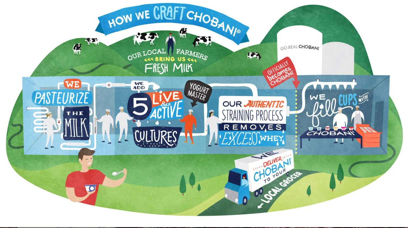
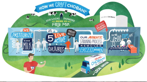
I really was drawn to this cute and colorful depiction of the process Chobani uses in producing their top-quality yogurt products. With a variety of different typographic styles and techniques, it all works together to create an interesting and captivating picture that is meanwhile informative.
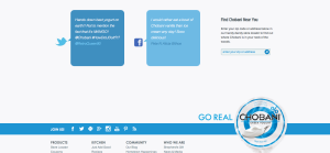
At the bottom of the page, cartoon speech bubbles show the words of real live customers that are either tweeting or facebooking about Chobani which informs viewers of other opinions as well as encourages them to share their own experiences through social media. I also really like the continuation of the color scheme as it focuses as well as emphasizes the yogurt on the bottom right which is in line with a rectangle across the bottom with tools in which to share information. I think it flows together really nicely.
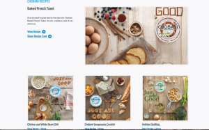
In accordance to their philosophy of natural and healthy eating, it makes sense that Chobani would go the extra mile to include a section of their website dedicated to health-conscious cooking recipes. The easy recipes that promote their own products encourages customers to not only eat healthy, but also to eat their healthy products.
In the end, Chobani’s website is effectively designed to attract customers who are likely to fall in love with the company’s natural, health-conscious ways. I am drawn to their website as its simple, color block design and attention to detail creates a unique web layout to entice viewers.
Website Design
http://obo.co.nz
The website I chose to comment on its impressive design is OBO. OBO is a brand of field hockey goalie equipment that makes everything from sticks to goalie pads. I included three screen shots to show the navigation tools and the full images of the home page. To start with the basics, the website is extremely easy to navigate. It’s organized into sections telling you about sizing, where to buy, and shows all of the products. What really makes this website incredible, however, is its awesome graphics. They’re humorous and still relate to the product. The colors are bright and it is all very attractive. Although I have no need for a goalie stick, the website does a great job of advertising them to make me want one.
Ben & Jerry’s Website\
I chose to include three different screen shots because I couldn’t just pick one that represented the whole website. I love this website because it includes so many bright colors but it doesn’t come off as childish or too hectic. Another feature of this website that I like is the interactivity. Almost any image on the page can be clicked. However, these aren’t just simple links to other plain, boring pages. The site almost acts like an online video game. The second screen shot features the “Flavor Graveyard.” Everything on the page moves, from bats flying in the sky to fog floating up from the ground. The user is also able to scroll left and right through the graveyard and click on the tombstones which bring you to a separate page that offers information about the discontinued flavor.
Similarly, the “Our Flavors” page features all of the flavors Ben & Jerry’s currently sells. Instead of just listing the names of these flavors, the flavors are displaying in a freezer in their actual packaging.
And finally, I really appreciate that they update their website regularly. The fact that the homepage says “October is Fairtrade Month” shows that they have updated the website within the last few days and this shows consumers that Ben & Jerry’s is constantly looking to impress, inform and help their consumers.
Website Design
I was immediately attracted to this design because of it’s creative feel. Some of the other websites that I visited were very creative, but also slightly overwhelming. This one clearly features a map in the background that helps the viewer makes sense of the “you are here” graphic. A small critique–the menu did not show up until one scrolls down on the page, and then it is apparent. It was a little confusing at first. But it was also nice that when I did click on one of the menu options, it scrolled down to the section of the screen that corresponded with the menu item. It didn’t open a new page. All of the content is essentially on one really long page. The typeface was also a nice choice to contribute to the creative feel of the website.
Blog Assignment: Website Design
This week you need to post a screenshot of a web page and briefly comment on why you like its design.
Here are some web design resources:
- AWWWawards : One of the most prestigious awards for web designers.
- CSS Design Award: An archive of the world’s greatest websites with high level of visual creativity.
- FWA: Favorite Website Awards, an industry recognised internet award program with high emphasis on web technology innovation. FWA is partnering with Adobe and Google for some pretty awesome digital creative programs, such as the Creative Sandbox.
Other interesting ones curated by individuals:
- Minimal Sites
- Unmatched Style
- CSSA
- The world’s best web design : At the bottom of this site’s main page, you can see a huge list of web design galleries and design tools. Check them out if you want.
Hope you can find some inspirations for your own interface project!
Deadline for the post: Friday 11:59 PM
Deadline for two comments: Sunday 11:59 PM
Flowers
This picture could be created using only the pen tool. It would not be difficult, but it would definitely require a lot of patience. First, the actual petals would have to be drawn. Next, the dotted lines that radiate outwards would be drawn, and the setting changed from a solid line to a dotted line. The grid view would be helpful, because all of the intricate curves are proportionately spaced out. In terms of the colors, you would have to open the color palette and then use your mouse to drag the palette down and reveal the large-view spectrum. From there, it would be easy to experiment with slightly varying shades of green, blue and yellow.
Illustrator
This strawberry would be very easy to make in illustrator by mainly utilizing the pen tool. First, I would create an ellipsis then drag down the bottom anchor point to create a more strawberry-esque shape. Then I would drag down the top anchor point to flatten the top. Then I would fill the shape with a red color. To make the seeds, I would create a smaller ellipsis then copy and paste the shape all over the strawberry. Then I would have to select portions of the strawberry to adjust the gradient to create the shadow that it has. In addition, I would use the pencil tool to draw the shape of the chocolate dripping off of the strawberry. Then using the ellipsis shape tool I could drag the anchor points to create the stem/leaves of the strawberry. Afterwards, I would use the pen tool to draw the shape for the stem of the strawberry.