Poster Critique

labyrinth-poster21_7824


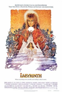
The poster I chose to critique is the movie poster from Jim Henson’s Labyrinth. This poster is well designed because it effectively conveys a lot of information about the movie: The design of the labyrinth in the background, Jareth on top demonstrates that he’s the one in power, the complexity/overlapping of the creatures exemplifies the tagline, which is “where anything seems possible and nothing is what it seems.” I think the text that was chosen is appropriate to the film. It’s a novelty type, but the use of all capital letters and the brassy ombre fits in with the aesthetic of the rest of the images.

Week 3 Post

Dave-Matthews-Band-Saratoga-Springs-John-Vogl-Postermethwestpalmleft

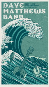
For my poster critiques I chose the concert info posters for Dave Matthews Band. What draws me to these posters is that illustrations are changed to fit the concert venue. For example, the poster to the left has racehorses because the concert was to be held in Saratoga, which is known for its racetrack. The poster to the right has wave because it was to be held in Palm Beach. These posters do their jobs well. Immediately you’re attracted to the picture. Next, the giant Dave Matthews Band at the top. If you’re interested in the concert its very easy to look next to the date and venue written right next to the title. Both posters use a serif typeface that’s easy to read and draws the eye. They both have a very relaxed tone to them, which is consistent with the relaxed feel of the artist’s music.


Week 3 Gelb

poster-designs-29{Save Water…Save Life}

In this poster, the eco-friendly message is conveyed through its simple and clear design. Combining the natural element of the growing life of the budding seedling coming out of the faucet represents the need for the seed’s need for water and our need to conserve Earth’s limited fresh water supply in order to create a more sustainable future. The chrome of the faucet against the blue and white background is shiny, clean and even reflective–possibly of a more sustainable future? Portraying the give and take relationship between nature and modern technology, the poster’s design effectively raises awareness to remain conscious of our water usage and cognizant of our environmental impact. I like the way that the reader’s eyes are drawn first to the vibrant green leaves growing from the faucet which is turned upside down so as to not let any water escape which continues the theme of the poster.

Power of Words

1995-GENERAL-Amnesty-Inte-003

This poster struck me as standing out from all other posters I searched primarily due to its color and white space. The first image I saw was the bigger white hand which intrigued me because I was wondering what the hand represented. After I saw the smaller hands reaching up and the type below the message hit me. The message the this poster conveys for Amnesty International is simple, yet powerful. The color is enough to grab your attention, but not overwhelming. The white space is what makes the poster so powerful. I feel as if the poster did its job and the message of the organization is clear.


WWF Posters

80_grdI’m a big fan of Word Wildlife Fund posters. You might need to enlarge it to see it, but all those tiny colorful dots represent “all the world’s tigers.” I thought this was especially effective to their message, because it shows the viewer visually that there aren’t too many tigers left and that we need to save them. I also think this poster works well as an infographic, because it splits up the amount of tigers by region funneling down to South China–where only 20 tigers inhabit. It is incredibly minimalist, which I think makes it also look more modern and striking. The black, bold capitalized “ALL THE WILD TIGERS OF THE WORLD FIT ON THIS POSTER” at the bottom of the page gives it a very ominous tone and leaves the viewer with an empty feeling in their stomach. The design gives the issue and element of surprise and prompts the public to help the cause.


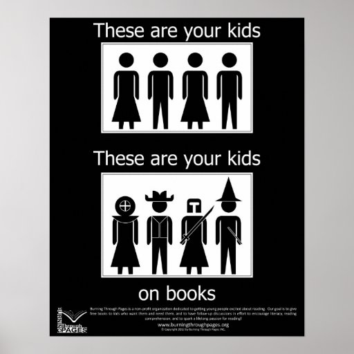
I like the design of this poster because it is straightforward and to the point. There is no elaborate typography or coloring to convey a message. Instead, the designer of this poster decided to use basic images to convey the message that reading is fun and makes children use their imaginations. Therefore, parents should encourage their children to read more.

I think this poster in particular drives home the point that graphic design doesn’t always have to consist of elaborate typography with gradient coloring and fantastic pictures. Sometimes the simpler the design is, the better and more effective it is. I don’t feel that here’s any need for improvement with this poster because it hits the nail on the head upon first glance – reading is fun; reading is engaging; kids should read more. The design and the message are so clear that children and adults alike can understand it.

Global Warming Poster

global-warming-awarness-poster-design (3)


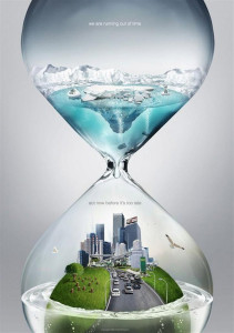
The poster above is dealing with the concept of global warming and the need for people to act now, before we see further consequences. The designer creatively used an hour glass to convey the idea of urgency. By placing the melting icebergs on the top of the hourglass, the water is dripping down onto the Earth and slowly drowning it.

In case the viewer did not understand the message just through the visual aspect of the poster, the designer makes his/her message very clear through his use of typography. By adding “we are running out of time/act now before it’s too late,” the designer eliminates any possibility of the audience misinterpreting the message. The words work well with the visual images because the sans serif typface and using all lowercase letters is a modern approach to a modern problem.

The colors used are effective because the blue and green stand out against the grey background. It seems as though the water turns clear when it drips from the icebergs to emphasis the idea that once the icebergs melt, we can’t get them back.

The poster is effective and does achieve the marketing goals because it is simple, clear and does not confuse the reader with statistics, numbers and terms that the audience may not understand. The only change I may make with the poster design is the background. Although it is effective the way it is, a solid black background may also be affective to enunciate the impending doom that the poster is suggesting.

POSTER CRITIQUE

37495093452_eJPwYwMp_l

Out of all the different posters I looked through this is the one that stood out to me the most, both visually and conceptively.

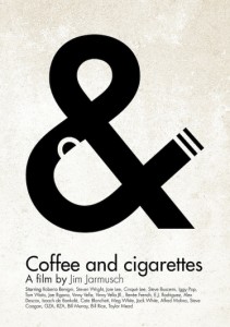
The simplicity and cleverness of the poster is what makes it stand out. By visually representing both coffee and cigarettes in the & symbol, the poster conveys the essence of the film to the general audience, which according to IMDb is a “series of vignettes that all have coffee and cigarettes in common”.

I think the designer had two reasons for picking black and white for the color of the poster. One is that Coffee and Cigarettes is shot in black and white, so by choosing those colors he or she stayed true and inline with the film’s visuals. Another reason for reason is that the white resembles the color white walls will eventually turn if someone is constantly smoking near them.

The title Coffee and Cigarettes is perfectly matched up with the visual elements. The coffee cup is aligned with the word coffee, the & symbol with the word and, and the word cigarettes with the visual cigarette created by the large typography. The visual is clean and to the point. I would not change anything with this poster. The design makes it clear that it is a poster for a film. It also engrains the title of the film into the viewers mind while illustrating an important theme in the film at the same time.

Wordmark

SUPREME WORDMARK

Supreme is a leading brand in the street-wear industry and is popular among a varied range of demographics. Many would argue that this is a result of their use of simplicity in their designs, and this is perfectly exemplified in their primary Wordmark. What I like about the simplicity of the Wordmark is that it doesn’t just strive to be simple, it emphasizes the word “Supreme” by doing so. It’s saying, “instead of cluttering up the word with fancy blots and scripts, let’s just allow the word speak for itself,” and it does. I can also appreciate the fact they decided to not just write the word in a nice front, but almost cut the word out of the red square so that the red color makes the word more pronounced.

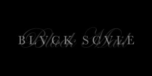
BLACK SCALE WORDMARK

Black Scale is another well-known street-attire brand and has a very unique style. In their clothing, they make an effort to be dark and give their designs a kind of “classic” feel; this is also especially represented in their Wordmark. The plain, serif text accomplishes the “classic” feel to the brand and is further amplified by the script writing in the background. To add to the distinctiveness of the brand, turning the “A’s” into “V’s” was a clever decision and further contributed to the sharpness and feel of the Wordmark. Not to mention, they attempted to stay in a darker range of colors when making their design.

Week 2: Wordmarks

pinkberry-logo


The first wordmark I chose was Pinkberry’s because its a logo that I’ve always been attracted to. The sans serif typeface makes it fun and easy to read. The colors and simple side logo add a refreshing look. This logo represents the company well because I would want to go get a nice froyo after looking at this.

images

The second wordmark I chose was Tostitos. I’ve always liked this logo because at first glance it seems pretty typical- a sans serif typeface with a bit of novelty thrown in. However at second glance you realize that the T’s and I’s are actually people sharing chips and salsa. Hence, a total representation of the company.