iPad design
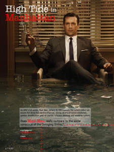
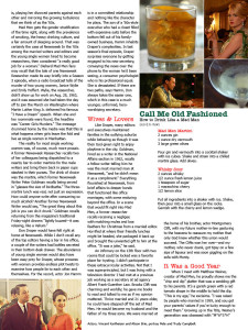
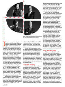
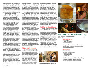
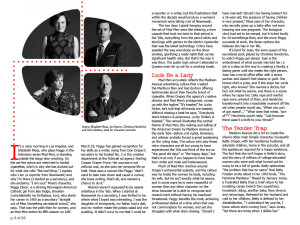
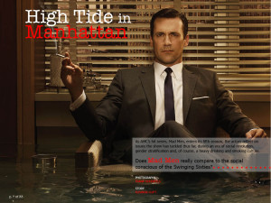
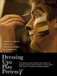
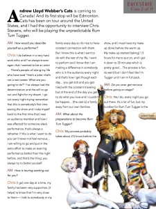
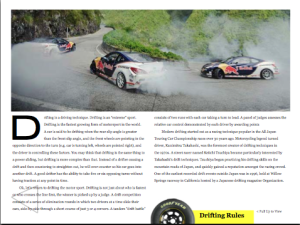
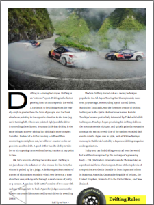
Through working on this project I guess I just came to understand that space on an iPad (or any digital surface) is infinite. It’s not like a newspaper where space is the be-all-end-all dictator of content. You can make things as big as you need or even just as big as you want them to be. So when I was designing my pages I tried to keep that in mind and just make everything big and spread out. Places where I would’ve mushed things closer to save space on previous projects, I left spread out on this one. This is also the first project where I’ve dramatically increased the leading for body text. I thought the most important part of this was to have the pages look inviting and not at all overwhelming, I think I was able to do this by taking advantage of the endless amount of room that iPads offer.
Retro magazine
iPad Design
During this project, it was definitely good to learn about the interactivity feature of InDesign and know that those features are there. I also learned a lot more about InDesign and the tools that it has by doing the resume and this project in that program.
iPad Magazine Cover
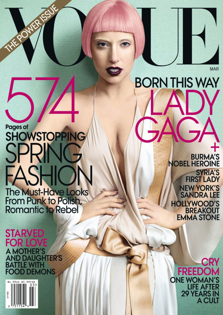
I chose an issue of Vogue with Lady Gaga on the cover for my iPad magazine design. As you can see, the iPad versions of the cover are significantly different than the print cover. The iPad covers are simple with no cover lines – only the magazine name and the image of Lady Gaga are displayed. I think the cover of the print edition looks way more crowded and less appealing due to all of the cover lines, plus the bar code and “The Power Issue” banner. The Lady Gaga image works well both horizontally and vertically. For the horizontal, the designer simply cropped Lady Gaga at her chest so the focus is solely on her head instead of her whole body. With the image cropped so closely, it looks balanced and clean in the middle of the horizontal iPad cover, and there is no need to fill extra white space. The image also works well because Lady Gaga’s head takes the place of the “G” in Vogue. Her shadow makes the cover look dimensional and interesting instead of flat.
Ipad Magazine Cover
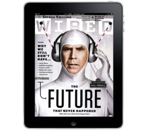
The type on this magazine is very readable and modern. I love how they stayed with with black and white. It lends the cover to be very simple and allows will ferrel to really be the focal point of the cover. Also there is relatively very little content on the page. Furthermore, compared to regular magazine covers there isn’t that much type.
iPad Mag Cover
The greatest strategy put into use on this cover would have to be the use of empty space in the background; with all the black space to the designer’s advantage, the text at the front becomes that much more emphasized. The lightly colored text comes out vibrantly against the black background, and the lightly toned face of the subject at the front comes out a lot more against the dark background and the black suit.
iPad Cover
The iPad and GQ magazine use this photo for several reasons. First, the GQ logo leads directly into Shia LaBeouf. As the reader’s eye’s move to the left, they instantly grab the headline and subsequently move down the page, reading each section of text. In addition, Shia’s hand leads directly into another blurb of text. Truthfully, there is no major difference between the iPad and the actual magazine. The only argument for potential difference is that the image may be slightly cropped on the iPad screen.
Paul Strand: The Mexican Portfolio
Paul Strand’s exhibit of a depressed and desperate world captured through a set of photographs taken during his two year stint in Mexico provided a very interesting viewing experience. There was not a single picture of a person smiling, and many pictures did not have any people at all. While this depressed and dark state is a trademark of Strands, it is significant that he shows the upset faces spanning across a number of different people. There was “Woman with Child” “Man with a hoe” and “Boy-Uruapan” among others of these very serious and upset looking people.
It is unclear as to whether Strand was trying to broadcast some greater point about these people because the pictures in the exhibit of landscapes were not sad or solemn by the same means. These pictures, while not quite beautiful, showed a open and thriving landscape that is uniquely Mexican.
All of the pictures are taken in the same faded brown duotone which also adds to the viewing effect. With this combination of colors it almost seems like there are no colors at all. They do not register because it is so earthy and plain.
Overall, the Strand exhibit does not spark a sense of enjoyment or even pleasure, but it does interest the viewer. The stern faces and the empty but culturally significant landscapes along with the shots of street murals or statues give the viewer a vivid picture of the world Strand lived in for two years. I believe that this is the intention. It is not create a sense of pity for these sad faces, it is to show that this is the life they live and this is what they do.


