Poster Critique

little_miss_sunshine_ver4


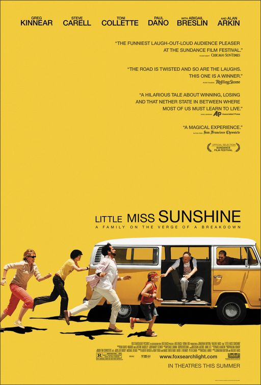
This is the movie poster for Little Miss Sunshine, and I’ve always found it to be really intriguing. First, the bold yellow background ties in perfectly with the movie title and is definitely eye-catching. The picture of the at the bottom of the poster also is very interesting and does a very effective job at catching people’s attention, and does a great job at portraying how the they’re a family “on the verge a breakdown”. I think my favorite part of this poster is the fact that the movie tittle isn’t all the same size. This really helps balance the action going on at the bottom left of the poster and the lack of weight on the bottom right. On this note, the poster designer did a phenomenal job understanding and incorporating the “Z” principle, because my eyes always follow that motion each time I look at the poster. I do find it awkward how heavy the poster is at the bottom, but I think that was intentional since the family in the movie is awkward and dysfunctional. All in all, I find this a very effective poster because not only is it appealing to the eye but it communicates very well, and makes you want to go see the movie.

syracuse_international_film_festival_xlg

This poster for a local film festival is very clear and straightforward. While the play on words is a little cliche and a little over done (and by a little, I mean a lot) it works with the over message of the poster. The two tickets set together to look like a heart is creative and definitely catches the eye. It ties in with the phrase very well and definitely makes up for the cliche-ness of the whole thing. As far as colors, I like the color scheme and I think that it is very well carried out throughout the entire poster. The red from the tickets is present in about half of the text and the other half of the text is the color of the text on the ticket.

Another thing I really like about this poster is the wordmark. The letters are kerned very tightly but they are differentiated by color and weight of the font.

WEEK 2 The Phantom of the Opera

phantom_of_the_opera

The beautiful poster for Andrew Webber’s opera-adapted film – The Phantom of the Opera – features fabulous design. The mixture of red and black conveys a mysterious, sad and dark phenomenon, which fits the touching but hopeless love in the film. Half of the phantom (the man in the poster)’s face is inside the dark color and the other half is behind the mask. It is just like him in the movie that he always lives in the darkness and hides the true self behind the mask.  The light on the girl, Christine’s, face implies that she is the only hope inside the phantom’s life. He wants to touch and own her.

The typeface also fits the poster and the story. Since The Phantom of the Opera talks about a classic love story happened in an opera house back to the 19th century, the classic font fits the story well. The larger size of “phantom” and “opera” highlights the main character and place of the story.


Comments:

屏幕快照 2013-09-15 下午09.33.39

屏幕快照 2013-09-15 下午09.56.04

Week 2 Gelb

Flickr_wordmark.svg

As a popular platform for image sharing, Flickr uses Frutgier Black in their wordmark. I think that the boxy-shaped letters of the Sans-Serif typeface has a clean feel that makes it easy to read. I like the square dot over the letter “i” that maintains the square style of the letters. Also, it is important to note the stylistic choice that was made to use five blue letters and one pink letter at the end. By having the first five letters “flick’ in blue, it isolates those letters and emphasizes the word “flick” which in my head makes me think of how it sounds like “pic” which aligns with the company’s role as an image host site. Similarly, the single and last letter “r” is a deep magenta that leaves the eyes on a bright, enticing note. I like that the wordmark conveys just enough playfulness and curiosity, but without taking away from its sense of professionalism.


NordstromLogo

Similar to the font “Optima,” the Nordstrom wordmark is a custom typeface specifically designed for Nordstrom’s use only. With the slightest flares at the end of the letters, it has subtle yet classy and refined style that exudes Nordstrom’s branding as a respectable household name. In addition, I like the tiny variations in its weight and thickness as it easily leads the eyes across the evenly spaced and capital letters. The use of all capital letters exudes a sense of strength and pride in the company. The Nordstrom wordmark is classic and elegant. As an avid shopper and supporter of Nordstrom, I’ve always been able to count on Nordstrom for quality service and products–Nordstrom’s powerful logo is justified as Nordstrom stands apart from the rest (just like the letters through the use of kerning).


Wordmarks

Screen Shot 2013-09-06 at 9.57.53 PM

The Marc Jacobs logo has always been one of my favorites. It is so modern, clean and elegant. I find that it really represents the contemporary style of the brand. Furthermore, I find the loose curning to be very appealing to the eyes, and I also love how the type is all caps. This logo really embraces the concept that less is better.

Screen Shot 2013-09-06 at 9.58.47 PM


This logo is also very similar to Marc Jacobs. I tend to like very modern and sleek designs.  I love the play on the word generation and how it’s attached to BCBG, I find it very creative. In addition, the use of the small caps gives the word generation just enough attention without distracting the consumer from the original brand name.

Wordmarks

Sharpie_Logo_BW_v2

The sharpie wordmark is effective because the font looks like stroke of a sharpie marker/pen. The designer also chose to use only black because the traditional sharpie marker was black. The loose cursive writing also makes the word look handwritten. The font that is used is also easy to read and unique so it makes it easier for the consumer to recognize it.

black_harry_potter_logo


The harry potter wordmark goes along with the aesthetics of the entire movie. The font’s jagged footings make it seem as though it could have been written using a quill, and the “p” has a lightening bolt, just like Harry does. The uneven quality to the letters with the jagged edges also makes the font look spooky.

W O R D M A R K S

3

I really like this wordmark. All the letters are upper case letter. I feel it shows that the company is very confident with their products. The space between letter let me feel comfortable. The wordmark use black and white color. These are very classical colors. The brand do have some classical designs. I think this wordmark prefectly matches their brand image. All the letter are in the same size and the typeface looks very formal. It seems that the company really cares about their design and they will provide a very strict quality standard.

2


I love this logo. First, it’s red. Warm color draws my attention. It delivers a friendly image. The size of the wordmark varies. I think it help people read from left to right. Also, because of the size varies, the whole wordmark is really eyecatching. The first word “papa” from small to big. It just like somebody start reading it and the sounds from their mouth. Also, the typeface makes me feel relax.


Wordmark

morningstarThis wordmark is entertaining because it first captures your attention with the classic bright red color. The all capitals create a powerful look, but keeping it simple with the plain text. The O is a play on the word morningstar, meaning the sun, and it is rising from the bottom of the word line like the sun would rise in the morning. The alteration of the shape of the O also adds to the sun reference. While being simple it is a creative word mark.

nascar-logoThis iconic wordmark is very identifiable. First off, the slant of the letters gives you the feeling of motion, which represents the cars of Nascar. The overlay of the text on the colored stripes show the motion by a transition of color, and transitional color makes your eye move across it giving more motion to the wordmark. Also the different widths of the stripes help your eye start from the left and move right. In addition, the kerning between the letters varies, and connecting some of the letters gives more fluidity. This all gives speed to the wordmark.


Eric Gordon’s Post 9/6/13

Wordmark1

The typeface on the Jeep wordmark is simple but bold.  It gives off a rugged and masculine impression to sell the idea that its cars are meant for tough outdoor use.  Although this example of the  wordmark is green, it is not uncommon to see different colors utilized, generally black or a darker blue. These deep and strong colors reinforce the outdoors aspect of the car and play to the manly, working class man.


Wordmark2

the Sharpie wordmark is designed to appear as if it was written by an actual sharpie.  The letters appear to flow uniformly to right as the eye carries across the word.  This also highlights the handwritten aspect.  The “h” and the “r” appear to have been created by two separate marker strokes. The capital “S” and the lowercase “p” are the only letters that do not connect to the following letter.  It is easy to see the way in which the “p” was written, a downward stroke retraced up to form the round section in a clockwise stroke.

GRA 217 Post 1

ferrari


The design of the Ferrari Word Mark is bold and eye catching.  It distinguishes itself from the competition through its warm red color that attracts the human eye.  This attraction garners the want of every individual, but the thick bold body copy depicts the fact that only the elite can have this vehicle.  The extension of the tip of the ‘F’ illustrates speed, adventure and the overall vision and mission of Ferrari as the essence of class.  

ESPN


The layout of the ESPN word mark utilizes white space in order to ensure that the letters seem effortlessly attached.  The fact that the letters S and P are actually attached reminds all those who see this logo that it deals with sports.  The warm red coloring is bold and instantly grabs the eyes attention.  The two layers of the letters distinguish the word mark and intrigue those who see it.