Week 4 Post Typography

advertising,illustration,nike,typography-79d4814c95665a5d1cf3010e5a12e12f_h


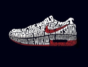
I thought this advertisement for Nike and Adobo Magazine was really cool. The typography in the advertisement is designed to look like a Nike sneaker with the famous Nike swoosh on the side. The shoe reads “One of the world’s most famous logos was designed for a mere 35 dollars by an art student. Learn more about the World of Advertising. Read Adobo Magazine.” Nowhere in the advertisement does it say anything about Nike, however, you can just tell by the swoosh and the statement regarding “the world’s most famous logos.” Also, the space between “the World of Advertising” and “Read Adobo Magazine” suggests that the sneaker is of the Nike Air type. The typeface used is in all caps and morphed so that the type fits the figure of a Nike sneaker.

Typography

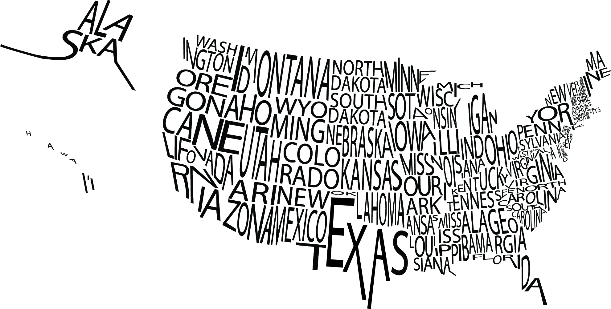
typographic-map-usI was particularly drawn to this image because of the visual image it creates not only with the type, but with the white space as well. The letters in the names of the states are kerned close enough together that the overall image is understood while not making the graphic seemed too squished. If you take the time to actually read each state name, they are all legible which must have proven to be a challenge for the designer.


Typography Post

ikea


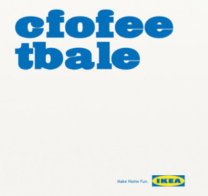
A few years ago, a study came out about being able to read and comprehend jumbled text. Here’s an example from FOX News, too — http://www.foxnews.com/story/2009/03/31/if-can-raed-tihs-msut-be-raelly-smrat/. I thought it was very clever of IKEA to make use of this trend in one of their ads. Along with clearly rearranging the letters, the typeface that they used is very effective. It being large and essentially the only thing on the image is eye-catching and makes people stop and wonder what the ad is about. Also, the slogan that is printed on the bottom, “Make Home Fun” goes along perfectly with the message that their use of typography is conveying.

WEEK 4 Typography

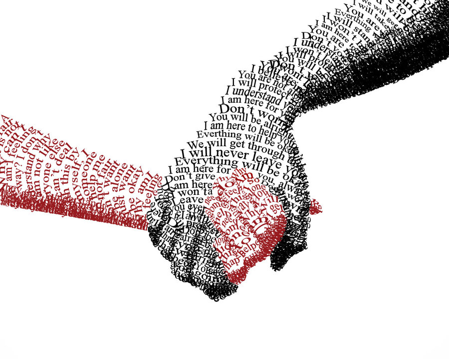
I really like how typography is applied to this picture.

gra week4 blog

The sentences “You are alright, I am here to help you…” consists of the black hand, which holding the red hand. These comforting sentences give people a reliable feeling and the solid black appear grave and composed. It makes people feel safe when seeing that black hand.

The phrases and words “alone”, ”by my self”, “why people…” formed the red hand, which is held by the black one. These sensitive and incomplete phrases imply loneliness and a desire to be cared and loved. The red shows emergency, highlighting the desire to be cared. The contrast of black and red imply the big difference of two hands. With these two hands holding together, though the picture just simply uses typography, it strongly conveys designer’s ideas.


Week 3 poster design

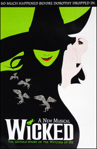
playbill_2267_72272055This is not just one of my favorite broadway shows, but one of my favorite posters. The aesthetic of Elphaba the bad witch and Glinda the good witch fitting together to create one image shows the idea of how these characters were once allies. The contrast in black and white counteracts this though and shows the good and bad characters, white being good and black being bad. Also, the big title and not much other text doesn’t overwhelm the viewer. The text font used for the title, being almost a gothic design, represents the eeriness of the play and mirrors the actual word “wicked.” There is not too much color so you are not overwhelmed, and the way the negative space reflects the green in Elphaba’s face is very cohesive. Overall, this simple but thought out poster truly reflects the aesthetics of the play.

Week 3: Poster

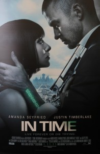
in-time-movie-poster-uk-01


“In time” is a science fiction movie. The whole color in this poster it kinds of dark. The watch in green words is very attractive and it matches with the name of the movie. The special gun and the unique watch could let me easily to tell that this is a science fiction movie. From the poster, I could easily tell that the story is also a love story.

Even though the poster is 2D, it seems that the actor is in the very front and the city is at very far away. I think this is a very good design. It could let me imagine the relationship between the actors and the city and motivate my imagination of the story of the movie.The wordmark of the movie title is very cool and matches the style of the movie.

Week 2 Blog Post

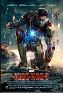
iron man 3


While I am a huge fan of the Iron Man series, the posters are what originally got me to see the movies.  The layout of the design attracts your eye to the warm color and the largest figure.  In addition, the eye is attracted to all the commotion in the background.  The color of the type fades in from top to bottom and truly illustrates the tone of the movie.  Furthermore, the type at the bottom is the perfect size so it leaves enough room for the picture and it is still legible.

rocky


Being from Philadelphia, I am already a huge Rocky fan.  The type is very simple and casual, just like a man from Philly.  The poster utilizes the white space, while making enough room for the iconic main character.  The reason this poster is so powerful is because a person does not need to have seen the movie to understand; he or she can look directly into the main character’s eyes and feel the emotion.  This is the epitome of graphic and type combination.

Poster Blog Post

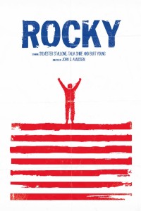
ROCKY POSTER


My infatuation with this poster comes from it’s creative use of white space to attract the viewer’s eye to the important information and imagery on poster. Firstly, the text is one color which makes it easier for the audience to read and understand what the poster is about. Secondly, the artist plays with two colors (red and white) to create the actual picture within, and makes a symbolic image of “Rocky” the boxer at the top of a set of steps; reminiscent of a critical moment in Rocky’s training in the film. And finally, the artist specifically used the color combination of red, white, and blue to convey the message that the movie is about an “all-american” boxer fighting to win something.

Week 3 Post: National Poetry Month Poster

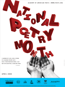
NPM_2008_poster_550

The poster promoting National Poetry Month is creative and unique. The eye is immediately drawn to the large red type displayed across most of the poster, which stands out against the plain white background. The letters look “messy” in a variety of sizes and angles, but this design works effectively for the poster because poetry is supposed to be creative, unique and individual. The letters seem to be floating out of the image of the hands, which connects to how poetry is supposed to flow. The designer probably chose a sans-serif font since the letters would look messy, chaotic and hard to read with added serifs. The sans-serif font also keeps the poster from looking too formal. I like how the rest of the poster is simple – minimal black text in an attention-drawing font with a white background. The black text matches the black-and-white image of the hand nicely, so the hand doesn’t look out of place. Also, the blue box on the bottom of the page provides separation and serves as a nice contrast to the red “National Poetry Month” type. I think the poster does a good job at promoting National Poetry Month and capturing the essence of the event.


WEEK 2 The Phantom of the Opera

phantom_of_the_opera

The beautiful poster for Andrew Webber’s opera-adapted film – The Phantom of the Opera – features fabulous design. The mixture of red and black conveys a mysterious, sad and dark phenomenon, which fits the touching but hopeless love in the film. Half of the phantom (the man in the poster)’s face is inside the dark color and the other half is behind the mask. It is just like him in the movie that he always lives in the darkness and hides the true self behind the mask.  The light on the girl, Christine’s, face implies that she is the only hope inside the phantom’s life. He wants to touch and own her.

The typeface also fits the poster and the story. Since The Phantom of the Opera talks about a classic love story happened in an opera house back to the 19th century, the classic font fits the story well. The larger size of “phantom” and “opera” highlights the main character and place of the story.


Comments:

屏幕快照 2013-09-15 下午09.33.39

屏幕快照 2013-09-15 下午09.56.04