


Resume
Resume Project
Week 3 poster design
 This is not just one of my favorite broadway shows, but one of my favorite posters. The aesthetic of Elphaba the bad witch and Glinda the good witch fitting together to create one image shows the idea of how these characters were once allies. The contrast in black and white counteracts this though and shows the good and bad characters, white being good and black being bad. Also, the big title and not much other text doesn’t overwhelm the viewer. The text font used for the title, being almost a gothic design, represents the eeriness of the play and mirrors the actual word “wicked.” There is not too much color so you are not overwhelmed, and the way the negative space reflects the green in Elphaba’s face is very cohesive. Overall, this simple but thought out poster truly reflects the aesthetics of the play.
Week 3: Poster
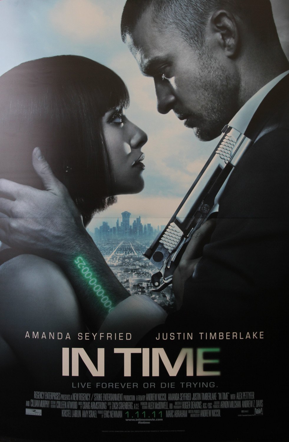
“In time” is a science fiction movie. The whole color in this poster it kinds of dark. The watch in green words is very attractive and it matches with the name of the movie. The special gun and the unique watch could let me easily to tell that this is a science fiction movie. From the poster, I could easily tell that the story is also a love story.
Even though the poster is 2D, it seems that the actor is in the very front and the city is at very far away. I think this is a very good design. It could let me imagine the relationship between the actors and the city and motivate my imagination of the story of the movie.The wordmark of the movie title is very cool and matches the style of the movie.
Watchmen Poster

When I thought about this assignment, the Watchmen poster immediately came to mind. It’s a perfect example of how good graphic design can have an emotional effect on the audience. For me, the best part of this poster is that it has very little copy. Besides the title, release date, and “From the visionary director of 300,” which tells us nothing about the actual movie, there are no words. However, we get a great feel for the emotional tone of the film. The sharp contrast between the bright, happy yellow of the smiley face and the deep red of the blood spatter makes us uneasy, and the extreme closeup of that smiley face creates a claustrophobic, anxious effect. All of this is largely achieved through a respect for visual heirarchy, or the “Z” formation that our eye follows. Starting in the upper left, my eye was drawn to a white clockface, and then a sudden splash of red blood. I moved from left to right, seeing the smiley face, and then diagonally leftward and down, watching the blood drip down the face and reading the blurb about the director. In the bottom left is the release date, and then, as the eye travels left to right again, all of the logos for the companies involved in the film’s production. Throughout all of this, the vertical title “Watchmen” is ever present, ensuring the audience remembers it.
Week 2 Blog Post
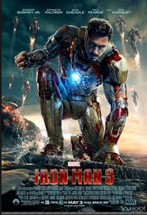
While I am a huge fan of the Iron Man series, the posters are what originally got me to see the movies. The layout of the design attracts your eye to the warm color and the largest figure. In addition, the eye is attracted to all the commotion in the background. The color of the type fades in from top to bottom and truly illustrates the tone of the movie. Furthermore, the type at the bottom is the perfect size so it leaves enough room for the picture and it is still legible.

Being from Philadelphia, I am already a huge Rocky fan. The type is very simple and casual, just like a man from Philly. The poster utilizes the white space, while making enough room for the iconic main character. The reason this poster is so powerful is because a person does not need to have seen the movie to understand; he or she can look directly into the main character’s eyes and feel the emotion. This is the epitome of graphic and type combination.
Lollapalooza Poster
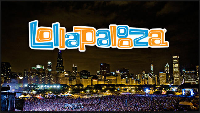
The Lollapalooza logo for the United States version of the popular music festival event is loud and fun. The clashing orange and blue colors make the letters pop and the stacked double “o” toward the end of the word force our eyes to take the extra split second to appreciate the artwork. The wordmark represents a good time, a party. Setting it in the visual center over the Chicago Skyline adds to this effect. Studying this poster close almost makes you want to nod your head as if you were in the festival. The warm whites and yellows of the skyline illuminates and contrasts the deep blue and purples of the crowd below drawing further emphasis to the wordmark on top. Everything about the poster screams crazy wonderful fun.
Poster Critique
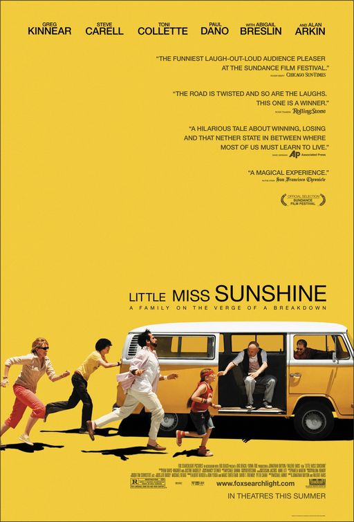
This is the movie poster for Little Miss Sunshine, and I’ve always found it to be really intriguing. First, the bold yellow background ties in perfectly with the movie title and is definitely eye-catching. The picture of the at the bottom of the poster also is very interesting and does a very effective job at catching people’s attention, and does a great job at portraying how the they’re a family “on the verge a breakdown”. I think my favorite part of this poster is the fact that the movie tittle isn’t all the same size. This really helps balance the action going on at the bottom left of the poster and the lack of weight on the bottom right. On this note, the poster designer did a phenomenal job understanding and incorporating the “Z” principle, because my eyes always follow that motion each time I look at the poster. I do find it awkward how heavy the poster is at the bottom, but I think that was intentional since the family in the movie is awkward and dysfunctional. All in all, I find this a very effective poster because not only is it appealing to the eye but it communicates very well, and makes you want to go see the movie.
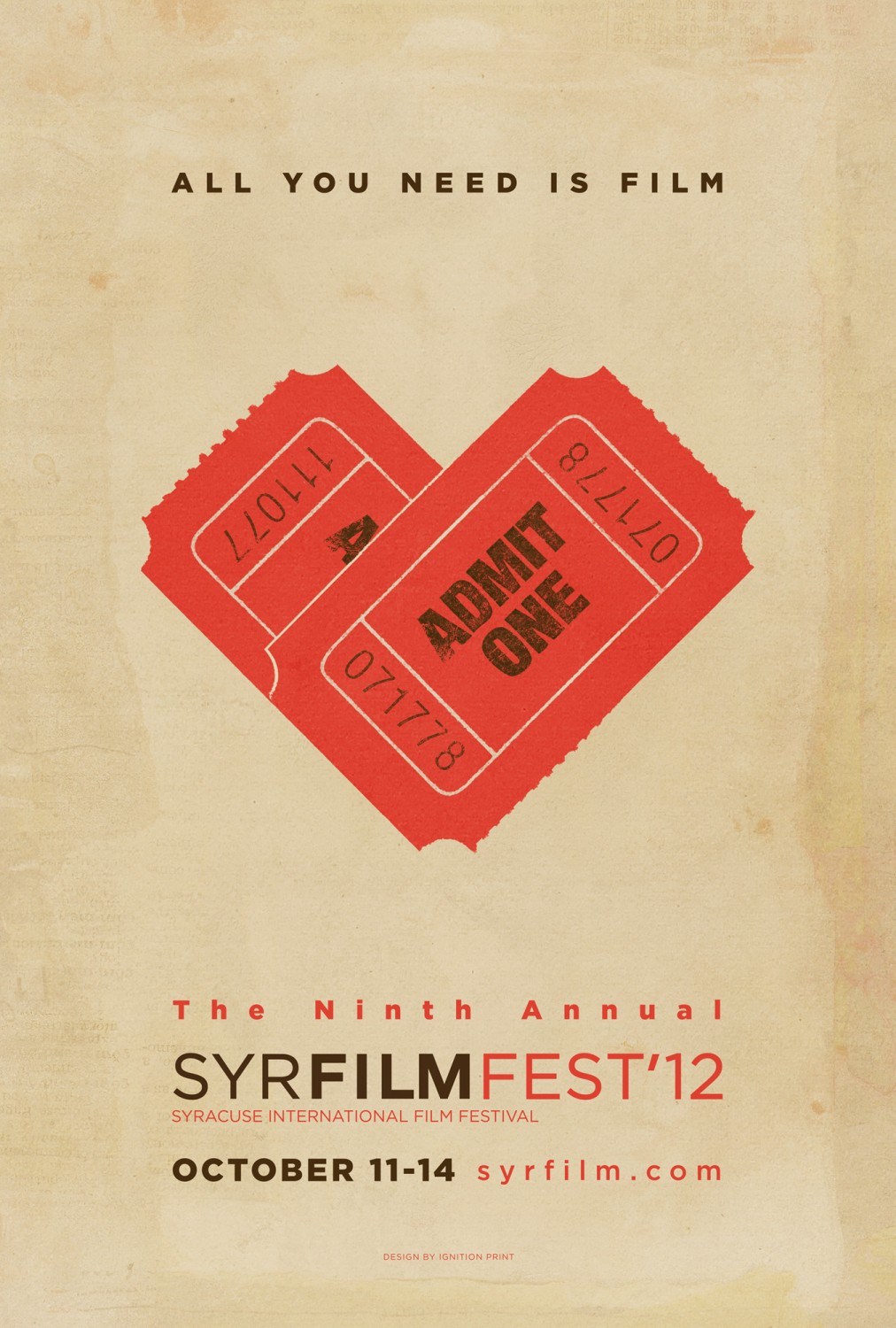
This poster for a local film festival is very clear and straightforward. While the play on words is a little cliche and a little over done (and by a little, I mean a lot) it works with the over message of the poster. The two tickets set together to look like a heart is creative and definitely catches the eye. It ties in with the phrase very well and definitely makes up for the cliche-ness of the whole thing. As far as colors, I like the color scheme and I think that it is very well carried out throughout the entire poster. The red from the tickets is present in about half of the text and the other half of the text is the color of the text on the ticket.
Another thing I really like about this poster is the wordmark. The letters are kerned very tightly but they are differentiated by color and weight of the font.