Global Warming Poster

global-warming-awarness-poster-design (3)


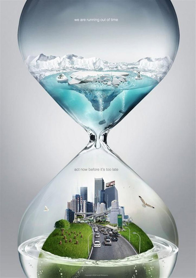
The poster above is dealing with the concept of global warming and the need for people to act now, before we see further consequences. The designer creatively used an hour glass to convey the idea of urgency. By placing the melting icebergs on the top of the hourglass, the water is dripping down onto the Earth and slowly drowning it.

In case the viewer did not understand the message just through the visual aspect of the poster, the designer makes his/her message very clear through his use of typography. By adding “we are running out of time/act now before it’s too late,” the designer eliminates any possibility of the audience misinterpreting the message. The words work well with the visual images because the sans serif typface and using all lowercase letters is a modern approach to a modern problem.

The colors used are effective because the blue and green stand out against the grey background. It seems as though the water turns clear when it drips from the icebergs to emphasis the idea that once the icebergs melt, we can’t get them back.

The poster is effective and does achieve the marketing goals because it is simple, clear and does not confuse the reader with statistics, numbers and terms that the audience may not understand. The only change I may make with the poster design is the background. Although it is effective the way it is, a solid black background may also be affective to enunciate the impending doom that the poster is suggesting.

POSTER CRITIQUE

37495093452_eJPwYwMp_l

Out of all the different posters I looked through this is the one that stood out to me the most, both visually and conceptively.

The simplicity and cleverness of the poster is what makes it stand out. By visually representing both coffee and cigarettes in the & symbol, the poster conveys the essence of the film to the general audience, which according to IMDb is a “series of vignettes that all have coffee and cigarettes in common”.

I think the designer had two reasons for picking black and white for the color of the poster. One is that Coffee and Cigarettes is shot in black and white, so by choosing those colors he or she stayed true and inline with the film’s visuals. Another reason for reason is that the white resembles the color white walls will eventually turn if someone is constantly smoking near them.

The title Coffee and Cigarettes is perfectly matched up with the visual elements. The coffee cup is aligned with the word coffee, the & symbol with the word and, and the word cigarettes with the visual cigarette created by the large typography. The visual is clean and to the point. I would not change anything with this poster. The design makes it clear that it is a poster for a film. It also engrains the title of the film into the viewers mind while illustrating an important theme in the film at the same time.

Week 3 Blog Assignment Instructions: Poster

MOV19

Designed by Metric72, a Spanish graphic designer. This poster is dedicated to the theory of quantum mechanics, which investigates physical phenomena at microscopic scales.

This week you are going to critique a poster. A strong poster should be not just visually attractive, but also communicative and understandable to the general audience. Research the Internet and choose a poster you like. Find out what design elements make the poster stand out. What is the major message the poster tries to convey? Why did the designer make such typography and visual choices (illustrations, photos, colors)? How did the words connect to the graphic elements? Did the poster fully achieve the its marketing goals? Is there any possible improvements?

  • Post Deadline: September 13, 11:49 PM
  • Comments Deadline: September 15, 11:49 PM


Wordmark

SUPREME WORDMARK

Supreme is a leading brand in the street-wear industry and is popular among a varied range of demographics. Many would argue that this is a result of their use of simplicity in their designs, and this is perfectly exemplified in their primary Wordmark. What I like about the simplicity of the Wordmark is that it doesn’t just strive to be simple, it emphasizes the word “Supreme” by doing so. It’s saying, “instead of cluttering up the word with fancy blots and scripts, let’s just allow the word speak for itself,” and it does. I can also appreciate the fact they decided to not just write the word in a nice front, but almost cut the word out of the red square so that the red color makes the word more pronounced.

BLACK SCALE WORDMARK

Black Scale is another well-known street-attire brand and has a very unique style. In their clothing, they make an effort to be dark and give their designs a kind of “classic” feel; this is also especially represented in their Wordmark. The plain, serif text accomplishes the “classic” feel to the brand and is further amplified by the script writing in the background. To add to the distinctiveness of the brand, turning the “A’s” into “V’s” was a clever decision and further contributed to the sharpness and feel of the Wordmark. Not to mention, they attempted to stay in a darker range of colors when making their design.

Week 2: Wordmarks

pinkberry-logo


The first wordmark I chose was Pinkberry’s because its a logo that I’ve always been attracted to. The sans serif typeface makes it fun and easy to read. The colors and simple side logo add a refreshing look. This logo represents the company well because I would want to go get a nice froyo after looking at this.

images

The second wordmark I chose was Tostitos. I’ve always liked this logo because at first glance it seems pretty typical- a sans serif typeface with a bit of novelty thrown in. However at second glance you realize that the T’s and I’s are actually people sharing chips and salsa. Hence, a total representation of the company.


Wordmarks


washington post logo

Like New York Times, The Washington Post has one of the most memorable wordmarks in the news industry. As a news agency of a long history of almost 100 years, The Washington Post enjoys a public image of great reliability. This gothic and old English-like wordmark reminds people of its long history which helps them trust its reputation. This old English like logo also reminds people of some classic novels written in old times. It fits the image of a news agency, which runs the business in writing industry.


Visa-logo

Visa changed its logo in 2006. The company simply capitalizes all the letters and made it all in deep blue. The capitalized letters in slightly italic typeface is very clear and easy to remember. Deep blue color gives people an impression of profession and business. The yellow represents the richness. As a credit card company, it easily builds an image of profession, richness and simplicity by its logo.


My Comments on classmates’ blogs:

屏幕快照 2013-09-08 下午09.45.43 屏幕快照 2013-09-08 下午09.45.57

Wordmarks

Screen Shot 2013-09-06 at 9.57.53 PM

The Marc Jacobs logo has always been one of my favorites. It is so modern, clean and elegant. I find that it really represents the contemporary style of the brand. Furthermore, I find the loose curning to be very appealing to the eyes, and I also love how the type is all caps. This logo really embraces the concept that less is better.

Screen Shot 2013-09-06 at 9.58.47 PM


This logo is also very similar to Marc Jacobs. I tend to like very modern and sleek designs.  I love the play on the word generation and how it’s attached to BCBG, I find it very creative. In addition, the use of the small caps gives the word generation just enough attention without distracting the consumer from the original brand name.

Wordmarks

Sharpie_Logo_BW_v2

The sharpie wordmark is effective because the font looks like stroke of a sharpie marker/pen. The designer also chose to use only black because the traditional sharpie marker was black. The loose cursive writing also makes the word look handwritten. The font that is used is also easy to read and unique so it makes it easier for the consumer to recognize it.

black_harry_potter_logo


The harry potter wordmark goes along with the aesthetics of the entire movie. The font’s jagged footings make it seem as though it could have been written using a quill, and the “p” has a lightening bolt, just like Harry does. The uneven quality to the letters with the jagged edges also makes the font look spooky.

W O R D M A R K S

3

I really like this wordmark. All the letters are upper case letter. I feel it shows that the company is very confident with their products. The space between letter let me feel comfortable. The wordmark use black and white color. These are very classical colors. The brand do have some classical designs. I think this wordmark prefectly matches their brand image. All the letter are in the same size and the typeface looks very formal. It seems that the company really cares about their design and they will provide a very strict quality standard.

2


I love this logo. First, it’s red. Warm color draws my attention. It delivers a friendly image. The size of the wordmark varies. I think it help people read from left to right. Also, because of the size varies, the whole wordmark is really eyecatching. The first word “papa” from small to big. It just like somebody start reading it and the sounds from their mouth. Also, the typeface makes me feel relax.


Week 2 Post: Wordmarks

Screen Shot 2013-09-06 at 4.52.22 PM

The wordmark for Tiffany & Co. represents the high-end jewelry store very nicely. The large serifs and thin letters make the typeface look formal and proper, which signifies the elegance and class of the items in the store. The plain black type, simple letters and uniform kerning between letters also show how the merchandise at Tiffany’s is classic and traditional. Every letter is a capital letter, which draws attention, but the “T” and “C” rise above the others to create a bit of separation.

Screen Shot 2013-09-06 at 4.27.14 PM

The wordmark for Little Tikes is very colorful and bold. Since the company manufactures young children’s toys, and since the word “little” is part of its name, all of the letters in the wordmark are lowercase. Red and blue are colors often associated with children, especially young boys, so it seems fitting that these colors were chosen for the Little Tikes wordmark. The bold and unique letters, especially the letter “e,”  also give the wordmark a childish vibe. The tight kerning allows the reader’s eye to skim quickly over the company name and allows both words to easily work together as one name.