Wordmark

morningstarThis wordmark is entertaining because it first captures your attention with the classic bright red color. The all capitals create a powerful look, but keeping it simple with the plain text. The O is a play on the word morningstar, meaning the sun, and it is rising from the bottom of the word line like the sun would rise in the morning. The alteration of the shape of the O also adds to the sun reference. While being simple it is a creative word mark.
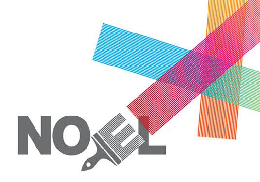
nascar-logoThis iconic wordmark is very identifiable. First off, the slant of the letters gives you the feeling of motion, which represents the cars of Nascar. The overlay of the text on the colored stripes show the motion by a transition of color, and transitional color makes your eye move across it giving more motion to the wordmark. Also the different widths of the stripes help your eye start from the left and move right. In addition, the kerning between the letters varies, and connecting some of the letters gives more fluidity. This all gives speed to the wordmark.


Word Marks

This watermark for the car company Porsche gives a very strong and bold presence when you first look at it. Its tight kerning along with stretched out characters add to its strong appearance. Being a very high end performance company I think this watermark suits the company very well. This water mark is also featured inside their cars which reinforces its identifiably.


The New York Times watermark is one of the most recognizable in its field. The Gothic or Old English font implies the media is a very educated and sophisticated in appearance. The creaters of this word mark defininately had that in mind when they created it so readers would be more attracted to it. Seeing that this is on the top of every paper the NYT produces along with its website, it is very recognizable and fits the company well.

WORDMARKS

Screen shot 2013-09-05 at 5.59.55 PM

Instagram ditched their old stock font wordmark for a more refined custom-drawn one. The new wordmark stays true to Instragram’s brand but looks cleaner and less choppy. The original typeface was script, but did not connect throughout the name. The new wordmark encourages the eye to flow effortlessly through the name. The old typeface “Billabong” gave the brand a retro feel, which carries over into the new wordmark so that the brand’s personality is not lost. The old I in Instagram could be confused for a G, but the new one is clearly an I without loosing character. Using blue also enhances the brands wordmark because it is easier on the eye and also can change appearances using Instragram’s different filters. The old wordmark looked the same in each filter, which did not represent the company’s concept of representing the same image in different ways.


Screen shot 2013-09-05 at 5.57.50 PM

The Disney wordmark represents The Walt Disney Company perfectly. The typeface gives the wordmark a whimsical feel and the choice to mix both upper case and lower case letters makes it feel fun and friendly. Making the D the longest and widest letter draws your eye to the start of the wordmark first. The I’s dot gives it a playful feeling and resembles Walt Disney’s real signature I. The curve of the S brings your eye in the direction of the N, which is tilted in the opposite direction of the following E, again reestablishing the companies playful feel. The Y at the end ties into the signature feeling of the entire wordmark making it feel personal. The thickness, lettercase, whitespace, and color all add to the feel of childhood and imagination, which is what Disney is all about.

Eric Gordon’s Post 9/6/13

Wordmark1

The typeface on the Jeep wordmark is simple but bold.  It gives off a rugged and masculine impression to sell the idea that its cars are meant for tough outdoor use.  Although this example of the  wordmark is green, it is not uncommon to see different colors utilized, generally black or a darker blue. These deep and strong colors reinforce the outdoors aspect of the car and play to the manly, working class man.


Wordmark2

the Sharpie wordmark is designed to appear as if it was written by an actual sharpie.  The letters appear to flow uniformly to right as the eye carries across the word.  This also highlights the handwritten aspect.  The “h” and the “r” appear to have been created by two separate marker strokes. The capital “S” and the lowercase “p” are the only letters that do not connect to the following letter.  It is easy to see the way in which the “p” was written, a downward stroke retraced up to form the round section in a clockwise stroke.

GRA 217 Post 1

ferrari


The design of the Ferrari Word Mark is bold and eye catching.  It distinguishes itself from the competition through its warm red color that attracts the human eye.  This attraction garners the want of every individual, but the thick bold body copy depicts the fact that only the elite can have this vehicle.  The extension of the tip of the ‘F’ illustrates speed, adventure and the overall vision and mission of Ferrari as the essence of class.  

ESPN


The layout of the ESPN word mark utilizes white space in order to ensure that the letters seem effortlessly attached.  The fact that the letters S and P are actually attached reminds all those who see this logo that it deals with sports.  The warm red coloring is bold and instantly grabs the eyes attention.  The two layers of the letters distinguish the word mark and intrigue those who see it.

Week 2 Post

Unknown-2Unknown-3

I thought the difference between Pacsun’s new and old wordmarks were quite interesting. The first wordmark uses the color yellow to emphasize the fact that most of Pacsun’s merchandise is used in the summer time or when it’s sunny. Hence why the S in Pacsun has rays around it as though it is the sun. On the other hand, the second logo is very simple, using plain black, bold typeface. This second wordmark gives Pacsun a cleaner and more prestigious look as though they are trying to change their look and target a demographic with a higher income. However, both wordmarks still hold some of the same characteristics. They both mix lower case and upper case letters within the wordmark. These letters are scaled to be the same size as well.

michael-kors_3747.jpg


Although this wordmark is very simple, it is known by many people, especially those of the higher income demographic. Michael Kors’s wordmark uses a thin typeface that displays simplicity and class. The letters in the wordmark are also all upper case letters to emphasize the importance of this brand name. Also, the kerning between each letter is the same, except between Michael and Kors. This is so that you can distinct the first and last name. Although these words are separated, they still work as a unit. This wordmark is very simple, but because of the name and style of the typeface it attracts the attention of it’s targeted audience.


wordmarks to admire

noel


This first wordmark was designed for house painter, Noel Devereux. By rotating the E, part of his name transforms into a paintbrush with colorful strokes extending beyond the margins. Through this playful typographic design, Noel is able to brand himself not only as creative, but also professional. The use of a sans serif font, as well as the juxtapositions of color, give it a modern look.

va


It’s only fitting that the Victorian and Albert  art & design museum in London would have an attractive wordmark. I love their use of negative space and how the end of the ampersand fits as the crossbar of the A. It’s a great example of minimalist design, since the rest of the A doesn’t even need to be filled in. The exclusion of color gives the museum an elegant persona, acting as a symbol of status in the art world. I also think the serif font combined with the simple design shows that the museum is rooted in tradition but still understands contemporary art and design.

Kerning Plays an Important Role

Screen Shot 2013-09-05 at 3.00.17 PM

The wordmark above is representative of Michael Roth, an independent consultant. After scrolling through hundreds of wordmarks on a particular website that I came across, this one specifically stuck out to me. The color struck me right away. It was bold enough to stand out from other work marks, but not overpowering to the point where its design turned me off. I felt that the text led me in the way it was supposed to due to the kerning choices that were used. The kerning was slight enough that it allowed me to see the overall image (the letter m) first, then leading my eyes to the individual r that came after. Finally I understood the entire meaning of the wordmark by reading the full name printed underneath. I think I was so attracted to this wordmark initially because it was bold enough to grab my attention while still staying simple enough to the point where it looked professional.


Screen shot 2013-09-05 at 6.00.12 PM

When I first came across this wordmark for the company eight, I had to take a second glance. Immediately the number “8” jumped out at me because my eyes focused on the first two characters coming together as one image. However, after staring at the wordmark for a little I saw the bigger picture. The letters e, i, g, h, and t were all formed out of the numerical version of 8. While the letters are not the first thing my eyes were initially attracted to, I was able to understand the meaning immediately. I like how this wordmark made me think. The way in which the number 8 is cut to make the letters and the way each letter is positioned is what made this wordmark so interesting to me.

This wordmark is effective in its simplicity. Orange and purple are very basic colors but when taken out of the Fedex context and shown together many people would identify them as Fedex colors just as if someone saw pink and orange together they would think Dunkin’ Donuts. The typeface is also simple and clear which I think aligns with their brand identity. It shows customers that they are a reliable and no-fuss shipping company which will get your package from point A to point B and nothing more, because that’s all they need to do. Also, by adjusting the tracking they created an arrow between the “E” and the “X.” Not only does this make the wordmark more fun and interesting but the arrow is also relevant to their business of shipping and mailing.

6a00d8341c767353ef0120a6ada5d4970b-800wi

Ebay’s wordmark stands out to me because of their use of color. The colors they use are very basic, three of them being primary colors, but the order in which they are used are distinct to Ebay. Also, the variety of colors used in the wordmark reflect how large the variety of items is that they sell and resell. As far as the positioning of the letters, this could be reflective of how items are bought and shipped all over the world through Ebay everyday.

Week 2 – Wordmarks

1. Five Below

Lowercase and capital letters were used unconventionally in the wordmark above, which initially caught my eye.  The mix of the lowercase and uppercase letters and the sans serif font gives the store a young vibe which is consistent with its target audience–young teenagers looking for cheap buys. The lowercase “o” in the raise position over the “L” gives the viewer a sense that it is the degree symbol, and -5 degrees is pretty “cool.” The store does not sell anything above $5, so the actual meaning of the wordmark is consistent with the store’s mission.

2. JanSport

This second wordmark is a well-known company around campus. In terms of the kerning, because the letters are all connected and bold, it gives the name strength, which is an important attribute for backpacks that are often heavy. Dropping the “J” and “S” down further than the rest of the wordmark separates the words and makes it easier for the reader to recognize the name. JanSport’s mission states that they are interested in “the discovery of fun, freedom and adventure.” As their mission, including “sport” in their name is beneficial because it attracts sporty, athletic people that are also keen on discovering new things and going on adventures.

Sarah Graham