Monthly Archives: September 2013
Typography Post: Week 4
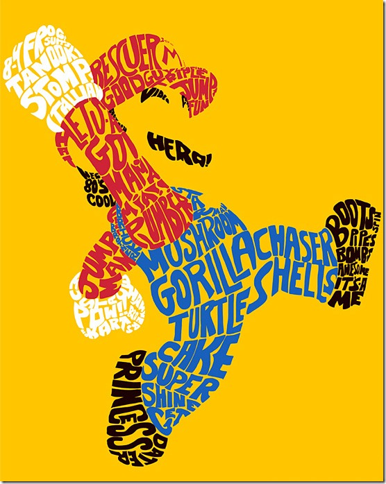
.I like the design of this using typography because it never says in any of the words what the design actually is. Everyone knows that it’s the super hero character Mario. It does have a lot of words and catchphrases that are related to the Mario franchist, such as “it’s a me!” and “Mama Mia!” and “princess” (which refers to Princess Peach. I know that distortion is a giant no-no in most typography, but it definitely works in the designers favor in this instance. I also think that without coloring in Mario’s shirt and overalls, and the design was all black, it might have been harder to pick up on the fact that this design was indeed Mario the plumber. So, the elements of the design that I like are the distortion and the coloring.
Week 4: Typography
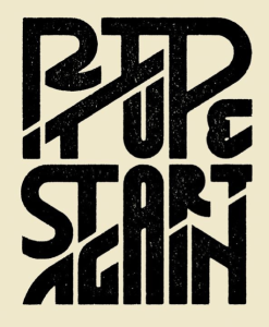
The intricate design on this “Rip It Up and Start Again” poster relies entirely on typography. Many of the letters have double functions and work in two separate words. For example, the “P” works in both “rip” and “up” and the “A” works in both “start and again” Similarly, bottom stroke of the “I” in “rip” doubles at the top stroke of the “T” in “it.” The double functions work because of the way the words are strategically stacked on each other. Instead of being confusing, though, the design is effective because of the white space and kerning. People can tell that the “P” works with “rip” because it is attached to the “I,” but it also works with “up” because of the tight kerning between the “U” and the “P” and the fact that the bottoms of the two letters line up. I also find it interesting how the letters are different sizes and shapes in order to fit together nicely. The white space also clearly separates the words and provides balance, order and a “clean” look. However, the connections between the letters and tight leading and kerning bring the entire design together.
Week 4 Post Typography
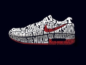
I thought this advertisement for Nike and Adobo Magazine was really cool. The typography in the advertisement is designed to look like a Nike sneaker with the famous Nike swoosh on the side. The shoe reads “One of the world’s most famous logos was designed for a mere 35 dollars by an art student. Learn more about the World of Advertising. Read Adobo Magazine.” Nowhere in the advertisement does it say anything about Nike, however, you can just tell by the swoosh and the statement regarding “the world’s most famous logos.” Also, the space between “the World of Advertising” and “Read Adobo Magazine” suggests that the sneaker is of the Nike Air type. The typeface used is in all caps and morphed so that the type fits the figure of a Nike sneaker.
Typography
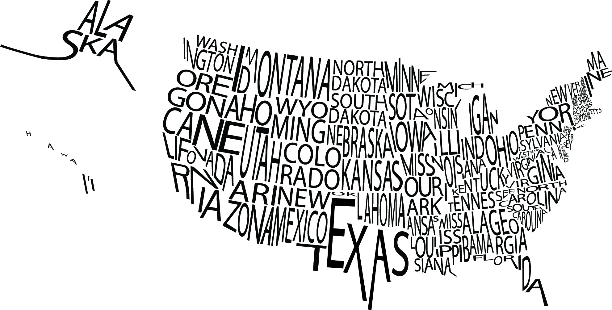 I was particularly drawn to this image because of the visual image it creates not only with the type, but with the white space as well. The letters in the names of the states are kerned close enough together that the overall image is understood while not making the graphic seemed too squished. If you take the time to actually read each state name, they are all legible which must have proven to be a challenge for the designer.
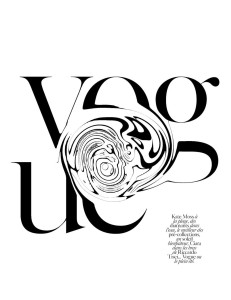
This a page from Vogue Paris and I selected it because of it’s simplicity and boldness. There isn’t much done to the letters, they are plain black and read as they typically do in Vogue, however my swirling even just part of every letter a completely new image is created. I also like that despite the fact that you can’t quite make out that the “E” is an “E” and the other letters are obscured as well, a person is still completely able to tell that this is vogue. A person may have more freedom when it comes to altering something as well known and legendary as Vogue because pretty much no matter what you do to it, people know the name well enough that they will still know it as vogue. I also like that while yes, this is a type of wordmark (kind of), it is strong enough to stand on its own as a graphic as well.
Typography
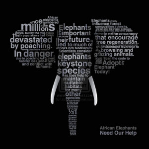
I really like this poster because it uses typography to be informational for a good cause. I think the sans serif typeface was ideal because it makes each word fit its place better. I also think the strategic sizing of different words help to spread more information at first look. It is very clear that the picture is of an elephant. But with ‘elephants’, ‘poaching’, ‘in danger’ and ‘millions’ all written in large letters its very clear what this poster is suggesting that we do. I find this poster to be very creative and effective.
Typography Post
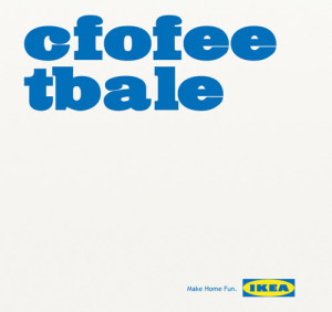
A few years ago, a study came out about being able to read and comprehend jumbled text. Here’s an example from FOX News, too — http://www.foxnews.com/story/2009/03/31/if-can-raed-tihs-msut-be-raelly-smrat/. I thought it was very clever of IKEA to make use of this trend in one of their ads. Along with clearly rearranging the letters, the typeface that they used is very effective. It being large and essentially the only thing on the image is eye-catching and makes people stop and wonder what the ad is about. Also, the slogan that is printed on the bottom, “Make Home Fun” goes along perfectly with the message that their use of typography is conveying.
Bicycle Typography
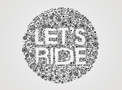
I love that this designer thought to use negative space to form the type. The doodle-like illustrations surrounding the letters give it a playful, childlike feel. Riding your bike has an element of a youthful mentality, and I think this typography executes that very well with the illustrations of children. It’s hard to notice at first, but there’s phrases like, “I want to ride my bike” and “Ride Bike” in small serif type. It’s interesting that the designer included type within the typography, but it works because there’s a contrast between the white and black.
WEEK 4 Typography
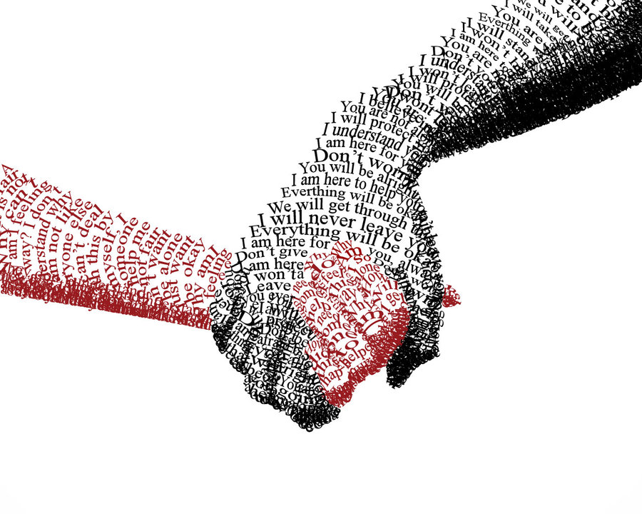
I really like how typography is applied to this picture.
The sentences “You are alright, I am here to help you…” consists of the black hand, which holding the red hand. These comforting sentences give people a reliable feeling and the solid black appear grave and composed. It makes people feel safe when seeing that black hand.
The phrases and words “alone”, ”by my self”, “why people…” formed the red hand, which is held by the black one. These sensitive and incomplete phrases imply loneliness and a desire to be cared and loved. The red shows emergency, highlighting the desire to be cared. The contrast of black and red imply the big difference of two hands. With these two hands holding together, though the picture just simply uses typography, it strongly conveys designer’s ideas.

